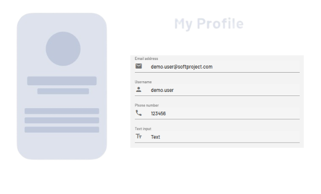
<TextBox> controls can be used to allow users of a Web App to work with text, numbers, or dates. Depending on the type of the TextBox, its appearance and behavior will change.
Instructions for use
A <TextBox> control is created with the <TextBox> element.
<TextBox>
...
</TextBox>
<TextBox> controls can be used in all available layout types. For more information, see Layouts.
Attribute
Note:
There are a number of default attributes that can be set for all controls. For more information about the default attributes, see Default attributes.
In addition to the default attributes, you can define the following attributes for <TextBox> controls:
|
Attribute |
Description |
|---|---|
|
|
This HTML attribute specifies whether AutoComplete is turned on or off for the TextBox. By default, AutoComplete is enabled. Possible values:
|
|
|
Defines whether a border is displayed around the control. Only works if Possible values:
|
|
|
Defines whether a left border is displayed. Only works if Possible values:
|
|
|
Defines whether a right border is displayed. Only works if Possible values:
|
|
|
Defines whether a top border is displayed. Only works if Possible values:
|
|
|
Defines whether a bottom border is displayed. Only works if Possible values:
|
|
|
Text box label.
Possible values: Any string |
|
|
Defines the color of the icon.
Possible values:
Note:
|
|
|
Position of the icon within the TextBox. Possible values:
|
|
|
Path to a graphic file or specification of a material icon that is used as an icon of the component.
Possible values:
With Ctrl+Space, you get an overview of the available icons. The selection may differ from the actual available Material Icons. |
|
|
Specifies whether multi-line inputs/outputs are possible in the TextBox. Works only with the Possible values:
|
|
|
Sets the visible height of the text box. Works only for multi-line text boxes. More lines can be entered, which are then visible by scrolling. Possible values: Integers (default: |
|
|
Type of the TextBox, changes behavior and appearance. Possible values:
All values that contain a date or time must be stored and provided in UTC! |
|
|
Required Content of the TextBox.
Possible values: Any string |
Actions
The following action is available for <TextBox> controls. For more information about actions, see Actions.
<SelectAction>
You can insert the Select action using the <SelectAction/> element within <TextBox>. The action is triggered when the user selects the TextBox.
Note:
You must insert the <SelectAction> element before the desired layout type (BoxLayout, FlowLayout, GridLayout, ResponsiveLayout, TabLayout).
Example