A bar chart can be used to compare multiple variables to a single value. Bar charts are useful for comparing categories.
Instructions for use
A bar chart is created using the <Bar> element within the <Chart> element. The element can only be used in the layout of a Detail Component.
<Chart>
    <Bar/>
</Chart>
The <Bar> element can contain the following elements:
-
<Axis>: Defines the axis labels. -
<BarData>: Defines how the data are displayed. A<BarData>element must be defined for each category in the bar chart. -
<Tooltip>: Defines how the tooltip for each value should be displayed in the chart.
General attributes
The following attributes are available for all elements of a bar chart:
|
Attribute |
Description |
|---|---|
|
|
Specifies the font family.
Possible values:
|
|
|
Sets the font size. This attribute overrides the default Web App font size for this layout. Possible values: Possible values:
|
|
|
Defines the font weight. This attribute overrides the default font weight for this layout. Possible values:
|
|
|
Defines a color for the foreground (text, etc.) of the control. Note:
Possible values:
Note:
|
<Bar> element
Contains all the elements that belong to the bar chart. Specifies how the chart should be displayed.
In addition to the general attributes, you can define the following attributes for the <Bar> element:
|
Attribute |
Description |
|---|---|
|
|
Specifies whether to display a legend. Possible values:
|
|
|
Specifies whether the value in stacked charts should be displayed within the bar. Possible values:
|
|
|
Specifies whether the bar chart should be displayed as a stacked chart.
Possible values:
|
|
|
Specifies how data points outside the current zoom range are handled in the bar chart. Affects axis scaling, display of empty bars, and removal of points. Possible values:
|
|
|
Specifies how users can zoom in the X-axis of the bar chart. Possible values:
|
|
|
Specifies how data points outside the current zoom range are handled in the bar chart. Affects axis scaling, display of empty bars, and removal of points. Possible values:
|
|
|
Specifies how users can zoom in the Y-axis of the bar chart. Possible values:
|
<Axis> element
Child element of <Bar> . Defines the axis labels.
In addition to the general attributes, you can define the following attributes for the <Axis> element:
|
Attribute |
Description |
|---|---|
|
|
Defines the color of the axes. Possible values:
Note:
|
<BarData> element
Child element of <Bar> . Defines how the data are displayed. A <BarData> element must be defined for each category in the bar chart.
In addition to the general attributes, you can define the following attributes for the <BarData> element:
|
Attribute |
Description |
|---|---|
|
|
Required Specifies which Possible values: Data binding possible |
|
|
Color of the bar Possible values: Hexadecimal color value or expression for data binding (Color) If the |
|
|
Required Specifies which data object of the data source is visualized. Possible values: Data binding possible |
|
|
Specifies the name of the data displayed in the legend. Possible values: Any string or data binding |
|
|
Required Specifies which value of the data object is visualized. Possible values: Data binding possible |
<Tooltip> element
Child element of <Bar> . Defines how the tooltip for each value should be displayed in the chart.
For the <Tooltip> element, you can define the general attributes (see above).
Emptying data
If you reload additional data using a process, the previously loaded chart will not be removed. If you want to overwrite the previously loaded chart with the new data, the empty="true" attribute must be declared in the data. The attribute clears the existing data.
Input 1
<?xml version="1.0" encoding="UTF-8"?>
<Ok>
	<b2 empty="true"/>
	<b1>
		<a>1</a>
		<b>1</b>
	</b1>
</Ok>
Input 2
<?xml version="1.0" encoding="UTF-8"?>
<Ok>
	<b1 empty="true"/>
	<b2>
		<a>1</a>
		<b>1</b>
	</b2>
</Ok>
Chart in the component
<Chart>
	<Bar>
		<BarData
			category="#a"
			data="#b1"
			value="#b" />
		<BarData
			category="#a"
			data="#b2"
			value="#b" />
	</Bar>
</Chart>
Examples
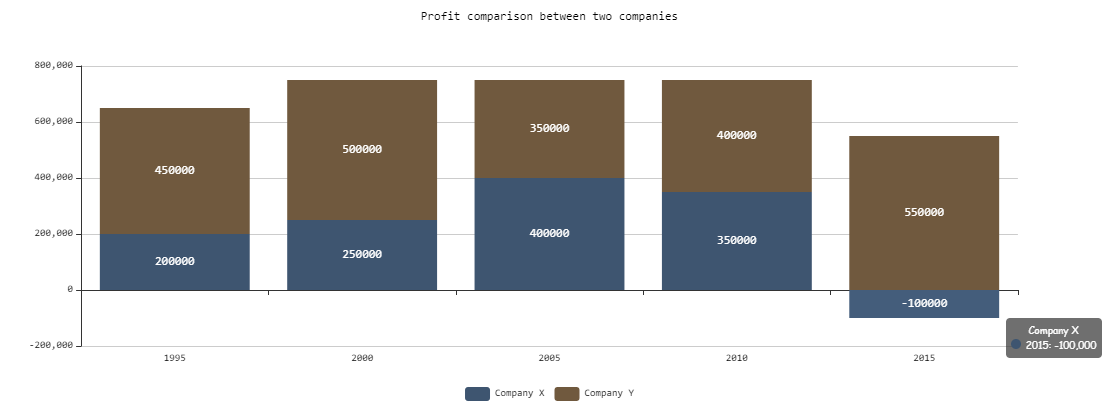
Example 1:
<Properties>
	<Property name="DataSource" type="Complex">
		<Property name="CompanyX" type="List">
			<Property name="Category" type="String"/>
			<Property name="Money" type="Integer"/>
		</Property>
		<Property name="CompanyY" type="List">
			<Property name="Category" type="String"/>
			<Property name="Money" type="Integer"/>
		</Property>
	</Property>
</Properties>
<FlowLayout>
	<Chart fontFamily="Font03" title="Profit comparison between two companies">
		<Bar stacked="true">
			<Tooltip fontFamily="Font02" fontSize="10"/>
			<Axis fontFamily="Font03" fontSize="10"/>
			<BarData category="#Category" data="#DataSource.CompanyX" fontFamily="Font03" name="Company X" value="#Money"/>
			<BarData  category="#Category" data="#DataSource.CompanyY" fontFamily="Font03" name="Company Y" value="#Money"/>
		</Bar>
	</Chart>
</FlowLayout>
Output
The data supplied by the Technical Process are in the followoing format:
<Ok>
	<DataSource>
		<CompanyX>
			<Category>1995</Category>
			<Money>200000</Money>
		</CompanyX>
		<CompanyX>
			<Category>2000</Category>
			<Money>250000</Money>
		</CompanyX>
		<CompanyX>
			<Category>2005</Category>
			<Money>400000</Money>
		</CompanyX>
		<CompanyX>
			<Category>2010</Category>
			<Money>350000</Money>
		</CompanyX>
		<CompanyX>
			<Category>2015</Category>
			<Money>-100000</Money>
		</CompanyX>
		<CompanyY>
			<Category>1995</Category>
			<Money>450000</Money>
		</CompanyY>
		<CompanyY>
			<Category>2000</Category>
			<Money>500000</Money>
		</CompanyY>
		<CompanyY>
			<Category>2005</Category>
			<Money>350000</Money>
		</CompanyY>
		<CompanyY>
			<Category>2010</Category>
			<Money>400000</Money>
		</CompanyY>
		<CompanyY>
			<Category>2015</Category>
			<Money>550000</Money>
		</CompanyY>
	</DataSource>
</Ok>
Example 2:
<Property name="Datasource" type="Complex">
<Property name="Bar1" type="List">
<Property name="category" type="String"></Property>
<Property name="value" type="Integer"></Property>
</Property>
<Property name="Bar2" type="List">
<Property name="category" type="String"></Property>
<Property name="value" type="Integer"></Property>
</Property>
<Property name="Bar3" type="List">
<Property name="category" type="String"></Property>
<Property name="value" type="Integer"></Property>
</Property>
...
...
...
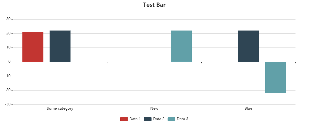
<Chart title="Test Bar">
<Bar>
<BarData data="#Datasource.Bar1" category="#category" value="#value"
name="Data 1" />
<BarData data="#Datasource.Bar2" category="#category" value="#value"
name="Data 2" />
<BarData data="#Datasource.Bar3" category="#category" value="#value"
name="Data 3" />
</Bar>
</Chart>
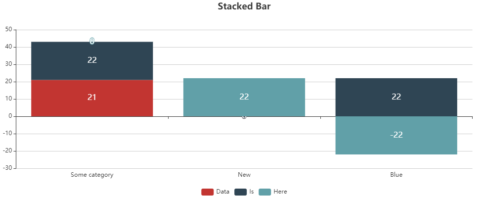
<Chart title="Stacked Bar">
<Bar stacked="true">
<BarData data="#Datasource.Bar1" category="#category" value="#value"
name="Data 1" />
<BarData data="#Datasource.Bar2" category="#category" value="#value"
name="Data 2" />
<BarData data="#Datasource.Bar3" category="#category" value="#value"
name="Data 3" />
</Bar>
</Chart>
The <BarData> element is used to represent a category in the chart. The displayed data itself is contained in the Datasource property.
Output
The data supplied by the Technical Process are in the followoing format:
<Ok>
	<Datasource>
		<Bar1>
			<category>Some category</category>
			<value>21</value>
		</Bar1>
		<Bar2>
			<category>Some category</category>
			<value>22</value>
		</Bar2>
		<Bar2>
			<category>New</category>
			<value>22</value>
		</Bar2>
		<Bar2>
			<category>Blue</category>
			<value>22</value>
		</Bar2>
		<Bar3>
			<category>Blue</category>
			<value>-22</value>
		</Bar3>
	</Datasource>
</Ok>