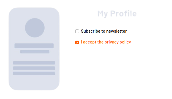
With <Checkbox> controls, you can map simple yes/no decisions or multiple selections to forms. Users can activate individual options or make multiple selections at the same time. In addition, <Checkbox> controls can be used to control the visibility or activation of other form fields or to trigger certain process paths in the workflow.
Instructions for use
A <Checkbox> control is created with the <Checkbox> element.
<Checkbox>
...
</Checkbox>
<Checkbox> controls can be used in all available layout types: For more information, see Layouts.
Attribute
Note:
There are a number of default attributes that can be set for all controls. For more information about the default attributes, see Default attributes.
In addition to the default attributes, you can define the following attributes for <Checkbox> controls:
|
Attribute |
Description |
|---|---|
|
|
Required Specifies whether the checkbox is enabled or disabled by default.
Note: The use of data binding for the status of the checkbox is necessary for the checkbox to function properly and to save the initial value of Possible values:
|
|
|
Label. Is displayed next to the checkbox.
Possible values: Any string |
|
|
Specifies whether the checkbox is displayed as a slider in the desktop version. Possible values:
|
Note:
Checkboxes are displayed differently in the desktop version and in the mobile version.
-
Display in the desktop version:

-
Display in mobile version:

The sliderOnDesktop attribute can also be used to view the mobile version display in the desktop version.
Actions
The following action is available for <Checkbox> controls. For more information about actions, see Actions.
<SelectAction>
You can insert the Select action using the <SelectAction/> element within <Checkbox>. The action is triggered as soon as the user activates or deactivates the checkbox.
Note:
You must insert the <SelectAction> element before the desired layout type (BoxLayout, FlowLayout, GridLayout, ResponsiveLayout, TabLayout).
Example