A line chart can be used to display trends or changes over time. Data points are connected by straight line segments. Multiple series of numbers can also be displayed in a line chart.
Instructions for use
A line chart is created using the <Line> element within the <Chart> element. The element can only be used in the layout of a Detail Component.
<Chart>
    <Line/>
</Chart>
The <Line> element can include the following elements:
-
<Axis>: Defines the axis labels. -
<LineData>: Defines how the data are displayed. A<LineData>element must be defined for each data record, that is, each line in the line chart. -
<Tooltip>: Defines how the tooltip for each value should be displayed in the chart.
Attribute
You can define the following attributes for all elements of a line chart:
|
Attribute |
Description |
|---|---|
|
|
Specifies the font family.
Possible values:
|
|
|
Sets the font size. This attribute overrides the default Web App font size for this layout. Possible values: Possible values:
|
|
|
Defines the tilt of the font. This attribute overrides the default font tilt for this layout. Possible values:
|
|
|
Defines the font weight. This attribute overrides the default font weight for this layout. Possible values:
|
|
|
Defines a color for the foreground (text, etc.) of the control. Note:
Possible values:
Note:
|
<Line> element
Contains all the elements that belong to the line chart.
In addition to the general attributes, you can define the following attribute for the <Line> element:
|
Attribute |
Description |
|---|---|
|
|
Specifies whether to display a legend. Possible values:
|
<Axis> element
Child element of <Line> . Defines the axis labels.
In addition to the general attributes, you can define the following attributes for the <Axis> element:
|
Attribute |
Description |
|---|---|
|
|
Defines the color of the axes. Possible values:
Note:
|
|
|
Defines the label of the x-axis. Possible values: Any string |
|
|
Maximum value of the x-axis Possible values: Integer |
|
|
Minimum value of the x-axis Possible values: Integer |
|
|
Unit of the x-axis Possible values: Integer |
|
|
Defines the label of the y-axis. Possible values: Any string |
|
|
Maximum value of the y-axis Possible values: Integer |
|
|
Minimum value of the y-axis Possible values: Integer |
|
|
Unit of the y-axis Possible values: Integer |
<LineData> element
Child element of <Line> . Defines how the data are displayed. A <LineData> element must be defined for each data record, that is, each line in the line chart.
In addition to the general attributes, you can define the following attributes for the <LineData> element:
|
Attribute |
Description |
|---|---|
|
|
Defines the color of the line. Possible values: Hexadecimal color value or expression for data binding ( If the |
|
|
Specifies which data are displayed in the chart. Possible values: Data binding possible |
|
|
Specifies whether the data points are labeled with the respective value. Possible values:
|
|
|
Specifies how a data point is represented. Possible values:
|
|
|
Defines whether data points are marked. Possible values:
|
|
|
Name of the data record displayed in the legend. Possible values: Any string |
|
|
Specifies which data is displayed in the chart on the x-axis. The specified string refers to a defined property in the provided Possible values: Data binding possible |
|
|
Specifies which data is displayed in the chart on the y-axis. The specified string refers to a defined property in the provided Possible values: Data binding possible |
<Tooltip> element
Child element of <Line> . Defines how the tooltip for each value should be displayed in the chart.
For the <Tooltip> element, you can define the general attributes (see above).
Example
<Properties>
<Property name="List1" type="List">
<Property name="Year" type="Integer"/>
<Property name="Sales" type="Integer"/>
</Property>
<Property name="List2" type="List">
<Property name="Year" type="Integer"/>
<Property name="Sales" type="Integer"/>
</Property>
</Properties>
...
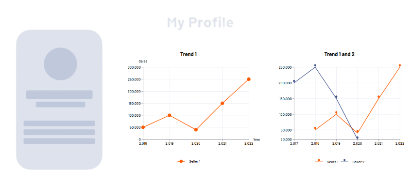
<Chart title="Trend 1">
<Line legend="true">
<Axis verticalMin="0" verticalMax="300000" verticalLabel="Sales" horizontalLabel="Year"/>
<LineData color="A700" xValues="#Year" data="#List1" yValues="#Sales" name="Seller 1"/>
</Line>
</Chart>
</Cell>
<Cell cellSizeDesktop="6">
<Chart title="Trend 1 and 2">
<Line legend="true">
<LineData color="A700" xValues="#Year" data="#List1" yValues="#Sales" name="Seller 1" marker="pin"/>
<LineData color="400" xValues="#Year" data="#List2" yValues="#Sales" name="Seller 2" marker="pin"/>
</Line>
</Chart>
Output
The data supplied by the Technical Process are in the following format:
<Ok>
	<List1>
		<Year>2018</Year>
		<Sales>50000</Sales>
	</List1>
	<List1>
		<Year>2019</Year>
		<Sales>100000</Sales>
	</List1>
	<List1>
		<Year>2020</Year>
		<Sales>40000</Sales>
	</List1>
	<List1>
		<Year>2021</Year>
		<Sales>150000</Sales>
	</List1>
	<List1>
		<Year>2022</Year>
		<Sales>250000</Sales>
	</List1>

	<List2>
		<Year>2017</Year>
		<Sales>200000</Sales>
	</List2>
	<List2>
		<Year>2018</Year>
		<Sales>250000</Sales>
	</List2>
	<List2>
		<Year>2019</Year>
		<Sales>150000</Sales>
	</List2>
	<List2>
		<Year>2020</Year>
		<Sales>20000</Sales>
	</List2>
</Ok>