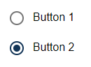
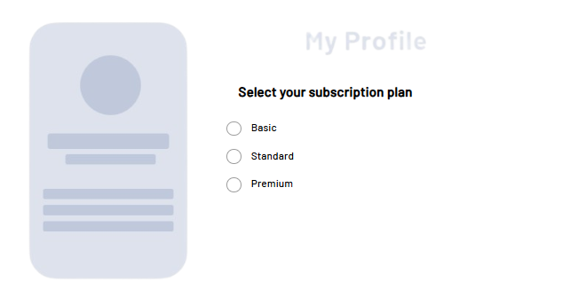
<RadioButton> controls can be used to create radio buttons. Users can select from several predefined options, where only one option can be active at a time. They are particularly suitable for decisions where the choices are mutually exclusive, such as the choice of a payment method or a priority level.
Instructions for use
A <RadioButton> control is created with the <RadioButton> element.
<RadioButton>
...
</RadioButton>
<RadioButton> controls can be used in all available layout types: For more information, see Layouts.
Attribute
Note:
There are a number of default attributes that can be set for all controls. For more information about the default attributes, see Default attributes.
In addition to the default attributes, you can define the following attributes for <RadioButton> controls.:
|
Attribute |
Description |
|---|---|
|
|
Label of the radio button.
Possible values: Any string |
|
|
Required Technical value to be further processed.
Possible values: Any string Note: It is possible to activate additional radio buttons by clicking on a radio button. To do this, the |
|
|
Required Radio buttons with the same
Possible values: Any string Note: By default, radio buttons are not selected when accessing the Web App. In order for a radio button to be selected when the Web App is called, the values for |
Actions
The following action is available for <RadioButton> controls. For more information about actions, see Actions.
<SelectAction>
You can insert the Select action using the <SelectAction/> element within <RadioButton>. The action is triggered when the user selects the radio button.
Note:
You must insert the <SelectAction> element before the desired layout type (BoxLayout, FlowLayout, GridLayout, ResponsiveLayout, TabLayout).
The Select action is created with the <SelectAction/> element within <RadioButton>.
Examples
Example 1:
Example 2:
Output format of the process
The Technical Process exampleProcess.wrf mentioned in the example generates the following output:
<?xml version="1.0" encoding="UTF-8"?>
<Ok>
	<group>false</group>
</Ok>