<Accordion> controls can be used to structure the areas of a page and dispay extensive lists. This is useful, for example, if you are working with numerous input fields from different categories. In addition, <Accordion> controls offer a high degree of flexibility, since you can add additional <Accordion> elements at any time and your Web App remains clearly structured.
Instructions for use
An <Accordion> control is created with the <Accordion> element.
<Accordion>
...
</Accordion>
You can use <Accordion> controls in all available layout types. A layout must be used within the <Accordion> control. For more information, see Layouts.
Attribute
Note:
There are a number of default attributes that can be set for all controls. For more information about the default attributes, see Default attributes.
In addition to the default attributes, you can define the following attributes for <Accordion> controls.
|
Attribute |
Description |
|---|---|
|
|
Specifies whether the Accordion element is expanded or closed when the Web App is opened.
Possible values:
|
|
|
Subtitle of the Accordion element Possible values:
|
|
|
Defines a color for the foreground of the subtitle. Note:
Possible values:
Note:
|
|
|
Title of the Accordion element Possible values:
|
Actions
The following actions are available for <Accordion> controls. For more information, see Actions.
<SelectAction>
You can insert the Select action using the <SelectAction/> element within <Accordion>. The action is triggered when the user selects the corresponding element in the Accordion.
Note:
You must insert the <SelectAction> element before the desired layout type (BoxLayout, FlowLayout, GridLayout, ResponsiveLayout, TabLayout).
<DoubleClickAction>
You can insert the DoubleClick action using the <DoubleClickAction/> element within <Accordion>. The action is triggered when the user double-clicks the corresponding element in the Accordion.
Note:
You must insert the <DoubleClickAction> element before the desired layout type (BoxLayout, FlowLayout, GridLayout, ResponsiveLayout, TabLayout).
Examples
Here you will find various examples of <Accordion> controls.
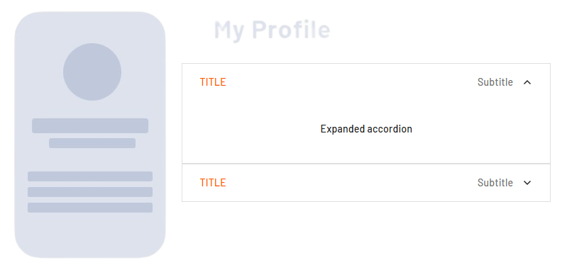
Example 1: Expanded and collapsed <Accordion>
This example showns an expanded <Accordion> and a collapsed one.
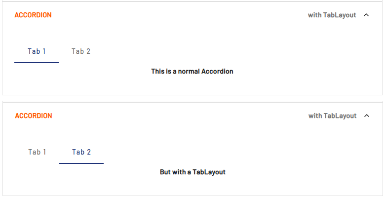
Example 2: <Accordion> with <TabLayout>
In this example, the <Accordion> contains a <TabLayout>. For more information on tab layouts, see Tab Layout: Tab Group.
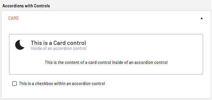
Example 3: <Accordion> with additional controls
In this example, the <Accordion> control contains a <Card> control and a <Checkbox> control.