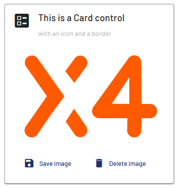
<Card> controls can be used to integrate cards into X4 Web Apps to integrate teasers or dashboards into applications, for example.
Instructions for use
A <Card> control is created with the <Card> element.
<Card>
...
</Card>
<Card> controls can be used in all available layout types: A layout must be used within the <Card> control. For more information, see Layouts.
Attributes
Note:
There are a number of default attributes that can be set for all controls. For more information about the default attributes, see Default attributes.
In addition to the default attributes, you can define the following attributes for <Card> controls.
|
Attribute |
Description |
|---|---|
|
|
Defines whether a border is displayed around the control. Possible values:
|
|
|
Defines whether a left border is displayed. Possible values:
|
|
|
Defines whether a right border is displayed. Possible values:
|
|
|
Defines whether a top border is displayed. Possible values:
|
|
|
Defines whether a bottom border is displayed. Possible values:
|
|
|
Specifies the icon for the control. Note: This attribute cannot be used at the same time as
Possible values:
Note about graphic files: The graphic file must be located in the
Notes on Material Icons:
|
|
|
Defines the color of the icon. Possible values:
Note:
|
|
|
Defines the subtitle of the card.
Possible values:
|
|
|
Defines the title of the card.
Possible values:
|
Actions
All existing actions are available for <Card> controls. For more information, see Actions.
If the Select actioin ( <SelectAction/>) and/or the DoubleClick action ( <DoubleClickAction> ) have been defined in the <Card> element, no further actions can be defined. The user can select and/or double-click the entire <Card> element. If neither action is specified, the <Card> element can contain any number of other actions.
Example