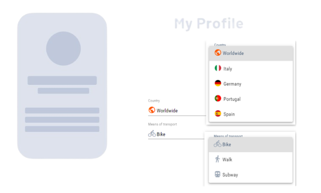
With <ComboBox> controls, you can offer users a choice from a list of predefined options, usually with only one choice. They are particularly useful when the number of options is manageable and you want to save space in the form, as the list is only visible when you click on the field. For long lists, it is recommended to use <ComboBoxAutocomplete> controls, which allow you to enter text and dynamically display matching options.
Instructions for use
A <ComboBox> control is created with the <ComboBox> element.
<ComboBox>
...
</ComboBox>
<ComboBox> controls can be used in all available layout types: For more information, see Layouts.
Attribute
Note:
There are a number of default attributes that can be set for all controls. For more information about the default attributes, see Default attributes.
In addition to the default attributes, you can define the following attributes for <ComboBox> controls.
|
Attribute |
Description |
|---|---|
|
|
Title of the ComboBox. Appears small above the input/output field.
Possible values: Any string |
|
|
Must be specified if Possible values: String that corresponds to a defined property Note: The specified string must correspond to a valid subproperty used in |
|
|
Name of the property that contains the color information of the icon. Note: This attribute is only used for Material Icons. The color can be a hexadecimal color value (e.g.
Possible values: String that corresponds to a defined property Note: For relative bindings, the hashtag |
|
|
Name of the property that contains the URL of the icon resource. Note: The icon can either be a resource from the
Possible values: String that corresponds to a defined property For relative bindings, the hashtag |
|
|
Enable automatic width for the options list. Possible values:
|
|
|
For swapped-out options list: Source of the list. Can only be used in conjunction with
Possible values: String (data binding) |
|
|
Maximum width of the options list in percent or pixels, where percent refers to the screen width. Possible values: Any integer |
|
|
Defines the unit for the Possible values:
|
|
|
Required Value that is displayed and stored.
Possible values: Any string |
|
|
Value that is technically processed. If this attribute is set, the property defined for this value must also be called this. If this attribute is not set, Possible values: Any string Note: The specified string must correspond to a valid subproperty used in |
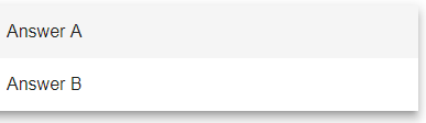
A ComboBox control contains at least one <Option> element that creates a selection option. The options in the pick list can either come from a Technical Process or be entered manually.
Note:
You can insert an empty <Option> element if you do not want the first entry in the pick list to be pre-selected automatically. For connected ComboBox elements, you must add an empty <Option> element in each element.
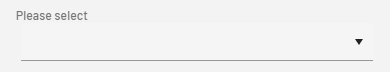
If you add an empty <Option> element and have added a display name for the ComboBox using the displayName attribute, the display name (for example, please select) is displayed as the first entry:
For the <Option> element, you can define the following attributes:
|
Attribute |
Description |
|---|---|
|
|
Required Display name of the selection option.
Possible values: Any string Note: If you want to quickly switch to a specific option in a ComboBox with many selection options instead of scrolling through the entire list, click in the ComboBox and enter all or part of the display name of the option. |
|
|
Value of the selection option
Possible values: Any string |
|
|
Color of the icon This attribute is only used for Material Icons. Possible values:
Note:
|
|
|
Path to the icon used The icon can either be a resource from the Possible values:
With Ctrl+Space, you get an overview of the available icons. The selection may differ from the actual available Material Icons.
|
The data for an outsourced option list must be XML data. The options must be included in a list:
<example>
	<listElement>list element 1</listElement>
</example>
<example>
	<listElement>list element 2</listElement>
</example>
Properties are defined according to the XML data. Note that an additional property saveValue is created, which is used as the initial value and container for saving the user input.
<Property name="example" type="List">
	<Property name="listElement" type="String" />
</Property>
<Property name="saveValue" type="String" />
Actions
The following action is available for <ComboBox> controls. For more information about actions, see Actions.
<SelectAction>
You can insert the Select action using the <SelectAction/> element within <ComboBox>. The action is triggered as soon as the user activates or deactivates the ComboBox.
Note:
You must insert the <SelectAction> element before the desired layout type (BoxLayout, FlowLayout, GridLayout, ResponsiveLayout, TabLayout).
Examples
Example 1: <ComboBox> with two options
Example 2: <ComboBox> with outsourced option list
The following example uses a outsourced option list. The displayed name and associated technical value differ.
The data for an outsourced option list must be XML data. The options, including the technical values, must be included in a list:
The ComboBox control in the Detail Component contains a SelectAction. The SelectAction sends the data to the defined Technical Process when an option is selected from the ComboBox.
The data from the outsourced option list (optionsList attribute) is used in the ComboBox. The OptionValue elements are displayed, but the technical data from the TechnicalValue element is selected in the background.
Note:
The XML data to be used for the options must be provided by a Technical Process (in the example LoadData.wrf and SaveData.wrf).
Example 3: <ComboBox> with icons and an outsourced option list
The following example shows the use of the <ComboBox> element with icons and an outsourced option list. The options are provided as a selection option via a Technical Process.