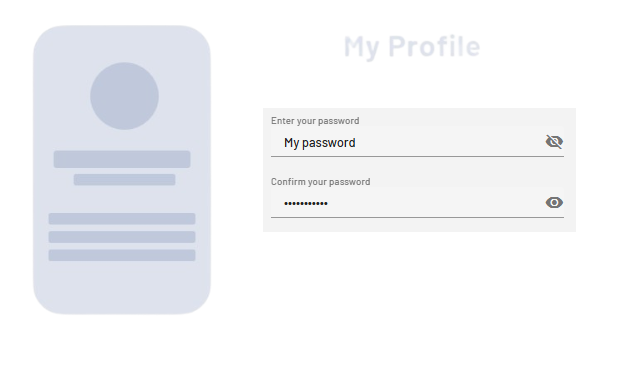
<PasswordBox> controls can be used to create password text fields. Depending on the definition of the control, the appearance changes.
Instructions for use
A <PasswordBox> control is created with the <PasswordBox> element.
<PasswordBox>
...
</PasswordBox>
<PasswordBox> controls can be used in all available layout types: For more information, see Layouts.
Attribute
Note:
There are a number of default attributes that can be set for all controls. For more information about the default attributes, see Default attributes.
In addition to the default attributes, you can define the following attributes for <PasswordBox> controls.
|
Attribute |
Description |
|---|---|
|
|
Title of the password field. Appears small above the input/output field.
Possible values: Any string |
|
|
Specifies whether the password field can be toggled to display the password. Possible values:
|
|
|
Required Contents of the password field.
Possible values: Any string |
Example