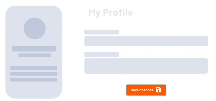
<Button> controls can be used to create buttons to trigger an action or to navigate a Web App. The buttons can be placed freely in the Web App.
Instructions for use
A <Button> control is created with the <Button> element.
<Button>
...
</Button>
<Button> controls can be used in all available layout types: For more information, see Layouts.
Attribute
You can define the following attributes for <Button> controls.
Note:
-
All other attributes for the buttons are defined in the respective action.
-
In Form Components, the
<Button>element serves only as a container for the action<CustomAction>. Here, you specify all attributes exclusively via the<CustomAction>element.
|
Attribute |
Description |
|---|---|
|
|
Specifies whether the user can interact with the control.
Possible values:
Note: The |
|
|
Specifies whether the user can interact with the control.
Possible values:
|
|
|
The direction in which the elements flow. The order of the elements corresponds to their declaration. Possible values:
|
|
|
Specifies what should happen when the control is full. Possible values:
|
|
|
Defines if the control is visible.
Possible values:
|
Actions
If you always want an action button to appear at the top of the component's content, create a button with Actions.
The <Button> element can contain the following elements:
-
<CustomAction/> -
<DeleteAction/> -
<DownloadAction/> -
<ForgotPasswordAction/> -
<LoginAction/> -
<LogoutAction/> -
<NewAction/> -
<ReloadAction/> -
<SaveAction/> -
<SaveViewAction/> -
<UploadAction/>
Note:
In a Form Component, you can only use the <CustomAction> action.
Example