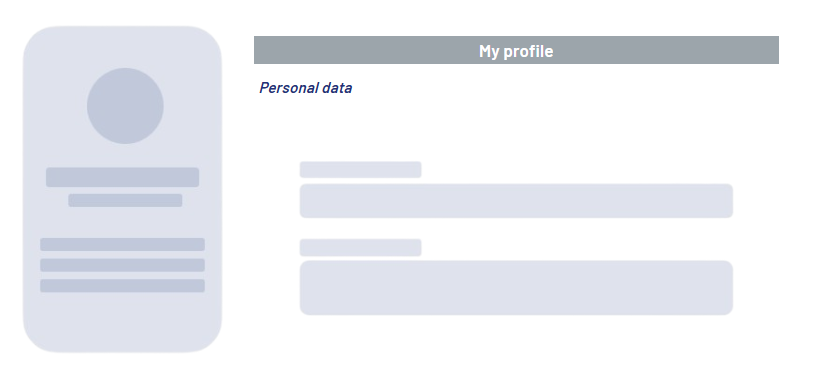
<Header> controls can be used to create headlines to organize and visually separate content in your web app. A header can not only be placed at the top of a layout, but anywhere it is needed.
Instructions for use
A <Header> control is created with the <Header> element.
<Header>
...
</Header>
<Header> controls can be used in all available layout types: For more information, see Layouts.
Attribute
Note:
There are a number of default attributes that can be set for all controls. For more information about the default attributes, see Default attributes.
In addition to the default attributes, you can define the following attributes for <Header> controls.
|
Attribute |
Description |
|---|---|
|
|
Defines the title level. Possible values:
Note: If you set |
|
|
Required Contains the header text.
Possible values:
|
Example