A Form Component is ideal for creating simple forms or for displaying data on simple pages without complex form configuration. To do this, information from a .viewmodel file is displayed in a structured format. You can configure the form in the X4 Designer, or you can open and edit the form in the Forms Editor. The generated forms can be integrated into a Web App or BPM process.
Instructions for use
Allowed layouts
You can include the following layouts in a Form Component:
-
Flow layout
-
Responsive layout
Allowed controls
You can integrate the following controls in a form component:
-
<Accordion> -
<Button>(limited to<CustomAction>) -
<Card> -
<Checkbox> -
<ComboBox > -
<CustomControl> -
<DateTimePicker> -
<FileLink> -
<FileUpload> -
<Header> -
<Label> -
<Link> -
<ListView> -
<PasswordBox> -
<RadioButtonGroup> -
<TextBox>
Defining the Form Component
A Form Component is declared within its own <form_name>.form definition file. This file is created in the Components project folder.
How to create a new definition file:
-
Select the Components folder and in the toolbar, select

Alternatively, the file can also be created via the context menu New > Add <desired_Component>. -
Select the desired definition file.
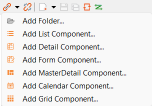
=> The Project Creation Wizard dialog opens.
-
In the File name field, enter the name of the definition file.
-
Select Finish.
A new definition file with a predefined structure is created.
The Form Component is created via the <FormComponent> element and can be declared except with the standard attributes for Components with the following attributes.
|
Attribute |
Description |
|---|---|
|
|
Defines a color for the foreground (text, etc.). Possible values:
|
|
|
Defines the color of the icon of the Component.
Note: This setting overrides the default color of the color scheme. Possible values:
Note:
|
|
|
Path to a graphic file or specification of a material icon that is used as icon of the Component. Note:
Possible values:
With Ctrl+Space, you get an overview of the available icons. Another overview is also available online. The selection may differ from the actual available Material Icons. |
|
|
Required Path to the Possible values: String (URI) |
|
|
Path to a The Possible values: String (URI) |
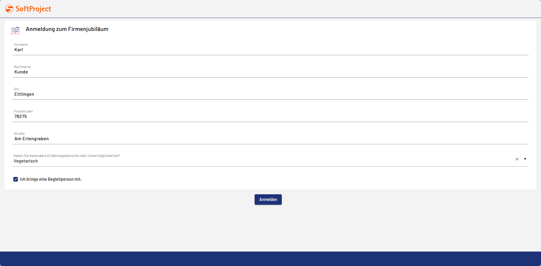
Example
<?xml version="1.0" encoding="UTF-8"?>
<FormComponent xmlns="http://softproject.de/webapp/1.0 "
	viewmodel="TennisPlayer.viewmodel" process="Load.wrf">
	<FlowLayout>
		<Card icon="25_Jahre_SP.png"
			title="Anmeldung zum Firmenjubiläum">
			<FlowLayout>
				<TextBox value="#firstname" displayName="Vorname"></TextBox>
				<TextBox value="#lastname" displayName="Nachname"></TextBox>
				<TextBox value="#city" displayName="Ort"></TextBox>
				<TextBox value="#zipcode" displayName="Postleitzahl"></TextBox>
				<TextBox value="#street" displayName="Straße"></TextBox>
				<ComboBox value="#diet" displayName="Haben Sie besondere Ernährungswünsche oder Unverträglichkeiten?">
					<Option displayName="Vegetarisch" />
					<Option displayName="Vegan" />
					<Option displayName="Glutenfrei" />
					<Option displayName="Laktosefrei" />
				</ComboBox>
				<Checkbox horizontalAlign="left" checked="#secondperson"
					displayName="Ich bringe eine Begleitperson mit."></Checkbox>
			</FlowLayout>
		</Card>
		<Button>
			<CustomAction displayName="Anmelden"></CustomAction>
		</Button>
	</FlowLayout>
</FormComponent>
Output format of the process
The Technical Process load.wrf mentioned in the example generates the following output:
<Ok>
   <firstname>Karl</firstname>
   <lastname>Kunde</lastname>
   <city>Ettlingen</city>
   <zipcode>76275</zipcode>
   <street>Am Erlengraben</street>
   <diet>Vegetarisch</diet>
   <secondperson>true</secondperson>
</Ok>