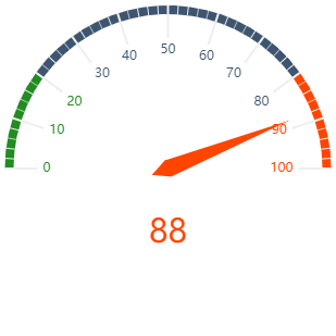
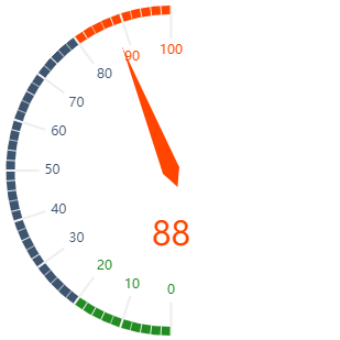
A tachograph can be used to display states with different ratings. It is well suited to compare target/actual values, e.g. for key performance indicators, customer satisfaction, or quality measurements.
Instructions for use
A tachograph is created using the <Gauge> element within the <Chart> element. The element can only be used in the layout of a Detail Component.
<Chart>
    <Gauge/>
</Chart>
The <Gauge> element can contain the following element:
-
<Tooltip>: Child element of<Gauge>. Defines how the tooltip for each value should be displayed in the chart.
Attribute
The following attributes are available for all elements of a tachograph:
|
Attribute |
Description |
|---|---|
|
|
Specifies the font family.
Possible values:
|
|
|
Sets the font size. This attribute overrides the default Web App font size for this layout. Possible values: Possible values:
|
|
|
Defines the tilt of the font. This attribute overrides the default font tilt for this layout. Possible values:
|
|
|
Defines the font weight. This attribute overrides the default font weight for this layout. Possible values:
|
|
|
Defines a color for the foreground (text, etc.) of the control. Note:
Possible values:
Note:
|
<Gauge> element
Specifies how the chart should be displayed.
In addition to the general attributes, you can define the following attributes for the <Gauge> element:
|
Attribute |
Description |
|---|---|
|
|
Specifies the end range of the tachograph in percent. The color of the area is defined in the Theming Editor via the Possible values: Integer between Example The default values ( |
|
|
Specifies the center portion of the tachograph in percent. The color of the area is defined in the Theming Editor via the Possible values: Integer between |
|
|
Specifies the starting range of the tachograph in percent. The color of the area is defined in the Theming Editor via the Possible values: Integer between |
|
|
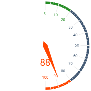
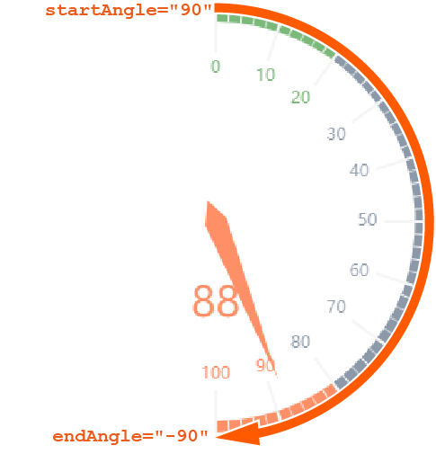
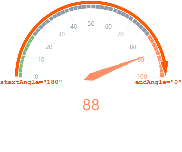
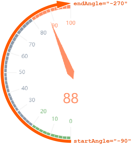
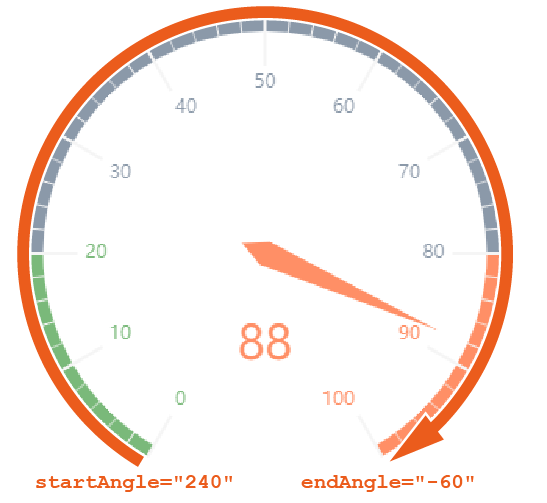
Specifies the endpoint of the tachograph. Possible values: Integer between Note:
|
|
|
Specifies whether to display a legend. Possible values:
|
|
|
Specifies the maximum value of the tachograph. Possible values: Integer (default: |
|
|
Specifies the minimum value of the tachograph. Possible values: Integer (default: Note: The connection from |
|
|
Specifies the start point of the tachograph. Possible values: Integer between Note: When defining values, the following integers correspond with the following positions on a clock:
|
|
|
Specifies the unit for the value that you specify using the value attribute. Possible values: Any string |
|
|
Required Specifies which value of the data object is visualized. Possible values: Any string or data binding |
<Tooltip> element
Child element of <Gauge> . Defines how the tooltip for each value should be displayed in the chart.
For the <Tooltip> element, you can define the general attributes (see above).
Example
<Properties>
    <Property name="Gauge1" type="Integer"/>
    <Property name="Gauge2" type="Integer"/>
</Properties>
<FlowLayout>
    <Chart title="Gauge Chart 1">
        <Gauge value="#Gauge1"/>
    </Chart>
    <Chart title="Gauge Chart 2">
        <Gauge value="#Gauge2" min="0" max="300" startAngle="225" endAngle="-45">
            <Tooltip foreground="A700"/>
        </Gauge>
    </Chart>
</FlowLayout>
Output
The data supplied by the Technical Process are in the followoing format:
<Ok>
	<Gauge1>75</Gauge1>
	<Gauge2>120</Gauge2>
</Ok>
How it works and other examples of tachographs
For tachographs, the following must be observed:
-
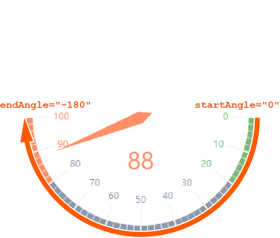
endAnglemust be smaller thanstartAngle. -
The connection from the start angle to the end angle is always clockwise.
-
The connection from
mintomax(scale) is always clockwise.
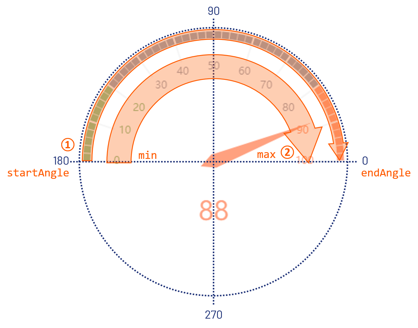
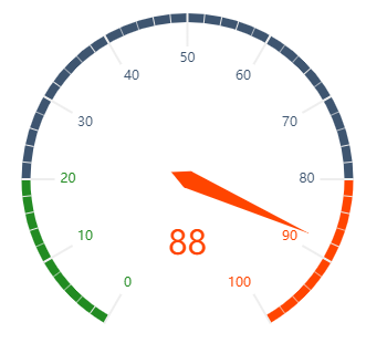
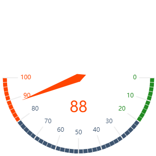
The following are further examples of tachograms with explanations to illustrate the function of the start and end angle.
|
Definition |
Result |
Explanation |
|---|---|---|
|
|
|
|
|
|
|
|
|
|
|
|
|
|
|
|
|
|
|
|