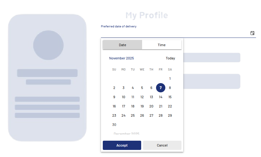
<DateTimePicker> controls are used to create a date and time picker. They are suitable for all cases where time or date values are required in the process, for example for appointments, deadlines or bookings. <DateTimePicker> controls support both calendar view selection and direct keyboard input.
Instructions for use
A <DateTimePicker> control is created with the <DateTimePicker> element.
<DateTimePicker>
...
</DateTimePicker>
<DateTimePicker> controls can be used in all available layout types: For more information, see Layouts.
Note
Please note that the date format depends on the language of the browser you are using (e.g. German: 3/31/2025 / US English: 03/31/2025).
Attributes
Note:
There are a number of default attributes that can be set for all controls. For more information about the default attributes, see Default attributes.
In addition to the default attributes, you can define the following attributes for <DateTimePicker> controls.
|
Attribute |
Description |
|---|---|
|
|
Title of the control.
Possible values: Any string |
|
|
Format in which the time is displayed and stored. Possible values:
|
|
|
Required Value that is displayed and stored.
Possible values:
|
Localization of the <DateTimePicker> control
You can use <DateTimePicker> controls to enter dates and times. The controls can be fully localized so that all texts, buttons, and labels are displayed in the user's language.
The following translations are available by default:
dateInput.increment = Wert erhöhen
dateInput.decrement = Wert verringern
datePicker.today = Heute
datePicker.toggle = Kalender umschalten
datePicker.prevButtonTitle = Auf vorherige Seite navigieren
datePicker.nextButtonTitle = Auf nächste Seite navigieren
dateTimePicker.dateTab = Datum
dateTimePicker.dateTabLabel = Datum
dateTimePicker.timeTab = Zeit
dateTimePicker.timeTabLabel = Zeit
dateTimePicker.toggle = Umschalten
dateTimePicker.accept = Setzen
dateTimePicker.acceptLabel = Setzen
dateTimePicker.cancel = Abbrechen
dateTimePicker.cancelLabel = Abbrechen
dateTimePicker.now = JETZT
dateTimePicker.nowLabel = Jetzt
dateTimePicker.today = HEUTE
dateTimePicker.prevButtonTitle = Zur vorherigen Ansicht
dateTimePicker.nextButtonTitle = Zur nächsten Ansicht
Example