A pie chart can be used to illustrate the proportion of individual data in the totality.
A pie/donut chart can contain the following elements:
-
<Pie>: Defines how the chart is displayed. -
<Tooltip>: Defines how the tooltip for each value should be displayed in the chart.
General attributes
The following attributes are available for all elements of a pie/donut chart:
|
Attribute |
Description |
|---|---|
|
|
Specifies the font family.
Possible values:
|
|
|
Sets the font size.
Possible values:
|
|
|
Defines the width of each character. This attribute overrides the default character width for this layout. Possible values:
This attribute does not work for the |
|
|
Defines the tilt of the font. This attribute overrides the default font tilt for this layout. Possible values:
This attribute does not work for the |
|
|
Defines the font weight. This attribute overrides the default font weight for this layout. Possible values:
This attribute does not work for the |
|
|
Defines the font color. This setting overrides the default color of the color scheme!
|
Pie
<Pie> : Defines how the chart is displayed.
In addition to the general attributes, <Pie> can have the following attributes:
|
Attribute |
Description |
|---|---|
|
|
Color of each chart pane Possible values: Hexadecimal color value or expression for data binding (Color) |
|
|
Specifies which data are displayed in the chart. The specified string refers to a defined property within the data source specified in the Possible values: Data binding possible |
|
|
Specifies whether the chart should be displayed as a donut chart. Possible values: |
|
|
Specifies whether to display a legend. Possible values: |
|
|
Defines the name associated with the respective value (data label). The specified string refers to a defined property in the provided Possible values: Data binding possible |
|
|
Specifies whether the values should be labeled directly in the chart. Possible values: |
|
|
Specifies which value of the data object is visualized. The specified string refers to a defined property in the provided Possible values: Data binding possible |
|
|
Defines the font color of the label. Overrides the color of all chart labels. Possible values: |
|
|
Defines the width of the label in pixels. Possible values:
|
|
|
Specifies what should happen if the label is longer than the specified width of the label. Possible values:
|
|
|
Specifies whether to prevent the overlapping of labels. Possible values:
|
|
|
Sets the radius in pixels. Possible values:
|
|
|
Sets the inner radius in pixels. Only relevant if the attribute Possible values:
|
|
|
Specifies the horizontal position of the chart. Possible values:
|
|
|
Specifies the vertical position of the chart. Possible values:
|
|
|
Specifies whether a percentage is displayed in addition to the value in the label and tooltip. Possible values:
|
Tooltip
<Tooltip>: Child element of <Pie> . Defines how the tooltip for each value should be displayed in the chart.
For <Tooltip>, you can define the general attributes (see above).
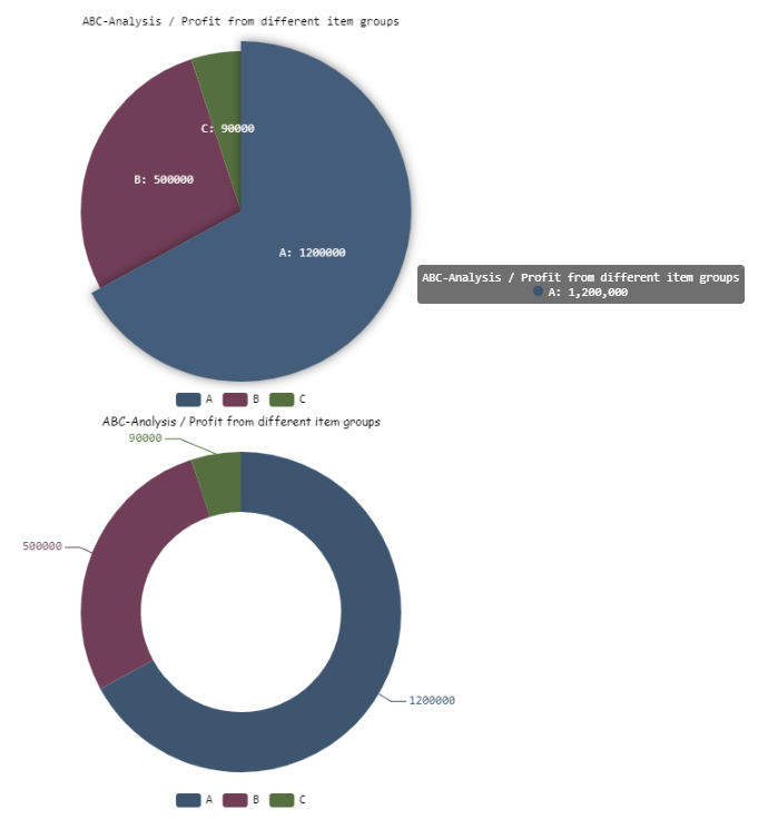
Example
<Properties>
	<Property name="DataSource" type="Complex">
		<Property name="ABC-Analysis" type="List">
			<Property name="ItemGroup" type="String"/>
			<Property name="Profit" type="Integer"/>
		</Property>
	</Property>
</Properties>
<FlowLayout>
	<Chart fontFamily="Font03" title="ABC-Analysis / Profit from different item groups">
		<Pie data="#DataSource.ABC-Analysis" fontFamily="Font03" name="#ItemGroup" normals="false" value="#Profit">
           <Tooltip fontFamily="Font03"/>
        </Pie>
	</Chart>
	<Chart fontFamily="Font02" title="ABC-Analysis / Profit from different item groups">
		<Pie data="#DataSource.ABC-Analysis" donut="true" fontFamily="Font03" name="#ItemGroup"  normals="true" value="#Profit">
			<Tooltip fontFamily="Font03"/>
		</Pie>
	</Chart>
</FlowLayout>
The example above results in the following chart: