<RadioButton> controls are used to create a group of buttons. The user can only select one radio button from this group at a time.
|
Attribute |
Description |
|---|---|
|
|
Label of the radio button
Possible values: Any string |
|
|
Required. Technical value that is processed.
Possible values: Any string It is possible to select additional radio buttons by clicking on a radio button. To do this, the
|
|
|
Required. Radio buttons with the same
Possible values: Any string By default, radio buttons are not selected when the web app is opened. The values for
|
|
|
Defines a color for the background of the control.
Possible values:
|
|
|
Defines if the user can interact with the control.
Possible values: The
|
|
|
Defines the font family.
Possible values:
|
|
|
Defines the font size.
Possible values:
|
|
|
Sets the width of the single characters. This attribute overrides the default width of the characters of the Web App for this control. Possible values:
This attribute doesn't work with the
|
|
|
Defines the font style. This attribute overrides the default style of the characters of the Web App for this control. Possible values:
This attribute doesn't work with the
|
|
|
Defines the font weight. This attribute overrides the default font weight of the Web App for this control. Possible values:
This attribute doesn't work with the
|
|
|
Defines a color for the foreground (texts etc.) of the control.
|
|
|
Direction in which the elements flow. The order of the elements corresponds to their declaration. Possible values:
|
|
|
Defines what happens if the page is full. Possible values:
|
|
|
Defines if the control is visible.
Possible values: |
"Select" Action within a radio button
The Select action is created via the element <SelectAction/> within <RadioButton> and is triggered as soon as an entry has been selected.
Example <RadioButton>
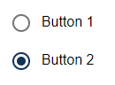
The following example shows the usage of the <RadioButton> tag.
<DetailComponent name="ExampleRadioButton" path="ExampleRadioButton" displayName="Example RadioButton" process="exampleProcess.wrf">
		<Properties>
			<Property name="group" type="String"></Property>
		</Properties>
		<FlowLayout>
			<RadioButton optionValue="true" value="#group" displayName="Button 1" />
			<RadioButton optionValue="false" value="#group" displayName="Button 2"/>
		</FlowLayout>
</DetailComponent>
Output Format of the Process
The Technical Process exampleProcess.wrf mentioned in the above example generates the following output:
<?xml version="1.0" encoding="UTF-8"?>
<Ok>
	<group>false</group>
</Ok>
The above code generates the following output in the web app: