Accordion controls can be used to structure the areas of a page and dispay extensive lists. This is useful, for example, if you are working with numerous input fields from different categories. In addition,Accordion controls offer a high degree of flexibility, since you can add additional Accordion elements at any time and your Web App remains clearly structured.
You can use Accordion controls in all available layout types.
-
BoxLayout -
FlowLayout -
GridLayout -
ResponsiveLayout -
TabLayout
The following attributes can be defined for an Accordion control.
|
Attribute |
Description |
|---|---|
|
|
Defines a color for the background of the control.
Possible values: |
|
|
Specifies whether the user can interact with the control.
Possible values:
|
|
|
Specifies whether the user can interact with the control.
Possible values:
|
|
|
Specifies whether the Accordion element is expanded or closed when the Web App is opened.
Possible values:
|
|
|
Specifies the font family.
Possible values:
|
|
|
Sets the font size.
Possible values:
|
|
|
Defines the width of each character. This attribute overrides the default character width for this layout. Possible values:
This attribute does not work for the |
|
|
Defines the tilt of the font. This attribute overrides the default font tilt for this layout. Possible values:
This attribute does not work for the |
|
|
Defines the font weight. This attribute overrides the default font weight for this layout. Possible values:
This attribute does not work for the |
|
|
Defines a color for the foreground (text, etc.) of the control.
Possible values: |
|
|
The direction in which the elements flow. The order of the elements corresponds to their declaration. Possible values:
|
|
|
Subtitle of the Accordion element Possible values:
|
|
|
Defines a color for the foreground of the subtitle.
Possible values:
Do not use a hash before the color value!
|
|
|
Specifies what should happen when the control is full. Possible values:
|
|
|
Title of the Accordion element Possible values:
|
|
|
Defines if the control is visible.
Possible values:
|
<SelectAction> within an Accordion control
The"Select" Action is generateed using the <SelectAction/> element within <Accordion> and is triggered when the user selects the corresponding element in the accordion.
<DoubleClickAction > within an Accordion control
The"DoubleClick" Action is generateed using the <DoubleClickAction/> element within <Accordion> and is triggered when the user double-clicks the corresponding element in the accordion.
Note:
The <SelectAction> and <DoubleClickAction/> elements must be inserted before the desired layout type (BoxLayout, FlowLayout, GridLayout, ResponsiveLayout, TabLayout).
Example
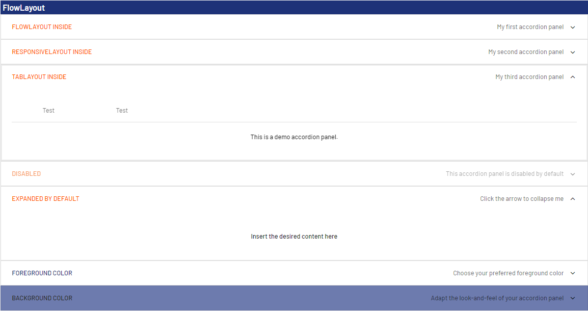
<?xml version="1.0" encoding="UTF-8"?>
<DetailComponent
	xmlns="http://softproject.de/webapp/1.0">
		<FlowLayout>
		<Header value="FlowLayout" />
		<Accordion title="FlowLayout inside" subtitle="My first accordion panel"
			expanded="false">
			<FlowLayout>
				<Label value="Welcome to my first accordion panel!" />
			</FlowLayout>
		</Accordion>
		<Accordion title="ResponsiveLayout inside"
			subtitle="My second accordion panel">
			<ResponsiveLayout>
				<Cell>
					<Label value="Welcome to my second accordion panel" />
				</Cell>
			</ResponsiveLayout>
		</Accordion>
		<Accordion title="TabLayout inside" subtitle="My third accordion panel">
			<TabLayout>
				<Tab displayName="Test">
					<FlowLayout>
						<Label value="This is a demo accordion panel."></Label>
					</FlowLayout>
				</Tab>
				<Tab displayName="Test">
					<FlowLayout>
						<Checkbox checked="true" displayName="I am a test checkbox" />
					</FlowLayout>
				</Tab>
			</TabLayout>
		</Accordion>
		<Accordion title="Disabled" subtitle="This accordion panel is disabled by default"
			disabled="true">
			<GridLayout>
				<Label value="Label" />
			</GridLayout>
		</Accordion>
		<Accordion title="Expanded by default" subtitle="Click the arrow to collapse me"
			expanded="true">
			<FlowLayout>
				<Label value="Insert the desired content here" />
			</FlowLayout>
		</Accordion>
		<Accordion title="Foreground color" subtitle="Choose your preferred foreground color"
			expanded="false" foreground="500">
			<FlowLayout>
				<Label value="Label"></Label>
				<Checkbox checked="true" displayName="I am a test checkbox" />
			</FlowLayout>
		</Accordion>
		<Accordion title="Background color"
			subtitle="Adapt the look-and-feel of your accordion panel" background="A200" foreground="900">
			<ResponsiveLayout>
				<Cell>
					<Label value="Select your favorite background color" />
				</Cell>
			</ResponsiveLayout>
		</Accordion>
	</FlowLayout>
</DetailComponent>
The code shown above generates the following output in the Web App: