TreeView controls are used in detail components to structure data on any number of levels and to display it clearly in a tree structure.
TreeView controls can be used in all available layout types:
-
BoxLayout -
FlowLayout -
GridLayout -
ResponsiveLayout -
TabLayout
The <TreeView> element can include the following actions:
-
<SelectAction/>(see Action "Select") -
<DoubleClickAction/>(see Action "DoubleClick")
The following attributes can be defined for a TreeView control:
|
Attribute |
Description |
|---|---|
|
|
Defines a color for the background of the control.
Possible values:
|
|
|
Defines if the user can interact with the control.
Possible values:
|
|
|
Defines if the user can interact with the control.
Possible values:
|
|
|
Defines the font family.
Possible values:
|
|
|
Defines the font size.
Possible values:
|
|
|
Sets the width of the single characters. This attribute overrides the default width of the characters of the Web App for this control. Possible values:
This attribute doesn't work with the
|
|
|
Defines the font style. This attribute overrides the default style of the characters of the Web App for this control. Possible values:
This attribute doesn't work with the
|
|
|
Defines the font weight. This attribute overrides the default font weight of the Web App for this control. Possible values:
This attribute doesn't work with the
|
|
|
Defines a color for the foreground (texts, etc.) of the control.
Possible values:
|
|
|
Direction in which the elements flow. The order of the elements corresponds to their declaration. Possible values:
|
|
|
Icon for the
Possible values:
This attribute cannot be used at the same time as
|
|
|
Defines the icon color. Possible values:
Do not use a hash in front of the color value!
|
|
|
Specifies a unique identifier of the element. Possible values:
|
|
|
Required. Source of the data. The number of entries defines the number of displayed elements. Possible values:
|
|
|
Specifies a unique identifier of the parent element. Possible values:
|
|
|
Defines what happens if the page is full. Possible values:
|
|
|
Title of the control Possible values:
|
|
|
Defines whether the control is visible.
Possible values:
|
Example
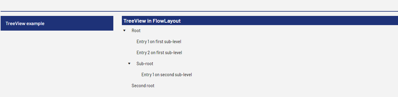
<?xml version="1.0" encoding="UTF-8"?>
<DetailComponent xmlns="http://softproject.de/webapp/1.0" process="loadTreeView.wrf">
	<Properties>
		<Property name="TV_List" type="List">
			<Property name="id" type="String"></Property>
			<Property name="pid" type="String"></Property>
			<Property name="entryName" type="String" />
		</Property>
	</Properties>
	<FlowLayout>
		<Header value="TreeView in FlowLayout" />
		<FlowLayout>
			<TreeView objectList="#TV_List" id="#id" parentId="#pid" title="#entryName">
				<SelectAction componentName="Dashboard_Copy" />
			</TreeView>
		</FlowLayout>
	</FlowLayout>
</DetailComponent>
Output Format of the Process
The Technical Process loadTreeView.wrf mentioned in the above example generates the following output:
<?xml version="1.0" encoding="UTF-8"?>
<Ok>
	<TV_List>
		<id>0-1</id>
		<pid>0</pid>
		<entryName>Root</entryName>
	</TV_List>
	<TV_List>
		<id>1-1</id>
		<pid>0-1</pid>
		<entryName>Entry 1 on first sub-level</entryName>
	</TV_List>
	<TV_List>
		<id>1-2</id>
		<pid>0-1</pid>
		<entryName>Entry 2 on first sub-level</entryName>
	</TV_List>
	<TV_List>
		<id>1-3</id>
		<pid>0-1</pid>
		<entryName>Sub-root</entryName>
	</TV_List>
	<TV_List>
		<id>2-1</id>
		<pid>1-3</pid>
		<entryName>Entry 1 on second sub-level</entryName>
	</TV_List>
	<TV_List>
		<id>0-2</id>
		<pid>0</pid>
		<entryName>Second root</entryName>
	</TV_List>
</Ok>
The above code generates the following output in the Web App: