Master/Detail component
The master/detail component consists of Actions and structural elements Master, Detail and Overlay.
| Element | Description |
|---|---|
Master | Contains the component that is displayed at the top of the screen. |
Detail | Contains the component that is displayed if a certain condition is fulfilled. By default, content is displayed in this area if a defined list entry is selected within the |
Overlay | Displays pop-ups. Components that are declared accordingly are displayed in the pop-up on the desktop and as a separate page on mobile devices. |
The structure elements Master, Detail and Overlay can contain a reference to a Detail or a List components, see Referencing Components in the Web App definition. In the Detail and Overlay element, the Master/Detail component can contain multiple referenced Components. This possibility can be used by using actions with defined componentName attribute and declared components with defined name attribute.
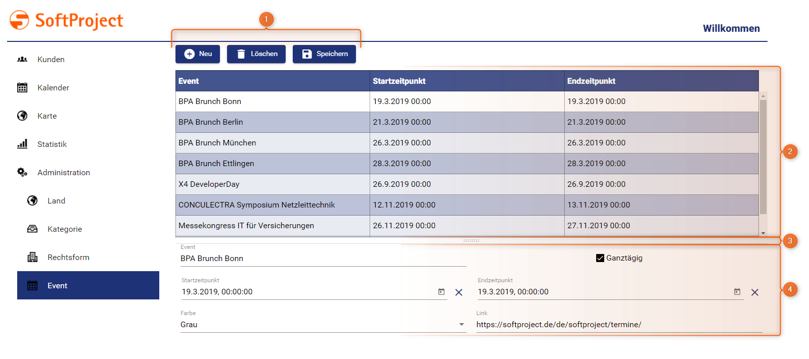
| 1 | Actions |
| 2 | Master structural element |
| 3 | Detail structural element |
Properties in Master/Detail
The properties of the Master/Detail component can be defined both in the Master/Detail component itself and in the subordinate components within the structure elements. A common data model for the entire Master/Detail component is created from these property definitions. This also means that conflicts between Properties within a Master/Detail component (e.g. same name but different data type) are not permitted and lead to a validation error.
All components within a Master/Detail component therefore work with the same data (for List components related to the selected entry). For overlays, a temporary copy of the data is created, which is synchronized back after successful processing.
Components included via ComponentReference can only access Properties that are also defined within this component. The components work nevertheless on the same data object, have however a limited view of the Properties, which they actually need. Especially when calling processes, this avoids unnecessary data transfer.
Defining Master/Detail component
A Master/Detail component is declared within its own definition file <MasterDetailComponentName>.masterdetail. This is created in the Components project folder.
How to create a new definition file
Click the menu New > Add <corresponding component>.
Alternatively, the file can also be created via the context menu New > Add
<corresponding component>.Select the desired definition file.
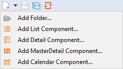
Enter a name for the definition file in File name.
Click Finish.
A new definition file with a predefined structure is created.
The Master/Detail component is created via <MasterDetailComponent> and can have the standard attributes for Components.
| Attribute | Description |
|---|---|
defaultSeparatorPosition | Default horizontal position of the separator in percent Possible values:
|
The following example shows the basic structure of a Master/Detail component.
<MasterDetailComponent xmlns="http://softproject.de/webapp/1.0">
	<Actions>
		<NewAction componentName="CustomerDetail" />
	</Actions>
	<Master>
		<ComponentReference source="Customer/Customer.list" name="AllCustomers" />
	</Master>
	<Detail>
		<TabGroup>
			<ComponentReference source="Customer/Tabs/Company.detail" displayName="$Company" name="CustomerDetail" />
			<ComponentReference source="Customer/Tabs/ContactPerson.detail" displayName="$ContactPerson" />
			<ComponentReference source="Customer/Tabs/Event.list" displayName="Events" name="CustomerEvents" />
		</TabGroup>
	</Detail>
	<Overlay>
		<ComponentReference source="Customer/Overlay/AddEvent.list" name="AddToEvent" />
	</Overlay>
</MasterDetailComponent>
Explanation:
- Within
Actionsthe available actions are defined. - The
Masterelement contains a reference to a List component. Depending on the selected list entry, further information is displayed in the detail view. - The
Detailelement defines which information is displayed for a list item. In the above example, the detail information is displayed in a Tab Group.
Hide and display components
Areas of a Master/Detail component (Master structure element, Detail structure element and Overlay) can be hidden and displayed dynamically via data binding. This can be controlled via the visible attribute:
Component with dynamic hide/display
<CalendarComponent displayName="CalendarComp with visible attribute" visible="#visibility">Component reference with dynamic hide/display
<ComponentReference source="detail_1.detail" displayName="CompRef with visible attribute" visible="#visibility"/>