Components
Web applications consist of different components, each of which is defined in a separate file. The components are then referenced within Components via the <ComponentReference> element.
There are different types of components:
| Component | Tag | Description |
|---|---|---|
| Detail Component | DetailComponent | Displays text. |
| List component | ListComponent | Displays data in the form of dynamically generated lists. |
| Calendar Component | CalendarComponent | Displays a calendar. |
| Master/Detail component | MasterDetailComponent | Can consist of the structural elements |
| ExternalWeb component | ExternalWebComponent | Embeds an external website into a web app. |
| Grid component | GridComponent | Displays data in a tabular format. |
More detailed differences between the components are explained in the respective chapters.
<WebApp xmlns="http://softproject.de/webapp/1.0" path="BeispielProjekt">
<Modules>
<Module path="Module" displayName="My Module">
<Components>
<!-- Bereich für die Komponenten -->
<ComponentReference/>
</Components>
</Module>
</Modules>
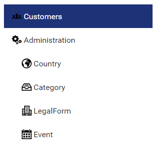
</WebApp>Components can be nested within each other.
<WebApp xmlns="http://softproject.de/webapp/1.0">
	<Modules>
		<Module displayName="My Module" path="Module">
			<Components>
				<ComponentReference default="true" displayName="$Customers" iconUrl="logo.png" name="Home"
                path="Home" source="Customers/Customers.masterdetail"/>
				<ComponentReference displayName="$Administration" iconUrl="Gear.png" path="Administration"
                source="Administration/Administration.masterdetail">
					<Components>
						<ComponentReference displayName="$Country" iconUrl="Country.png" name="Countries"
						path="Countries" source="Administration/Country/Country.masterdetail"/>
						...
						<ComponentReference displayName="$Event" iconUrl="Event.png" name="Event"
						path="Event" source="Administration/Event/Event.masterdetail/>
					</Components>
				</ComponentReference>
			</Components>
		</Module>
	</Modules>
</WebApp>
When components are nested, they are displayed as sub-items in the menu:
When nesting components, make sure that a Components element is first created within the outer component. Components contains the subordinate components.
Attributes for components
Components can have the following attributes:
Attribut | Description |
|---|---|
fontFamily | Defines the font family within the component. The property is inherited by all controls and actions of the component. Possible values: Font code from the font list, e.g. |
fontSize | Defines the font size within the component. The property is inherited by all controls and actions of the component. Possible values:
|
fontStretch | Defines the width of the individual characters. The property is inherited by all controls and actions of the component. Possible values:
|
fontStyle | Defines the slant of the font. The property is inherited by all controls and actions of the component. Possible values:
|
fontWeight | Defines the font weight. The property is inherited by all controls and actions of the component. Possible values:
|
iconColor | Defines the color of the component's icon.
This setting overwrites the default color of the color scheme!
Possible values:
|
iconURL | Path to a graphic file or specification of a material icon that is used as the icon of the component.
Possible values:
With |
process | Required. Path to the Possible values: String (URI) |
title | Title of the component. Displayed in the application as a header.
Possible values: Any character string or data binding expression |
titleBackground | Defines the title background color. Possible values:
|
titleForeground | Defines a color for the title foreground. Possible values:
|