Calendar Component
A calendar component displays a calendar and events. A calendar component can be used stand-alone or within a master/detail component.
Defining a Calendar Component
A calendar component is defined within an own definition file <CalendarName>.calendar. The definition file is created within the Repository folder Components.
How to create a new definition file
Click the menu New > Add <corresponding component>.
Alternatively, the file can also be created via the context menu New > Add
<corresponding component>.Select the desired definition file.
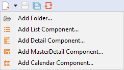
Enter a name for the definition file in File name.
Click Finish.
A new definition file with a predefined structure is created.
The calendar component is created via <CalendarComponent> and can contain the standard attributes for Components.
Calendar settings: Views
The calendar settings determine which views of the calendar can be displayed by the user and which view is the default view. The calendar settings are made using attributes of the <CalendarSettings> element.
<CalendarComponent ...>
 	...
 	<CalendarSettings defaultView="Day" ...>
 </CalendarComponent>
Possible attributes:
| Attribute | Description |
|---|---|
dayView | Enables and disables the day view. Possible values: |
dayViewSlot | Defines the time scale in the day view. Possible values:
|
defaultView | Defines the default view of the calendar. Possible values:
A view must be enabled to be defined as default view. |
monthView | Enables and disables the month view. Possible values: |
weekView | Enables and disables the week view. Possible values: |
weekViewSlot | Defines the time scale in the week view. Possible values:
|
The calendar views (monthView, weekView, dayView) are linked with buttons that allow the user to select the respective view. If a calendar view is disabled, the corresponding button is hidden.

Calendar settings: Localization
A calendar component can be localized. A German user interface is provided by default. The <Localization> element within <CalendarSettings> can be used to define any translation or custom key for translation files.
<CalendarComponent ...>
 	...
	<CalendarSettings ...>
 		<Localization march="March" ... />
 	</CalendarSettings>
 </CalendarComponent>
If a translation file is created for the corresponding Web app, all translation keys are available.
Available translations:
| Key | Value |
|---|---|
next | Next |
prev | Back |
today | Today |
monthView | Month |
weekView | Week |
dayView | Day |
monday | Monday |
tuesday | Tuesday |
wednesday | Wednesday |
thursday | Thursday |
friday | Friday |
saturday | Saturday |
sunday | Sunday |
mondayShort | Mo |
tuesdayShort | Tu |
wednesdayShort | We |
thursdayShort | Th |
fridayShort | Fr |
saturdayShort | Sa |
sundayShort | Su |
january | January |
february | February |
march | March |
april | April |
may | May |
june | June |
july | July |
august | August |
september | September |
october | October |
november | November |
december | December |
start | Start |
end | End |
location | Location |
description | Description |
allDay | All Day |
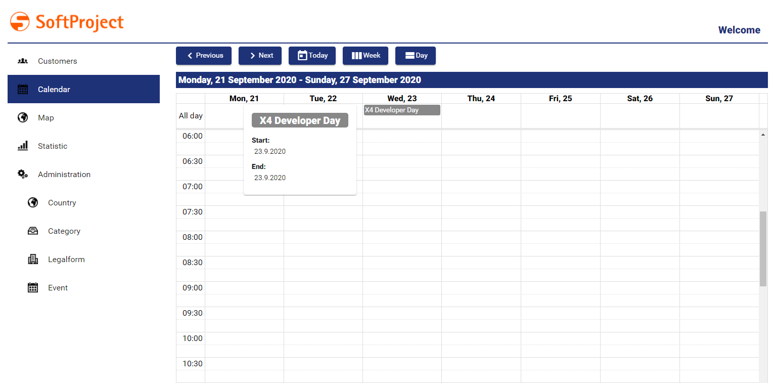
Events
Events are defined with the element <EventConfiguration/>. The element is used to bind values from a list to events in the calendar. The list that contains the events is delivered by a Technical Process to the Calendar component.
<CalendarComponent ...>
 	...
 	<CalendarSettings ...>
 		<Localization .../>
 	</CalendarSetting>
 	<EventConfiguration/>
 </CalendarComponent>
Possible attributes:
| Attribute | Description |
|---|---|
allDay | Defines if the event takes place all day. Possible values: |
background | Defines the color with which the event is displayed. Possible values: HTML color code e.g. |
begin | Defines the start time of the event. Possible values: Data binding expression (DateTime) |
description | Defines the event description. Possible values: Any string or data binding expression (string) |
detailNavigationLinkName | Name of the button opening the detail view, if the attribute Possible values:
If the calendar is placed within the master component of a master/detail component, the detail view cannot be accessed on mobile devices since it is opened by an external navigation link. If the event does not have an external navigation link, you can navigate to the detailed view using a button. The attribute The button is only displayed in the mobile view, if the calendar component is located within a master/detail component. |
end | Defines the end time of the event. Possible values: Data binding expression (DateTime) |
externalNavigationLink | Link to be opened when the event is clicked. Possible values: Hyperlink (string) or data binding expression (string) |
externalNavigationLinkName | Text that is displayed for an external link instead of the URL. Possible values: String If the |
externalNavigationLinkTarget | Defines whether the link ( Possible values:
|
fontFamily | Defines the font family. Possible values: Font code from the font palette, e.g. |
fontSize | Defines the font size. Possible values:
|
fontStretch | Defines the width of the single characters. Possible values:
|
fontStyle | Defines the font inclination. Possible values:
|
fontWeight | Defines the font weight. Possible values:
|
foreground | Defines a color for the event name. Possible values:
|
location | Defines the event location. Possible values: Any string or data binding expression (string) |
name | Defines the name of the event. Possible values: Any string or data binding expression (string) |
External Links in Events
Events can contain external links. They are specified within the element <EventConfiguration/> using a <SelectAction>.
<SelectAction/> can have the standard attributes for Actions and the attributes, which are specific for the Aktion "Auswählen".
<EventConfiguration>
	<SelectAction externalLink="#event.link"/>
</EventConfiguration>
Data for the calendar component
The calendar component needs data in a list as input to display events. This data is provided by a Technical Process and must comply with the following scheme.
<CalendarComponent displayName="Calendar" path="calendar" process="events.wrf">
	<Properties>
		<Property name="List" type="Complex">
			<Property name="Name" type="String"/>
			<Property name="AllDay" type="Boolean"/>
			<Property name="Begin" type="DateTime"/>
			<Property name="End" type="DateTime"/>
			<Property name="Color" type="Color"/>
			<Property name="Link" type="String"/>
		</Property>
	</Properties>
	<EventConfiguration allDay="#List.AllDay" name="#List.Name" begin="#List.Begin" end="#List.End" color="#List.Color" externalNavigationLink="#List.Link"/>
</CalendarComponent>
The data structure must be specified in the properties of the component!
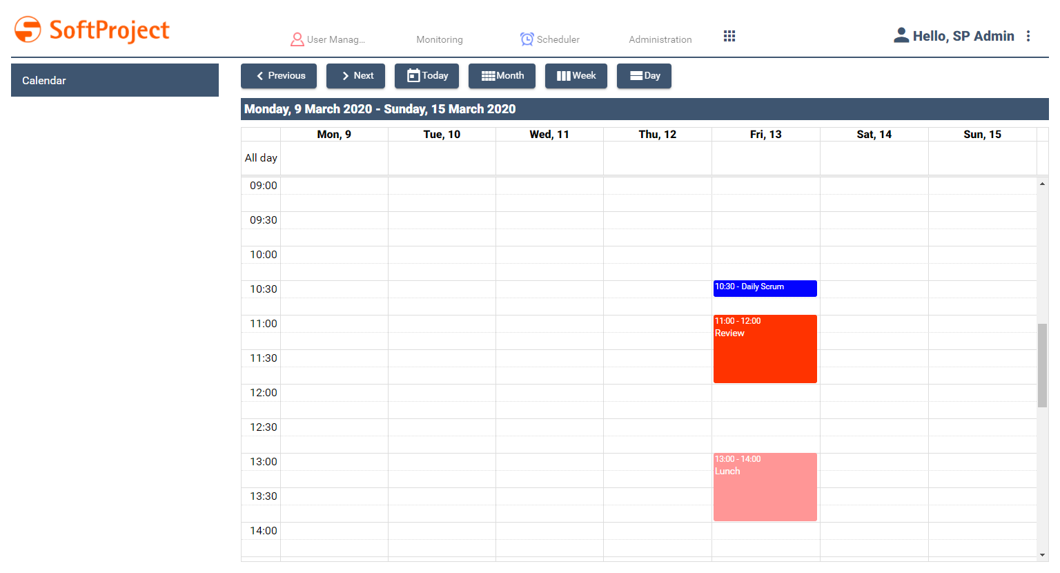
Example
The definition of a calendar component can look like this.
Example CalendarComponent
<CalendarComponent
	xmlns="http://softproject.de/webapp/1.0" process="calendar.wrf">
	<Properties>
		<Property name="event" type="Complex">
			<Property name="id" type="String"/>
			<Property name="name" type="String"/>
			<Property name="allDay" type="Boolean"/>
			<Property name="begin" type="DateTime"/>
			<Property name="end" type="DateTime"/>
			<Property name="color" type="Color"/>
			<Property name="link" type="String"/>
		</Property>
	</Properties>
	<CalendarSettings defaultView="Week"/>
	<EventConfiguration allDay="#event.allDay" background="#event.color" begin="#event.begin" end="#event.end" name="#event.name">
		<SelectAction externalLink="#event.link"/>
	</EventConfiguration>
</CalendarComponent>
The input is provided by the calendar.wrf Technical Process and looks like this:
Example Input Events.xml
<?xml version="1.0" encoding="UTF-8"?>
<OkList>
	<event>
		<id>1</id>
		<name>Daily Scrum</name>
		<allDay>false</allDay>
		<begin>2020-03-13T09:30:00Z</begin>
		<end>2020-03-13T09:45:00Z</end>
		<color>0303FF</color>
		<link>https://www.scrum.org/resources/what-is-a-daily-scrum</link>
	</event>
	<event>
		<id>2</id>
		<name>Review</name>
		<allDay>false</allDay>
		<begin>2020-03-13T10:00:00Z</begin>
		<end>2020-03-13T11:00:00Z</end>
		<color>FF3300</color>
		<link></link>
	</event>
	<event>
		<id>3</id>
		<name>Lunch</name>
		<allDay>false</allDay>
		<begin>2020-03-13T12:00:00Z</begin>
		<end>2020-03-13T13:00:00Z</end>
		<color>FF9696</color>
		<link></link>
	</event>
</OkList>
The following result is output: