List component
A list component displays dynamically generated lists. The component requires data and information on how this data is to be displayed.
Defining List component
A List component is declared within its own definition file <ListName>.list. This is created in the Components project folder.
How to create a new definition file
Click the menu New > Add <corresponding component>.
Alternatively, the file can also be created via the context menu New > Add
<corresponding component>.Select the desired definition file.
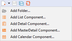
Enter a name for the definition file in File name.
Click Finish.
A new definition file with a predefined structure is created.
The List component is created via <ListComponent> and can have the following additional attributes besides the default attributes for Components.
| Attribute | Description |
|---|---|
pageSize | Defines the number of elements which are loaded into the list at once (see Paging). Possible values: Integer greater than |
rowBackground | Defines the background color of the rows in the list. Possible values:
|
rowForeground | Defines a color for the foreground (texts etc.). Possible values:
|
layout | Defines the layout mode of the list. Possible values:
If line breaks are prevented, this can create vertical scrollbars if needed.
|
textOverflow | Defines what should happen if overflowing texts cannot be displayed. Possible values:
|
borderColor
| Defines the border color of a list component. Possible values
|
The data to be displayed must be provided by a Technical Process and correspond to a specific data model. The data model delivered by the Technical Process must be defined in the Properties. To link the data that is delivered by the Technical Process with the representation within the web application, the corresponding Property must be defined and stored in the column definition using Data Binding.
If a property is to be used in the list component, it must be defined as Complex type. This property can contain further properties.
Column definition
The list columns must be defined within the list component. Columns are defined using Column or ImageColumn for columns that contain images. All columns must be defined within Columns.
<ListComponent process="list.wrf">
	<Properties>
		...
	</Properties>
	<Columns>
		<Column .../>
		<Column .../>
		<ImageColumn .../>
	</Columns>
</ListComponent>
Possible attributes for <Column>:
| Attribute | Description |
|---|---|
displayName | Title of the column.
Possible values: Any string |
horizontalAlign | Defines the horizontal alignment of the content within the column. Possible values:
|
mobilePosition | Defines the position at which the column is displayed in the mobile view. A maximum of four values can be displayed in the mobile view. Possible values:
If this attribute is not set, the column is not displayed in the mobile view.
|
sortable | Defines if the column can be sorted according to its content. More information on Sorting. Possible values: |
value | Defines the content of the column using data binding. Possible values: String (data binding) If no attribute |
width | Defines the column width. Possible values:
The unit in which the column width is specified is set with the |
widthUnits | Defines the unit in which the column Possible values:
|
textOverflow | Defines what should happen if overflowing texts cannot be displayed. Possible values:
The attribute in
<Column> has a higher priority and overrides the attribute in <ListComponent>.
|
Possible attributes for <ImageColumn>:
| Attribute | Description |
|---|---|
displayName | Title of the column.
Possible values: Any string |
horizontalAlign | Horizontal alignment of the graphic in the column Possible values:
|
iconColor | Defines the color of the image. Possible values:
|
image | Graphic that is displayed in the column. Possible values: Data binding expression (Image) |
imageHeight | Height of the graphic Possible values: Integer The unit in which the height is specified is set with the |
imageUnits | Unit for the width and height of the graphic. Possible values:
|
imageWidth | Width of the graphic Possible values: Integer The unit in which the width is specified is set with the |
mobilePosition | Defines the position at which the column is displayed in the mobile view. A maximum of four values can be displayed in the mobile view. Possible values:
If this attribute is not set, the column is not displayed in the mobile view. |
Periodic reloading
The ReloadTimer element can be used to reload the List component periodically.
Periodic reloading of data can cause a high load and should only be used in rare use cases.
Possible attributes for <ReloadTimer>:
| Attribute | Description |
|---|---|
refreshTime | Time until reload in seconds
Possible values: any integer |
itemIdentifier | Optional; Unique key for the data represented in the rows.
Possible values: Data Binding to a defined property of the grid component |
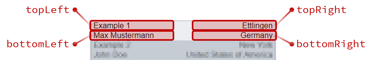
Mobile view of the list component
In the mobile view, lists are displayed in compressed form with a maximum of four columns. The four columns are arranged in the four corners of a rectangle; the arrangement can be defined with the attribute mobilePosition. Other columns are not displayed in the mobile view.
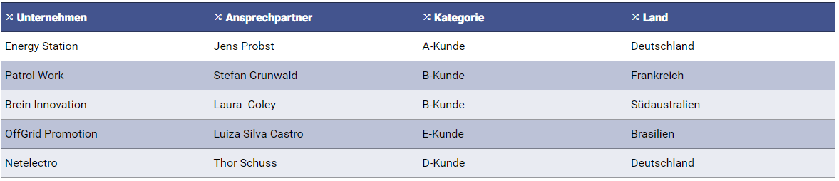
List in the desktop view
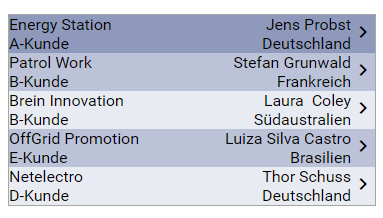
List in the mobile view
<SelectAction> within a List Component
The Select action is created via the <SelectAction/> element within <Actions> and is triggered when a user selects an entry from a list component.
In addition to the standard attributes of the Select action, the following attribute is available:
Attribute | Description |
|---|---|
disableAutoselect | Only when used within a Master/Detail component. Possible values: |
<DoubleClickAction> within a List Component
The DoubleClick action is created via the <DoubleClickAction/> element within <Actions> and is triggered when a user double-clicks an entry from a list component.
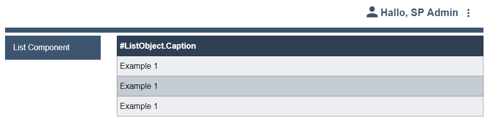
Example list component
The following example shows the declaration of a list component.
<ListComponent process="list.wrf">
	<Properties>
		<Property name="ListObject" type="Complex">
			<Property name="Caption" type="String" />
		</Property>
	</Properties>
	<Columns>
		<Column value="#ListObject.Caption" />
	</Columns>
</ListComponent>
The component processes data in the following format.
<?xml version="1.0" encoding="UTF-8" ?>
<OkList size="30">
	<ListObject>
		<Caption>Example 1</Caption>
	</ListObject>
	<ListObject>
		<Caption>Example 1</Caption>
	</ListObject>
	<ListObject>
		<Caption>Example 1</Caption>
	</ListObject>
</OkList>
The above code creates the following result: