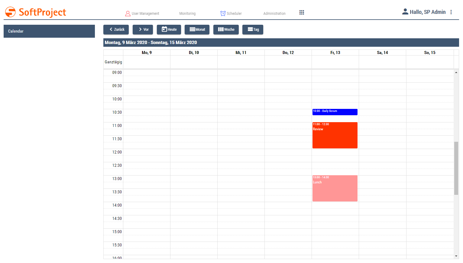
A Calendar Component shows a calendar and events. A Calendar Component can be used alone or in a Master/Detail Component.
Defining the Calendar Component
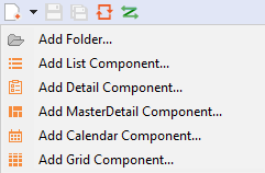
A Calendar Component is declared within its own <CalendarName>.calendar definition file. This file is created in the Components project folder..
How to create a new definition file:
-
Click the New > Add <name of component> menu.
Alternatively, you can create the file using the New > Add <name of component> context menu. -
Select the desired definition file.
-
In File name, enter the name of the definition file.
-
Select Finish.
A new definition file with a predefined structure is created.
The Calendar Component is created via <CalendarComponent> and can have the default attributes for Components.
Calendar Settings: Views
The Calendar Settings can be used to specify which views of the calendar can be viewed by the user and which view is the default view. The calendar settings are made via attributes of the <CalendarSettings> element.
<CalendarComponent ...>
	...
	<CalendarSettings defaultView="Day" ...>
</CalendarComponent>
Possible attributes:
|
Attribute |
Description |
|---|---|
|
|
Enables and disables the day view. Possible values: |
|
|
Defines the timescale in the day view. Possible values:
|
|
|
Defines the default view of the calendar. Possible values:
Only one active view can be defined as the default view. |
|
|
Enables and disables the month view. Possible values: |
|
|
Enables and disables the week view. Possible values: |
|
|
Defines the timescale in the week view. Possible values:
|
The calendar views (monthView, weekView, dayView) are linked to buttons that allow the user to select the respective view. If a calendar view is deactivated, the corresponding button is also hidden.
Calendar Settings: Localization
A Calendar Component can be localized. A German user interface is offered by default. The <Localization> element within <CalendarSettings> can be used to define any translations or custom keys for translation files.
<CalendarComponent ...>
	...
	<CalendarSettings ...>
		<Localization march="March" ... />
	</CalendarSettings>
</CalendarComponent>
When a translation file is created for the corresponding Web App, all translation keys are available.
Existing translations:
|
Key |
Value |
|---|---|
|
|
Next |
|
|
Back |
|
|
Today |
|
|
Month |
|
|
Week |
|
|
Day |
|
|
Monday |
|
|
Tuesday |
|
|
Wednesday |
|
|
Thursday |
|
|
Friday |
|
|
Saturday |
|
|
Sunday |
|
|
Mo |
|
|
Tu |
|
|
We |
|
|
Th |
|
|
Fr |
|
|
Sa |
|
|
Su |
|
|
January |
|
|
February |
|
|
March |
|
|
April |
|
|
May |
|
|
June |
|
|
July |
|
|
August |
|
|
September |
|
|
October |
|
|
November |
|
|
December |
|
|
Start |
|
|
End |
|
|
Location |
|
|
Description |
|
|
all day |
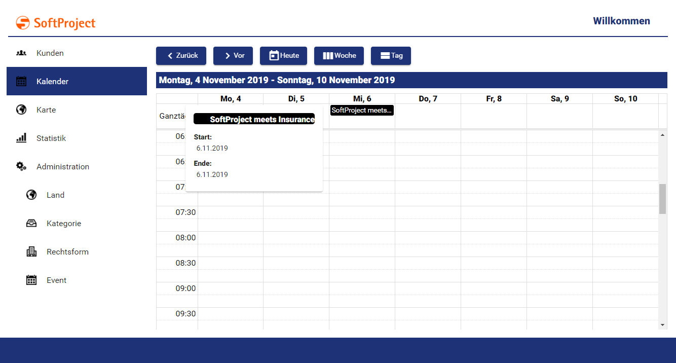
Events
Events are defined with the <EventConfiguration/> element. The item is used to bind values from a list to events in the calendar. The list containing the events is delivered by a technical process to the calendar component.
<CalendarComponent ...>
	...
	<CalendarSettings ...>
		<Localization ... />
	</CalendarSetting>
	<EventConfiguration />
</CalendarComponent>
Possible attributes:
|
Attribute |
Description |
|---|---|
|
|
Defines whether the event takes place all day. Possible values: |
|
|
Defines the color with which the event should be displayed. Possible values: HTML color code, such as |
|
|
Defines the start time of the event. Possible values: Expression for data binding (DateTime) |
|
|
Specifies the description of the event. Possible values: Any string or expression for data binding (String) |
|
|
Name of the button that opens the detail view if the Possible values:
If the calendar is within the Master Component of a Master/Detail Component, the detail view cannot be accessed on mobile devices because it is opened by an external navigation link. If the event does not have an external navigation link, a button can be used to navigate to the detail view. The The button only appears in the mobile view if the Calendar Component is within a Master/Detail Component. |
|
|
Defines the end time of the event. Possible values: Expression for data binding (DateTime) |
|
|
Link to open when the event is clicked. Possible values: Hyperlink (string) or expression for data binding (string) |
|
|
Text that appears instead of the URL for an external link. Possible values: Character string If the |
|
|
Specifies whether the link ( Possible values:
|
|
|
Specifies the font family. Possible values: Font code from the font palette, e.g. |
|
|
Sets the font size. Possible values:
|
|
|
Defines the width of each character. Possible values:
|
|
|
Defines the tilt of the font. Possible values:
|
|
|
Defines the font weight. Possible values:
|
|
|
Defines a color for the title foreground. Possible values: |
|
|
Specifies the location of the event. Possible values: Any string or expression for data binding (String) |
|
|
Defines the name of the event. Possible values: Any string or expression for data binding (String) |
External links in events
External links can be inserted within an event. These are implemented within the <EventConfiguration/> element using a <SelectAction>.
The <SelectAction/> element can have the default attributes for Actions as well as the attributes specific to the Action "Select".
<EventConfiguration>
	<SelectAction externalLink="#event.link" />
</EventConfiguration>
Data for the Calendar Component
The Calendar Component requires data in a list as input to display events. This data is supplied by a Technical Process and must conform to the following scheme.
<CalendarComponent displayName="Calendar" path="calendar" process="events.wrf">
	<Properties>
		<Property name="List" type="Complex">
			<Property name="Name" type="String" />
			<Property name="AllDay" type="Boolean" />
			<Property name="Begin" type="DateTime" />
			<Property name="End" type="DateTime" />
			<Property name="Color" type="Color" />
			<Property name="Link" type="String" />
		</Property>
	</Properties>
	<EventConfiguration allDay="#List.AllDay" name="#List.Name" begin="#List.Begin" end="#List.End" color="#List.Color" externalNavigationLink="#List.Link" />
</CalendarComponent>
The data structure must be specified in the properties of the component!
Example
The definition of a Calendar Component can look like this.
The input is provided by the Technical Process calendar.wrf and looks like this:
The following result is returned: