Responsive Behavior
Web applications that are created with Web App are optimized for display on smartphones an tablets as well as on classic desktop PCs. The responsive behavior affects:
the page layout
the appearance of checkboxes
the display of information within a list component / grid component
the display of master/detail components
Page Layout on a Desktop PC
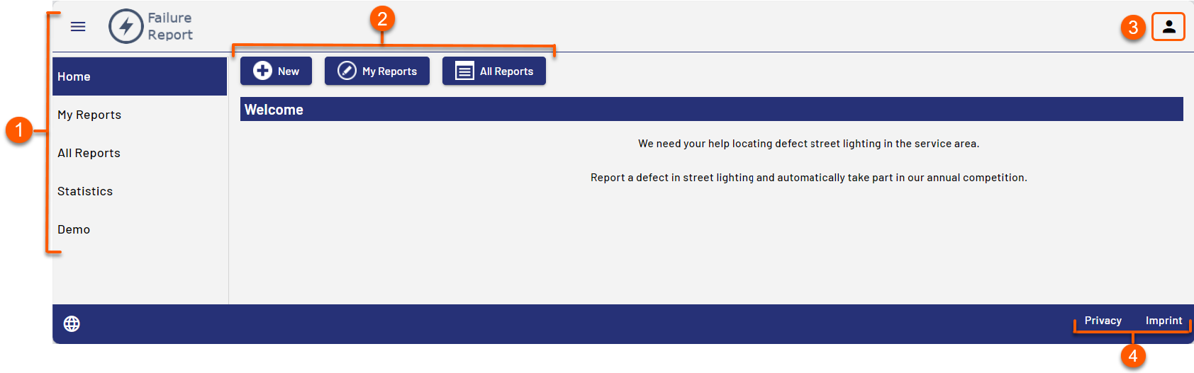
1 | The menu is created automatically using the components. Each component creates a menu item. |
2 | Buttons for actions |
3 | User menu Note: Selecting the icon displays the logged-in user and the functions for changing the password and logging out. The user menu is displayed only for Web Apps with the Authorization Flow Resource Owner Password Flow. |
4 | Links to the data protection statement and the imprint. Links are generated automatically and refer to the files |
Mobile Page Layout
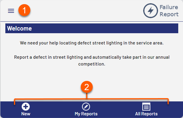
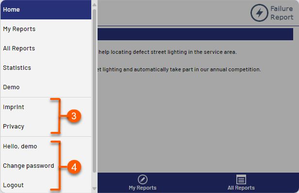
1 | Menu, is created automatically using the components. Each component creates a menu item. In mobile mode the menu becomes visible when you click on the menu button. |
2 | Buttons for actions |
3 | Links to the data protection statement and the imprint. Links are generated automatically and refer to the files |
4 | Details for the logged-in user and options for changing the password and logging out |