Skip table of contents

Grid Component

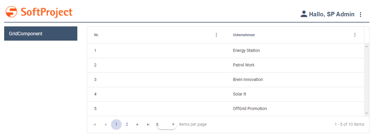
A Grid Component is ideal for mapping data in a tabular representation. The behavior of the Grid Component can be defined via individual elements in the Grid Settings.

Note:

The Grid Component will be optimized for display on mobile devices in a future version of the X4 BPMS.
Defining the Grid Component

A Grid Component is declared within its own <GridName>.grid definition file. This file is created in the Components project folder.

How to create a new definition file

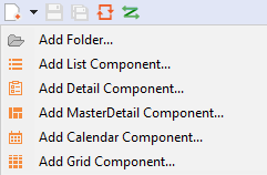
  1. Click the New > Add <desired_Component> menu.
    Alternatively, the file can also be created via the context menu New > Add <desired_Component>.

  2. Select the desired definition file.

  3. In the File name field, enter the name of the definition file.

  4. Select Finish.
    A new definition file with a predefined structure is created.

The data to be displayed must be provided by a Technical Process and must correspond to a specific data model.

The data model supplied by the Technical Process must be mapped in the properties. In order to link the data supplied by the Technical Process with the representation within the web application, the corresponding property must be defined and Data Binding stored in the definition of the <GridColumn/>.

Note:

If a property is to be used in a Grid Component, it must be defined with the Complex type. This property can contain additional properties.

The Grid Component is created via the <GridComponent> element, which can have the following attributes:

Attribute

Description

background

Defines a background color.

  • Data binding (color) is possible

This setting overrides the default color of the color scheme.

Possible values:

  • Hexadecimal color value, e.g. ff5a00

  • Do not use a hash before the color value.

  • Do not use an abbreviated notation of the color value

  • Color code from the color palette of the Web App (cf. Theming), e.g. A200

fontFamily

Specifies the font family within the component. The property is inherited by all controls and actions of the component.

  • Data binding (String) is possible

Possible values: Fontcode from the font palette, e.g. Font04

fontSize

Specifies the font size within the component. The property is inherited by all controls and actions of the component.

  • Data binding (String) is possible

Possible values:

  • Any integer or decimal number with a period as a decimal separator, e.g. 20; 20.8; .9

  • Font size in pixels, e.g. 20px

  • Font size in points, e.g. 18pt

  • Font size compared to the font size of the parent element, e.g. .8em or 120%

  • Keywords:Xx-small, x-small, small, medium , large , x-large, xx-large, smaller , larger

fontStretch

Specifies the width of each character. The property is inherited by all controls and actions of the component.

  • Data binding (String) is possible

Possible values:

  • Condensed

  • Expanded

  • ExtraCondensed

  • ExtraExpanded

  • Medium

  • Normal (default)

  • SemiCondensed

  • SemiExpanded

  • UltraCondensed

  • UltraExpanded

fontStyle

Sets the tilt of the font. The property is inherited by all controls and actions of the component.

  • Data binding (String) is possible

Possible values:

  • italic: Italic font

  • normal: Normal font (default)

  • oblique: Slanted font style (calculated)

fontWeight

Sets the font weight. The property is inherited by all controls and actions of the component.

  • Data binding (String) is possible

Possible values:

  • Black

  • Bold

  • DemiBold

  • ExtraBlack

  • ExtraBold

  • ExtraLight

  • Heavy

  • Light

  • Medium

  • Normal (default)

  • Regular

  • SemiBold

  • Thin

  • UltraBlack

  • UltraBold

  • UltraLight

foreground

Defines the font color.

  • Data binding (color) is possible

This setting overrides the default color of the color scheme.

Possible values:

  • Hexadecimal color value, e.g. ff5a00

  • Do not use a hash before the color value.

  • Do not use an abbreviated notation of the color value

  • Color code from the color palette of the Web App (cf. Theming), e.g. A200

headerBackground

Defines the background color of the header.

  • Data binding (color) is possible

This setting overrides the default color of the color scheme.

Possible values:

  • Hexadecimal color value, e.g. ff5a00

  • Do not use a hash before the color value.

  • Do not use an abbreviated notation of the color value

  • Color code from the color palette of the Web App (cf. Theming), e.g. A200

headerForeground

Defines the font color of the header.

  • Data binding (color) is possible

This setting overrides the default color of the color scheme.

Possible values:

  • Hexadecimal color value, e.g. ff5a00

  • Do not use a hash before the color value.

  • Do not use an abbreviated notation of the color value

  • Color code from the color palette of the Web App (cf. Theming), e.g. A200

headerFontFamily

Defines the font family of the header.

  • Data binding (String) is possible

Possible values: Fontcode from the font palette, e.g. Font04

headerFontWeight

Defines the font weight of the header.

  • Data binding (String) is possible

Possible values:

  • Black

  • Bold (default)

  • DemiBold

  • ExtraBlack

  • ExtraBold

  • ExtraLight

  • Heavy

  • Light

  • Medium

  • Normal

  • Regular

  • SemiBold

  • Thin

  • UltraBlack

  • UltraBold

  • UltraLight

iconColor

Defines the color of the icon of the Component.

  • Data binding (color) is possible

This setting overrides the default color of the color scheme.

Possible values:

  • Hexadecimal color value, e.g. ff5a00

  • Do not use a hash before the color value.

  • Do not use an abbreviated notation of the color value

  • Color code from the color palette of the Web App (cf. Theming), e.g. A200

iconUrl

Path to a graphic file or specification of a material icon that is used as an icon of the component.

  • The graphic file must be located in the Resources folder just below the Web App project. Path information relative to the Resources folder.

  • The material icon must be specified with the prefix icon, e.g. icon:<MaterialIconName> .

Possible values:

  • String (URI), for example, clock.png

  • icon:<MaterialIconName> , e.g. icon:extension

With Strg+Space , you display an overview of the available icons. The selection may differ from the actual available material icons.

itemsPerPage

Defines the number of rows displayed per page.

Possible values:

  • 5 (default)

  • 10

  • 20

  • 50

  • 100

process

Required. Path to the .wrf file that supplies the data for the Component. The Process must be in the Services/Processes folder. Path information relative to the Resources folder.

Possible values: String (URI)

title

Title of the component. Appears as a header in the application.

  • Data binding (String) is possible

Possible values: Any string or expression for data binding

titleBackground

Defines a title background color.

  • Data binding (color) is possible

Possible values:

  • Hexadecimal color value, e.g. ff5a00

  • Do not use a hash before the color value.

  • Do not use an abbreviated notation of the color value

  • Color code from the color palette of the Web App (cf. Theming), e.g. A200

titleForeground

Defines a color for the title foreground.

  • Data binding (color) is possible

Possible values:

  • Hexadecimal color value, e.g. ff5a00

  • Do not use a hash before the color value.

  • Do not use an abbreviated notation of the color value

  • Color code from the color palette of the Web App (cf. Theming), e.g. A200

viewmodel

Path to a .viewmodel file that references entities with properties from a Data Model Project. For more information on Data Model Projects, see Using a Data Model in an X4 Web App.

The .viewmodel file must be in the ViewModels folder.

Path information relative to the ViewModels folder.

Possible values:

String (URI)

visible

Sets the visibility.

  • Data binding (Boolean) possible

Possible values: Boolean value or string for data binding

Example of a Grid Component

XML
<?xml version="1.0" encoding="UTF-8"?>
<GridComponent xmlns="http://softproject.de/webapp/1.0" process="loadGrid.wrf">
	<Properties>
		<Property name="list" type="Complex">
			<Property name="id" type="Integer" displayName="No." />
			<Property name="company" type="String" displayName="Company" />
		</Property>
	</Properties>
	<GridSettings>
		<Resize />
		<Reorder />
		<ColumnVisibility />
		<Filtering />
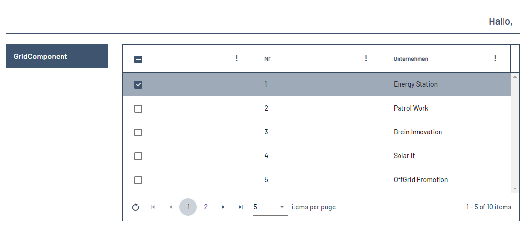
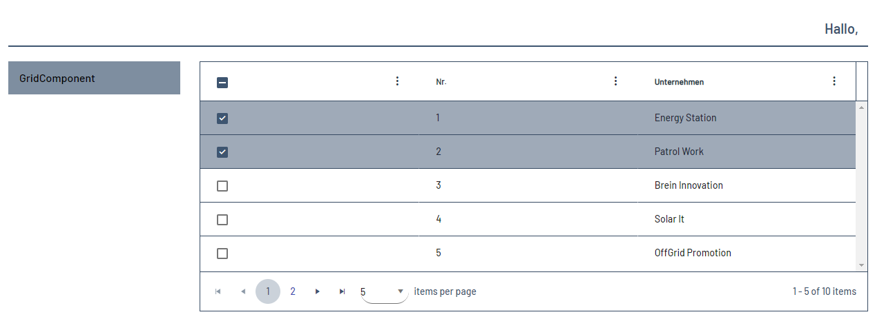
		<Multiselect checkboxSelection="true" />
		<Autoselection />
	</GridSettings>
	<GridColumns>
		<GridColumn value="#list.id" sortable="true" />
		<GridColumn value="#list.company" />
	</GridColumns>
</GridComponent>

Output format of the process

The Technical Process loadGrid.wrf mentioned in the example generates the following output:

XML
<OkList>
   <list>
      <id>1</id>
      <company>Energy Station</company>
   </list>
   <list>
      <id>2</id>
      <company>Patrol Work</company>
   </list>
   <list>
      <id>3</id>
      <company>Brain Innovation</company>
   </list>
   <list>
      <id>4</id>
      <company>Solar It</company>
   </list>
   <list>
      <id>5</id>
      <company>OffGrid Promotion</company>
   </list>
   <list>
      <id>6</id>
      <company>SoftProject GmbH</company>
   </list>
   <list>
      <id>7</id>
      <company>SoftProject Ibérica SL</company>
   </list>
   <list>
      <id>8</id>
      <company>SP Digital AG</company>
   </list>
</OkList>

Grid Settings

Within the GridSettings element, the elements listed below can be declared to determine the behavior of the Grid Component.

Possible elements

Element

Description

Appearance

The Appearance element can be used to specify whether the margins in the rows, columns, and cells in the Grid Component should be reduced to show more data on a screen.

When using the Appearance element, the spacingMode attribute can be set and contain the following values.

Possible values:

  • Data binding possible

  • dense (default)

  • normal

Note

If you declare the spacingMode attribute, dense is the default value. If you do not set the Appearance element within the GridSettings element, the normal appearance of the Grid Component is retained.

Autoselection

The Autoselection element specifies that the first row of the table is automatically selected when the Grid Component is opened.

ColumnVisibility

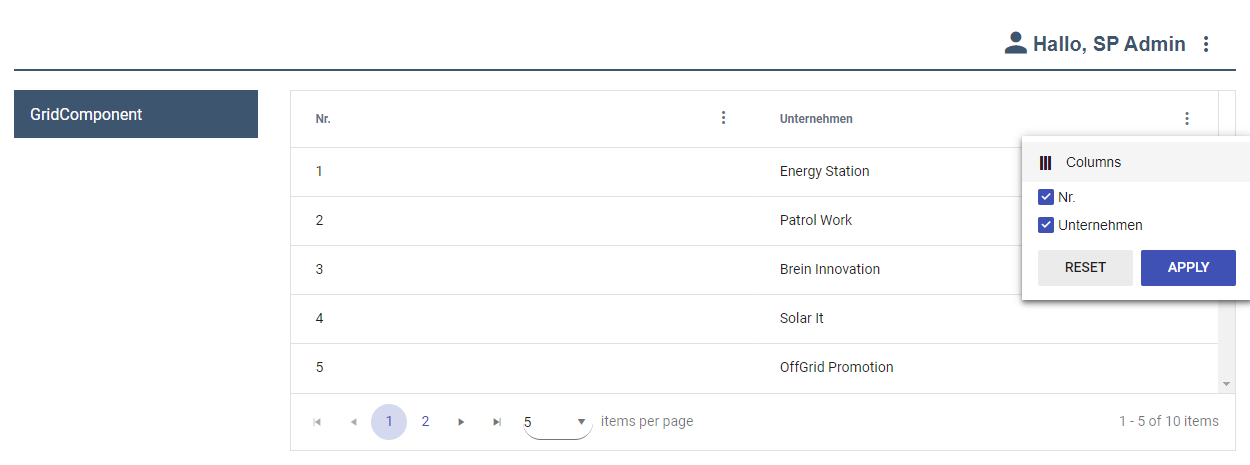
The ColumnVisibility element can be used to show and hide individual columns.

Editing

The Editing element only has a function if the attribute editable="true" has been set in the GridColumn element.

When using the Editing element, the reloadOnSave attribute can be set and contain the following values:

Possible values:

  • true: When saving using a Save Action, the Grid Component is reloaded.

  • false: Saving using a Save Action does not reload the Grid Component.

Filtering

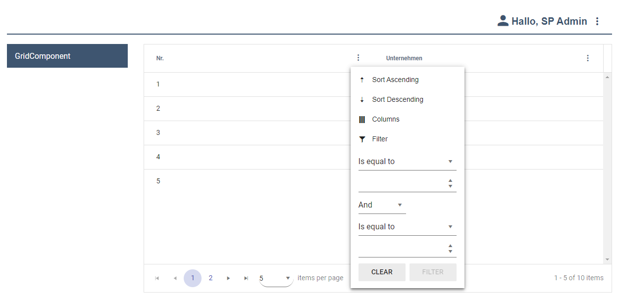
The Filtering element allows you to specify conditions by which you want to filter.

Footer

The Footer element can be used to set various settings for the footer of the Grid Component.

When using the Footer element, the following attributes can be used:


cleanupEnabled
determines whether a button is displayed in the Grid Component footer to delete settings such as column width, column visibility, filter and sort settings. This button (image-20250902-060340.png) deletes any settings the user has made in the browser from the browser's local memory and displays the Grid Component as configured in the .grid file.

Note:

As an alternative, advanced users can delete the settings in the browser as follows:

  1. Open the developer tools.

  2. Go to Application > Storage > Local storage .

  3. Manually delete the saved settings.

  • Data binding possible

Possible values:

  • true (default): The button to delete the settings from the local browser memory (image-20250902-060340.png) is displayed in the footer.

    false: The button to delete the settings from the local browser memory is not displayed.


pagingEnabled
determines whether the Grid Component's footer displays elements for scrolling through multiple pages.

  • Data binding possible

Possible values:

  • true (default): The elements for scrolling through multiple pages are displayed.

  • false: The elements for scrolling through multiple pages are not displayed.

Note:

If server-side paging is enabled and pagingEnabled is set to false, server-side paging mode is disabled and client-side filters can be used.


reloadEnabled
determines whether a reload button is displayed in the Grid Component footer.

  • Data binding possible

Possible values:

  • true (default): The reload button appears.

  • false: The reload button does not appear.


Note:

If all three attributes are set to true, the Grid Component's footer looks like this:

image-20250902-065127.png

Note:

The cleanupEnabled, pagingEnabled , and reloadEnabled attributes are set to true by default even if no Footer element has been declared in GridSettings. If all three attributes are set to false, no footer is displayed in the Grid Component. This can be useful to save screen space if you do not need a footer.

GridHeader

The GridHeader element can be used to specify the alignment of the column title.

When using the GridHeader element, the horizontalAlign attribute can be set and contain the following values:

Possible values:

left (default): The column title is aligned to the left.

center: The column title is centered.

right: The column title is aligned to the right.

Multiselect

The Multiselect element allows multiple entries to be selected.

When using the Multiselect element, the checkboxSelection attribute can be set and contain the following values:

Possible values:

true/false

Remember

The Remember element can be used to save the setting for certain properties of the Grid Component.

When using the Remember element, the following attributes can be used:


rememberFiltering

Specifies whether the specified filter setting should be saved and applied the next time it is opened.

  • Data binding possible

Possible values:

  • true (default): The specified setting is saved.

  • false: The specified setting is ignored.


rememberPage

Specifies whether the specified pagination setting should be saved and applied the next time it is opened.

  • Data binding possible

Possible values:

  • true (default): The specified setting is saved.

  • false: The specified setting is ignored.


rememberSelection

Specifies whether to save the setting you set for selecting items in the Web App and apply it the next time you open it.

Possible values:

  • true (default): The specified setting is saved.

  • false: The specified setting is ignored.


rmemberSorting

Specifies whether the specified sort setting should be saved and applied the next time the Web App is opened.

  • Data binding possible

Possible values:

  • true (default): The specified setting is saved.

  • false: The specified setting is ignored.


rememberVisibility

Specifies whether to save the specified visibility setting and apply it the next time you open it.

  • Data binding possible

Possible values:

  • true (default): The specified setting is saved.

  • false: The specified setting is ignored.

Reorder

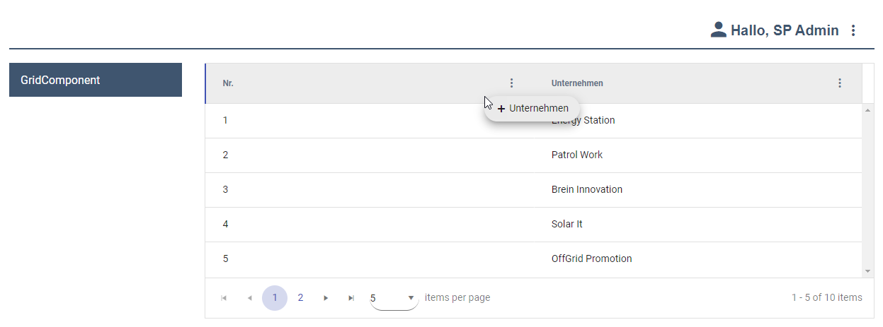
The Reorder element can be used to click the column headings and drag them to a different position.

Resize

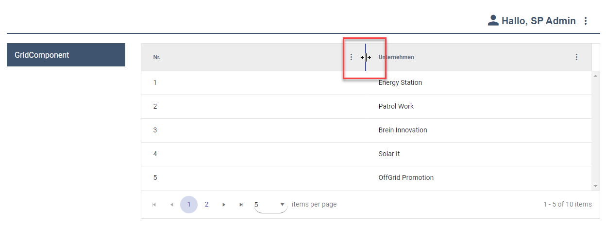
The Resize element allows you to click on the transitions of the column headings and change the width of the respective columns with the mouse button depressed.

RowSettings

The RowSettings element defines the rows within the Grid Component. Within the RowSettings element, the RowStyle element can be declared, which defines the appearance of the row. For more information, see "Defining rows in the Grid Component."


Defining rows in the Grid Component

Within the Grid Component, the rows must be defined via the RowSettings element. The RowStyle element included in RowSettings allows you to set colors for individual rows.

Note:

If a cell is in an intersection of row and column that has colors set, the column definitions take precedence.


Within the RowSettings element, the RowStyle element can be declared, which can have the following attributes:

Attribute

Description

background

Defines a background color.

  • Data binding (color) is possible

    Note:

    The data binding for this attribute can be defined within the Complex property valid for the entire Grid Component.

    This setting overrides the default color of the color scheme.

Possible values:

  • Hexadecimal color value, e.g. ff5a00

    • Do not use a hash before the color value.

    • Do not use an abbreviated notation of the color value.

  • Color code from the color palette of the Web App (cf. Theming), e.g. A200


fontFamily

Specifies the font family within the component. The property is inherited by all controls and actions of the component.

  • Data binding (String) is possible

Possible values: Fontcode from the font palette, e.g. Font04

fontSize

Specifies the font size within the component. The property is inherited by all controls and actions of the component.

  • Data binding (String) is possible

Possible values:

  • Any integer or decimal number with a period as a decimal separator, e.g. 20; 20.8; .9

  • Font size in pixels, e.g. 20px

  • Font size in points, e.g. 18pt

  • Font size compared to the font size of the parent element, e.g. .8em or 120%

  • Keywords:Xx-small, x-small, small, medium , large , x-large, xx-large, smaller , larger

fontStretch

Specifies the width of each character. The property is inherited by all controls and actions of the component.

  • Data binding (String) is possible

Possible values:

  • Condensed

  • Expanded

  • ExtraCondensed

  • ExtraExpanded

  • Medium

  • Normal (default)

  • SemiCondensed

  • SemiExpanded

  • UltraCondensed

  • UltraExpanded

fontStyle

Sets the tilt of the font. The property is inherited by all controls and actions of the component.

  • Data binding (String) is possible

Possible values:

  • italic: Italic font

  • normal: Normal font (default)

  • oblique: Slanted font style (calculated)

fontWeight

Sets the font weight. The property is inherited by all controls and actions of the component.

  • Data binding (String) is possible

Possible values:

  • Black

  • Bold

  • DemiBold

  • ExtraBlack

  • ExtraBold

  • ExtraLight

  • Heavy

  • Light

  • Medium

  • Normal (default)

  • Regular

  • SemiBold

  • Thin

  • UltraBlack

  • UltraBold

  • UltraLight

foreground

Defines the font color.

  • Data binding (color) is possible

    Note:

    The data binding for this attribute can be defined within the Complex property valid for the entire Grid Component.

This setting overrides the default color of the color scheme.

Possible values:

  • Hexadecimal color value, e.g. ff5a00

    • Do not use a hash before the color value.

    • Do not use an abbreviated notation of the color value.

  • Color code from the color palette of the Web App (cf. Theming), e.g. A200

highlightBackground

Defines the background color of the selected row when the user hovers over the row.

  • Data binding (color) is possible

Note:

Please note that the data binding for this attribute cannot be defined within the property of the type Complex valid for the entire Grid Component, but that a separate property must be defined.

Beispiel
XML
<Properties>
		<Property name="list" type="Complex">
			<Property name="id" type="Integer" displayName="Nr." />
			<Property name="company" type="String"
				displayName="Unternehmen" />
		</Property>
		<Property name="Settings" type="Complex">
			<Property name="SelectedColor" type="Color" />
			<Property name="HighlightColor" type="Color" />
			<Property name="ColumnColor" type="Color" />
		</Property>
	</Properties>


This setting overrides the default color of the color scheme.

Possible values:

  • Hexadecimal color value, e.g. ff5a00

    • Do not use a hash before the color value.

    • Do not use an abbreviated notation of the color value.

  • Color code from the color palette of the Web App (cf. Theming), e.g. A200

highlightForeground

Defines the font color of the selected line when the user hovers over the line.

  • Data binding (color) is possible

Note:

Please note that the data binding for this attribute cannot be defined within the property of the type Complex valid for the entire Grid Component, but that a separate property must be defined.

Beispiel
XML
<Properties>
		<Property name="list" type="Complex">
			<Property name="id" type="Integer" displayName="Nr." />
			<Property name="company" type="String"
				displayName="Unternehmen" />
		</Property>
		<Property name="Settings" type="Complex">
			<Property name="SelectedColor" type="Color" />
			<Property name="HighlightColor" type="Color" />
			<Property name="ColumnColor" type="Color" />
		</Property>
	</Properties>


This setting overrides the default color of the color scheme.

Possible values:

  • Hexadecimal color value, e.g. ff5a00

    • Do not use a hash before the color value.

    • Do not use an abbreviated notation of the color value.

  • Color code from the color palette of the Web App (cf. Theming), e.g. A200

selectedBackgroundColor

Defines the background color of the row when the user selects the row with a mouse click.

  • Data binding (color) is possible

Note:

Please note that the data binding for this attribute cannot be defined within the property of the type Complex valid for the entire Grid Component, but that a separate property must be defined.

Beispiel
XML
<Properties>
		<Property name="list" type="Complex">
			<Property name="id" type="Integer" displayName="Nr." />
			<Property name="company" type="String"
				displayName="Unternehmen" />
		</Property>
		<Property name="Settings" type="Complex">
			<Property name="SelectedColor" type="Color" />
			<Property name="HighlightColor" type="Color" />
			<Property name="ColumnColor" type="Color" />
		</Property>
	</Properties>


This setting overrides the default color of the color scheme.

Possible values:

  • Hexadecimal color value, e.g. ff5a00

    • Do not use a hash before the color value.

    • Do not use an abbreviated notation of the color value.

  • Color code from the color palette of the Web App (cf. Theming), e.g. A200

selectedForegroundColor

Defines the foreground color of the row when the user selects the row with a mouse click.

  • Data binding (color) is possible

Note:

Please note that the data binding for this attribute cannot be defined within the property of the type Complex valid for the entire Grid Component, but that a separate property must be defined.

Beispiel
XML
<Properties>
		<Property name="list" type="Complex">
			<Property name="id" type="Integer" displayName="Nr." />
			<Property name="company" type="String"
				displayName="Unternehmen" />
		</Property>
		<Property name="Settings" type="Complex">
			<Property name="SelectedColor" type="Color" />
			<Property name="HighlightColor" type="Color" />
			<Property name="ColumnColor" type="Color" />
		</Property>
	</Properties>


This setting overrides the default color of the color scheme.

Possible values:

  • Hexadecimal color value, e.g. ff5a00

    • Do not use a hash before the color value.

    • Do not use an abbreviated notation of the color value.

  • Color code from the color palette of the Web App (cf. Theming), e.g. A200


Defining columns in the Grid Component

Within the Grid Component, the columns must be defined via the GridColumn element. All columns must be defined within GridColumn elements.

Possible attributes

Attribute

Description

displayName

Title of the column.

  • Data binding possible

Possible values: any string

Note:

For very long column headers that you specify using the displayName attribute, you can ensure that the column header is wrapped as follows:

  1. In the GridColumn element, add the ColumnStyle element.

  2. In the ColumnStyle element, declare the textOverflow attribute with the value wordBreak.

editable


Specifies whether the contents of the column can be edited.

  • Data binding possible (with property of type Boolean)

Possible values: true/false (default) or string for data binding

filterable

Specifies whether the content of the column can be filtered.

Note:

The filterable attribute has an effect only if the Filtering element is declared in the Grid Settings.

  • Data binding possible

Possible values: true (default)/false

format

Sets the display of the date format in minutes, seconds, or milliseconds.

Possible values:

  • Datetime with Minutes: The date is specified in the format hh:mm. (default)

  • Datetime with Seconds: The date is specified in hh:mm:ss format.

  • DateTime with Milliseconds: The date is specified in the format hh:mm:ss.sss.

horizontalAlign

Sets the horizontal orientation of the content within the column.

Possible values:

  • left: Content is left-aligned.

  • center: Content is centered.

  • right: Content is right-aligned.

order

Defines the order of the columns.

  • Data binding possible (with property of type Integer in the process that loads the grid data)

Possible values are integers from 0 or string for data binding

Note:

The column with the lowest number in the order attribute is on the far left, and the column with the highest number is on the far right.

sortable

Specifies whether to sort by the contents of the column. For more information on sorting column contents, see the Sorting section.

  • Data binding possible (with Boolean property in the process that loads the grid data)

Possible values: true/false or string for data binding

value

Defines the content of the column using data binding.

Possible values: String (data binding)

If no displayName attribute is assigned to the corresponding property, the data binding expression is used as the column heading.

visible

Specifies whether the column is displayed.

  • Data binding possible

Possible values: true (Standard)/false

Grid Column

Within the GridColumn element, the elements listed below can be declared:

Possible elements

Element

Description

ColumnStyle

Defines the appearance of the column.

MultiselectFilter

Filters GridColumns by multiple values in columns. If the MultiselectFilter element is set, no further filter option can be set for this column.

  • Data binding possible

Note:

If data binding is used, a property element of type list is required. The list and value attributes must also be set.

The attributes listed below can be declared for the MultiselectFilter element:

Possible attributes

Element

Description

list

Defines the content of the column by means of a database. In the list element, you must specify the name attribute from a property element whose data you want to display.

Possible values: String (data binding)

value

Defines the content of the column using data binding.

Possible values: String (data binding)

Example of <MultiselectFilter> without data binding

XML
<?xml version="1.0" encoding="UTF-8"?>
<GridComponent xmlns="http://softproject.de/webapp/1.0"
	process="Grid.wrf">
	<Properties>
		<Property name="Entry" type="Complex">
			<Property name="Field" displayName="Field" type="String"></Property>
		</Property>
		<Property name="Filter" type="List">
			<Property name="Option" type="String"></Property>
		</Property>
	</Properties>
	<GridSettings>
		<Filtering />
	</GridSettings>
	<GridColumns>
		<GridColumn editable="false" value="#Entry.Field"
			sortable="true">
			<MultiselectFilter>
				<Option value="1" />
				<Option value="2" />
				<Option value="3" />
			</MultiselectFilter>
		</GridColumn>
	</GridColumns>
</GridComponent>

Example of <MultiselectFilter> with data binding

XML
<?xml version="1.0" encoding="UTF-8"?>
<GridComponent xmlns="http://softproject.de/webapp/1.0"
	process="Grid.wrf">
	<Properties>
		<Property name="Entry" type="Complex">
			<Property name="Field" displayName="Field" type="String"></Property>
		</Property>
		<Property name="Filter" type="List">
			<Property name="Option" type="String"></Property>
		</Property>
	</Properties>
	<GridSettings>
		<Filtering />
	</GridSettings>
	<GridColumns>
		<GridColumn editable="false" value="#Entry.Field"
			sortable="true">
			<MultiselectFilter list="#Filter" value="#Option" />
		</GridColumn>
	</GridColumns>
</GridComponent>


The <ColumnStyle> element can have the following attributes:

Attribute

Description

background

Defines a background color.

  • Data binding (color) is possible

Note:

Please note that the data binding for this attribute cannot be defined within the property of the type Complex valid for the entire Grid Component, but that a separate property must be defined.

Beispiel
XML
<Properties>
		<Property name="list" type="Complex">
			<Property name="id" type="Integer" displayName="Nr." />
			<Property name="company" type="String"
				displayName="Unternehmen" />
		</Property>
		<Property name="Settings" type="Complex">
			<Property name="Background" type="Color" />
			<Property name="Foreground" type="Color" />
		</Property>
	</Properties>


This setting overrides the default color of the color scheme.

Possible values:

  • Hexadecimal color value, e.g. ff5a00

    • Do not use a hash before the color value.

    • Do not use an abbreviated notation of the color value.

  • Color code from the color palette of the Web App (cf. Theming), e.g. A200

fontFamily

Specifies the font family within the component. The property is inherited by all controls and actions of the component.

  • Data binding (String) is possible

Possible values: Fontcode from the font palette, e.g. Font04

fontSize

Specifies the font size within the component. The property is inherited by all controls and actions of the component.

  • Data binding (String) is possible

Possible values:

  • Any integer or decimal number with a period as a decimal separator, e.g. 20; 20.8; .9

  • Font size in pixels, e.g. 20px

  • Font size in points, e.g. 18pt

  • Font size compared to the font size of the parent element, e.g. .8em or 120%

  • Keywords:Xx-small, x-small, small, medium , large , x-large, xx-large, smaller , larger

fontStretch

Specifies the width of each character. The property is inherited by all controls and actions of the component.

  • Data binding (String) is possible

Possible values:

  • Condensed

  • Expanded

  • ExtraCondensed

  • ExtraExpanded

  • Medium

  • Normal (default)

  • SemiCondensed

  • SemiExpanded

  • UltraCondensed

  • UltraExpanded

fontStyle

Sets the tilt of the font. The property is inherited by all controls and actions of the component.

  • Data binding (String) is possible

Possible values:

  • italic: Italic font

  • normal: Normal font (default)

  • oblique: Slanted font style (calculated)

fontWeight

Sets the font weight. The property is inherited by all controls and actions of the component.

  • Data binding (String) is possible

Possible values:

  • Black

  • Bold

  • DemiBold

  • ExtraBlack

  • ExtraBold

  • ExtraLight

  • Heavy

  • Light

  • Medium

  • Normal (default)

  • Regular

  • SemiBold

  • Thin

  • UltraBlack

  • UltraBold

  • UltraLight

foreground

Defines the font color.

  • Data binding (color) is possible

Note:

Please note that the data binding for this attribute cannot be defined within the property of the type Complex valid for the entire Grid Component, but that a separate property must be defined.

Beispiel
XML
<Properties>
		<Property name="list" type="Complex">
			<Property name="id" type="Integer" displayName="Nr." />
			<Property name="company" type="String"
				displayName="Unternehmen" />
		</Property>
		<Property name="Settings" type="Complex">
			<Property name="Background" type="Color" />
			<Property name="Foreground" type="Color" />
		</Property>
	</Properties>


This setting overrides the default color of the color scheme.

Possible values:

  • Hexadecimal color value, e.g. ff5a00

    • Do not use a hash before the color value.

    • Do not use an abbreviated notation of the color value.

  • Color code from the color palette of the Web App (cf. Theming), e.g. A200

textOverflow

Specifies what should happen if overflowing text cannot be displayed.

Possible values:

  • ellipsis: Use ... to show that the text is not finished Text wrapping is prevented.

  • hidden: (Default if layout="optimized") Cancel text, pay attention to whole words. Text wrapping is prevented.

  • wordBreak: (Default if layout="fixed") wrap within the word

  • allow: Break off text between words

width

Sets the column width.

Possible values:

  • Integers

The unit in which the column width is specified is specified with the widthUnits attribute.

widthUnits

Specifies the unit in which the column width is specified.

Possible values:

  • pixels: The column width is specified in pixels.

  • percents: The column width is expressed as a percentage.

Periodic reload

The ReloadTimer element can be used to periodically reload the grid component.

Periodic reloading of data can cause a heavy load and should only be used in rare cases.

Possible attributes

Attribute

Description

refreshTime

Time to reload in seconds

  • Data binding (Boolean) possible

Possible values: Any integer

itemIdentifier

Optional: unique key for the data displayed in the rows

  • The attribute can be used to find rows when reloading and to improve the reloading process.

  • If the attribute is not specified, a string comparison to a record is used to identify the row.

Possible values: Data binding to a defined property of the grid component

<SelectAction> within the Grid Component

The Select action is generated via the <SelectAction/> element within <Actions>. The action is triggered when a user selectes an entry from a Grid Component.

<DoubleClickAction> within the Grid Component

The DoubleClick action is generated via the <DoubleClickAction/> element within <Actions> and is triggered when a user double-clicks an entry from aGrid Component.

Note:

If the Editing attribute in the GridSettings element and the editable attribute in the GridColumn element are set to true, the DoubleClick action has no effect.

<SaveAction> within the Grid Component

The Save action is generated via the <SaveAction/> element within <Actions>. The Save action saves entered data. The status depends on the validation status.

Note:

When a Save action is defined, the Technical Process receives the data objects of the edited rows with a new index attribute that contains the index of a row. Numbering begins at 0.


JavaScript errors detected

Please note, these errors can depend on your browser setup.

If this problem persists, please contact our support.