The Responsive Layout is ideal for web applications that are designed to be displayed on different devices. The Responsive Layout is divided into 12 virtual columns. The available space for a column depends on the resolution of the device.
The <ResponsiveLayout> element creates a Responsive layout. At least one <Cell> element must be defined inside the ResponsiveLayout <ResponsiveLayout>. For each <Cell> element, you can define the number of columns that the element will take on the corresponding device. Additional layout types can be nested in the <Cell> element. In Responsive layout, the content within the <Cell> element is adjusted to the available screen space and wrapped if necessary.
For further information please visit the section
Example
<DetailComponent
	default="true"
	displayName="Dashboard"
	path="Dashboard">
	<ResponsiveLayout defaultCellSizeTablet="6">
		<Cell cellSizeTablet="3">
			<FlowLayout>
				<TextBox
					displayName="Unternehmen"
					value="SoftProject GmbH" />
			</FlowLayout>
		</Cell>
		<Cell cellSizeDesktop="3">
			<GridLayout columns="2">
				<TextBox
					displayName="Straße"
					value="Am Erlengraben 3" />
				<TextBox
					displayName="Land"
					value="Deutschland" />
				<TextBox
					displayName="Postleitzahl"
					value="76275" />
				<TextBox
					displayName="Ort"
					value="Ettlingen" />
			</GridLayout>
		</Cell>
		<Cell
			cellSizeDesktop="6"
			cellSizeTablet="12">
			<Map vendor="OpenStreetMap">
				<SingleMarker
					name="Marker"
					searchString="Am Erlengraben 3, 76275 Ettlingen" />
			</Map>
		</Cell>
	</ResponsiveLayout>
</DetailComponent>
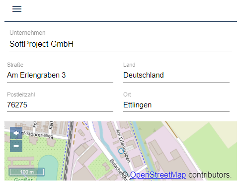
Desktop view

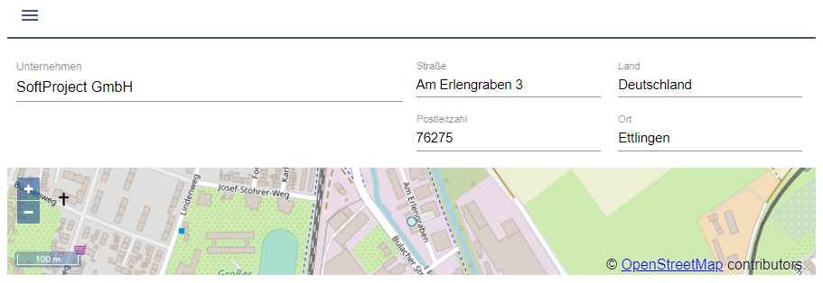
Tablet view
Mobile view