<Header> controls are used to create headers. A header can be placed not only at the top of a layout, but anywhere it is needed.
The following table explains the attributes that can be used.
|
Attribute |
Description |
|---|---|
|
|
Contains the header text.
Possible values: Any string |
|
|
Defines the heading level. Possible values:
|
|
|
Defines a color for the background of the control.
Possible values:
|
|
|
Defines if the user can interact with the control.
Possible values: The
|
|
|
Defines the font family.
Possible values:
|
|
|
Defines the font size.
Possible values:
|
|
|
Sets the width of the single characters. This attribute overrides the default width of the characters of the Web App for this control. Possible values:
This attribute doesn't work with the
|
|
|
Defines the font style. This attribute overrides the default style of the characters of the Web App for this control. Possible values:
This attribute doesn't work with the
|
|
|
Defines the font weight. This attribute overrides the default font weight of the Web App for this control. Possible values:
This attribute doesn't work with the
|
|
|
Defines a color for the foreground (texts etc.) of the control.
|
|
|
Direction in which the elements flow. The order of the elements corresponds to their declaration. Possible values:
|
|
|
Defines what happens if the page is full. Possible values:
|
|
|
Defines if the control is visible.
Possible values: |
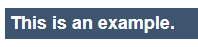
Example <Header>
The following example shows the usage of the <Header> tag.
<Header value="This is an example."/>
The above code creates the following header: