Accordion controls are used to structure areas on a page and to represent extensive lists in a space-saving way. This is helpful, for example, when you work with numerous input fields relating to different categories. In addition, Accordion controls offer a high degree of flexibility, since you can add more accordion panels at any time and your web app always remains well-structured.
Accordion controls can be used in all available layout types :
-
BoxLayout
-
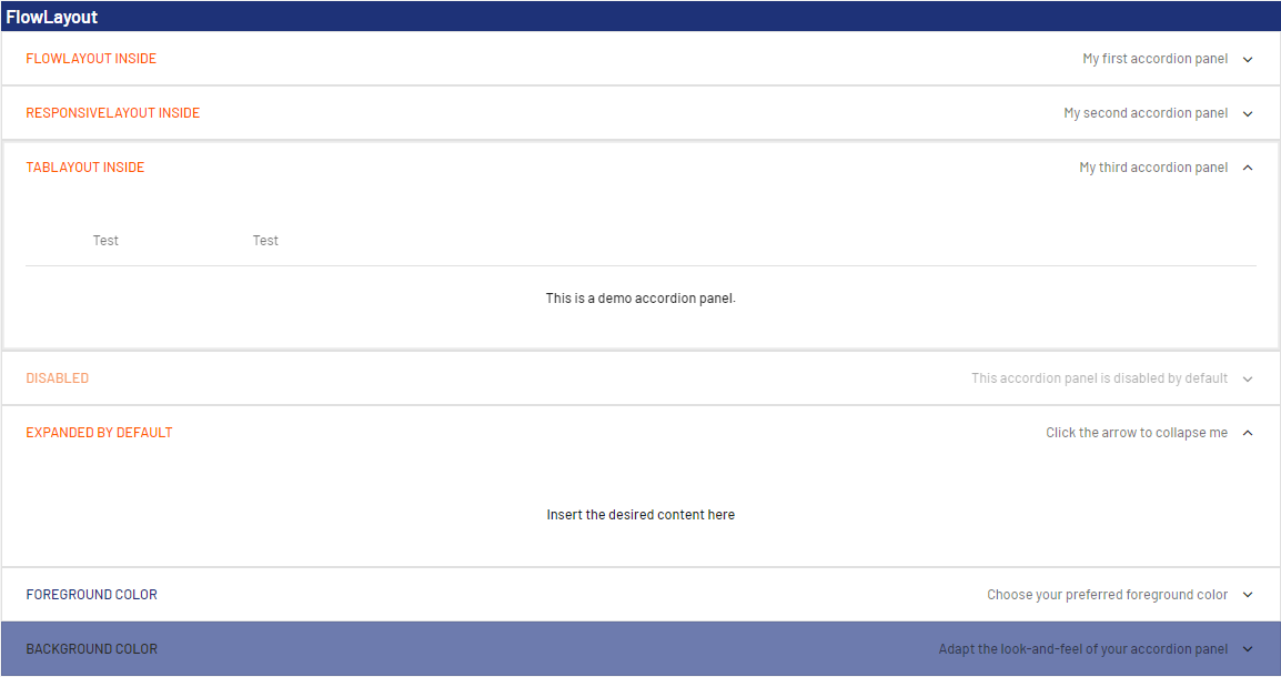
FlowLayout
-
GridLayout
-
ResponsiveLayout
-
TabLayout
The following attributes can be defined for an Accordion control:
|
Attribute |
Description |
|---|---|
|
background |
Defines a color for the background of the control.
Possible values:
|
|
disabled |
Defines if the user can interact with the control.
Possible values:
|
|
enabled |
Defines if the user can interact with the control.
Possible values:
|
|
expanded |
Defines if the accordion panel is expanded or collapsed when opening the web app.
Possible values:
|
|
fontFamily |
Defines the font family.
Possible values:
|
|
fontSize |
Defines the font size.
Possible values:
|
|
fontStretch |
Sets the width of the single characters. This attribute overrides the default width of the characters of the Web App for this control. Possible values:
This attribute doesn't work with the Image, Maps, Charts and HtmlDocument controls.
|
|
fontStyle |
Defines the font style. This attribute overrides the default style of the characters of the Web App for this control. Possible values:
This attribute doesn't work with the Image, Maps and HtmlDocument controls.
|
|
fontWeight |
Defines the font weight. This attribute overrides the default font weight of the Web App for this control. Possible values:
This attribute doesn't work with the Image, Maps and HtmlDocument controls.
|
|
foreground |
Defines a color for the foreground (texts, etc.) of the control.
Possible values:
|
|
horizontalAlign |
Direction in which the elements flow. The order of the elements corresponds to their declaration. Possible values:
|
|
subtitle |
Subtitle of the accordion element Possible values:
|
|
subtitleForeground |
Defines a color for the foreground of the subtitle.
Possible values:
|
|
textOverflow |
Defines what happens if the page is full. Possible values:
|
|
title |
Title of the accordion element Possible values:
|
|
visible |
Defines whether the control is visible.
Possible values:
|
<SelectAction/> within an Accordion Control
The Select action is created using the <SelectAction/> element within <Accordion> and is triggered once a user selects the corresponding item in the accordion.
<DoubleclickAction> within an Accordion Control
The DoubleClick action is created using the <DoubleClickAction/> element within <Accordion> and is triggered once a user double-clicks the corresponding item in an accordion.
The <SelectAction/> and <DoubleClickAction> elements must be inserted before the desired layout type (BoxLayout, FlowLayout, GridLayout, ResponsiveLayout, TabLayout).
Example
|
|
The above code generates the following output in the web app: