Prerequisites:
-
You have created a Form Component in the X4 Designer.
-
You have opened the Forms Editor from the X4 Designer.
Adding form elements
Note:
When you create a new form, you can only place the first control in the existing flow layout (the gray area labeled Drag components into this area) in the form area. All other controls can be stored in the existing layout or in a new responsive layout. A new responsive layout is automatically created when you place an element above or below an existing layout.
For more information on layouts, see Layouts.
-
Drag and drop a control from the tool area to the desired position in the form area.
-
Release the mouse button to place the control in the desired position.
Tip:
As you drag, the editor displays a visual highlighting of the possible drop locations:
Moving form elements
-
Select an element in the form area.
-
Hold down the left mouse button and drag the element to a new location.
-
Release the mouse button to place the element in the desired position.
Deleting form elements
-
Select an element in the form area.
-
Select the

✅ The element will be deleted without further confirmation.
Tip:
If you accidentally delete an element, you can undo the deletion via 
Note:
-
If the deleted element contains children, they are also deleted.
-
An empty responsive layout is automatically deleted.
Configuring form elements
-
Select an element in the form area.
✅ The configuration area displays the available attributes for the selected element. -
Define the desired attributes.
For more information on the attributes, see the Controls documentation.
Note:
-
Mandatory fields are marked with an asterisk (*).
-
All entries are accepted immediately and are visible in the form area.
-
All entries are transferred to the
.formfile in the X4 Designer and are visible there.
Configuring attributes with input assistance
Many of the attributes of controls can not only be entered as text, but can also be configured more conveniently and securely with special input assistance features. These features help you select valid values, avoid errors, and make complex settings faster. Depending on the property, the appropriate selection or search help opens automatically.
Tip:
Select the 
The following input assistance features are available:
|
Input assistance |
Usage |
Example |
|---|---|---|
|
List of calues |
Attributes with fixed selection values
|
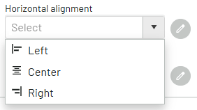
|
|
Binary values |
|
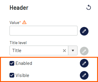
|
|
Translations |
Multilingual properties |
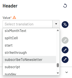
|
|
Data binding |
Selection of properties defined in the view model |
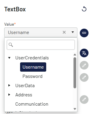
|
|
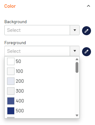
Colors |
Selection of colors using the following options:
|
|
|
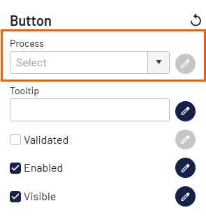
Processes |
Selection of a process that exists in an X4 project |
|
|
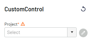
X4 projects |
Selection of an X4 project for a custom control |
|
Previewing the form
-
In the toolbar, select

✅ A new browser tab opens with a preview of the form.
Note:
You cannot enter data in the form preview. The preview is used to get an overview of the structure of the form.