Grid Component
A grid component is ideal for displaying data in a tabular display. In the grid settings, the behavior of the grid component can be defined by setting individual elements.
Note:
The grid component will be optimized for being displayed on mobile devices in a future version of X4 BPMS.
Defining a Grid Component
A grid component is declared within its own <GridName>.grid definition file. This file is created in the Components project folder.
How to create a new definition file:
Click in the New > Add <name of component> menu.
Alternatively, you can create the file using the New > Add <name of component> context menu.Select the desired definition file.
In File name, enter the name of the definition file.
Select Finish.
A new definition file with a predefined structure is created.
The data to be displayed must be provided by a Technical Process and must comply with a specific data model.
The data model provided by the Technical Process must be mapped in the Properties. To link the data provided by the Technical Process with the representation within the web application, the corresponding Property must be defined and stored via (7.4.0-en) Data Binding in the GridColumn definition.
Note:
If a property is to be used in the grid component, it must be defined as a Complex type. This property can contain other properties.
The grid component is created via <GridComponent> and can have the following attributes:
Attribute | Description |
|---|---|
| Defines a background color.
This setting overrides the default color of the color scheme. Possible values:
|
| Defines the font family within the component. The property is inherited by all controls and actions of the component.
Possible values: Font code from the font palette, e.g. |
| Defines the font size within the component. The property is inherited by all controls and actions of the component.
Possible values:
|
| Defines the width of each character. The property is inherited by all controls and actions of the component.
Possible values:
|
| Defines the slant of the font. The property is inherited by all controls and actions of the component.
Possible values:
|
| Defines the font weight. The property is inherited by all controls and actions of the component.
Possible values:
|
| Defines the font color.
This setting overrides the default color of the color scheme. Possible values:
|
| Defines the background color of the header.
This setting overrides the default color of the color scheme. Possible values:
|
| Defines the font family of the header.
Possible values: Font code from the font palette, e.g. |
| Defines the font weight of the header.
Possible values:
|
| Defines the font color of the header.
This setting overrides the default color of the color scheme. Possible values:
|
| Defines the color of the component's icon.
This setting overrides the default color of the color scheme. Possible values:
|
| Path to the graphic file or specification of a Material Icon that will be used as the component's icon.
Possible values:
With |
| Defines the number of rows displayed per page. Possible values:
|
| Required. Path to the Possible values: String (URI) |
| Title of the component. Displayed in the application as a header
Possible values: Any string or data binding expression |
| Defines a title background color.
Possible values:
|
| Defines a color for the title foreground.
Possible values:
|
| Path to a The Path specification relative to the Possible values: String (URI) |
| Defines the visibility.
Possible values: Boolean or string for Data Binding |
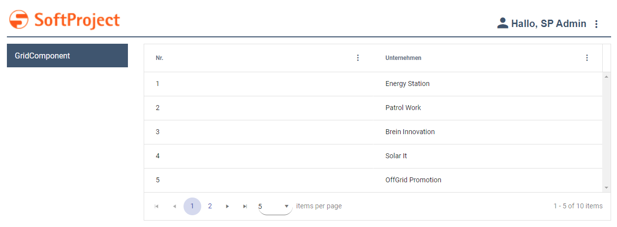
Example of a Grid Component
<?xml version="1.0" encoding="UTF-8"?>
<GridComponent xmlns="http://softproject.de/webapp/1.0" process="loadGrid.wrf">
	<Properties>
		<Property name="list" type="Complex">
			<Property name="id" type="Integer" displayName="No." />
			<Property name="company" type="String" displayName="Company" />
		</Property>
	</Properties>
	<GridSettings>
		<Resize />
		<Reorder />
		<ColumnVisibility />
		<Filtering />
		<Multiselect checkboxSelection="true" />
		<Autoselection />
	</GridSettings>
	<GridColumns>
		<GridColumn value="#list.id" sortable="true" />
		<GridColumn value="#list.company" />
	</GridColumns>
</GridComponent>
Output Format of the Process
The Technical Process loadGrid.wrf mentioned in the above example generates the following output:
<?xml version="1.0" encoding="UTF-8"?>
<OkList>
	<list>
		<id>1</id>
		<company>Energy Station</company>
	</list>
	<list>
		<id>2</id>
		<company>Patrol Work</company>
	</list>
	<list>
		<id>3</id>
		<company>Brein Innovation</company>
	</list>
	<list>
		<id>4</id>
		<company>Solar It</company>
	</list>
	<list>
		<id>5</id>
		<company>OffGrid Promotion</company>
	</list>
	<list>
		<id>6</id>
		<company>SoftProject GmbH</company>
	</list>
	<list>
		<id>7</id>
		<company>SoftProject Ibérica SL</company>
	</list>
	<list>
		<id>8</id>
		<company>SP Digital AG</company>
	</list>
</OkList>
Grid Settings
Within the GridSettings element, the elements listed below can be declared to define the behavior of the grid component:
Possible elements
Element | Description |
|---|---|
| The When the Possible values:
Note: If you declare the |
| The 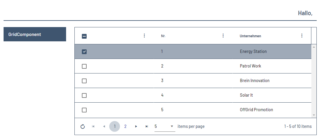 |
| The 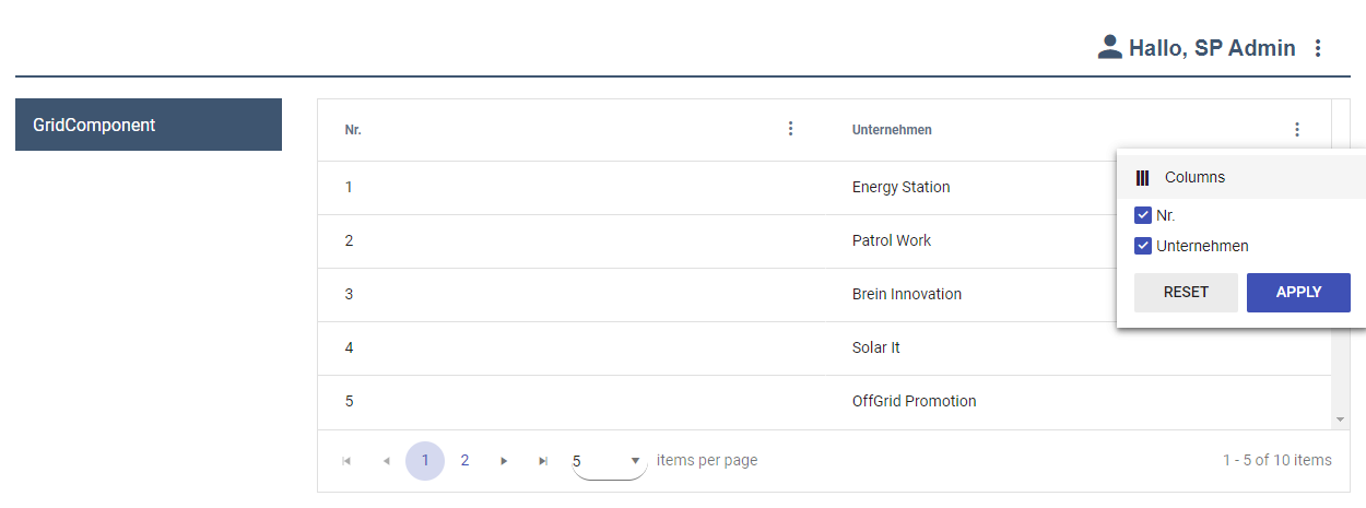 |
| The When using the Possible values:
|
| The 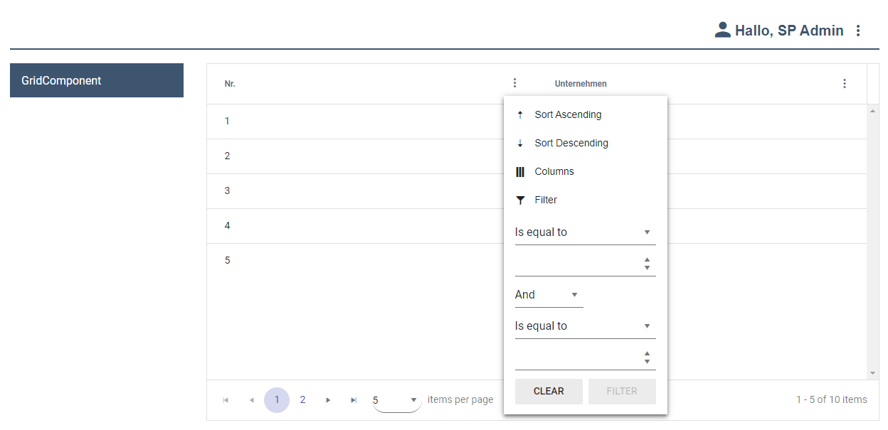 |
| The When using the
Note: Experienced users can alternatively delete the settings in the browser as follows:
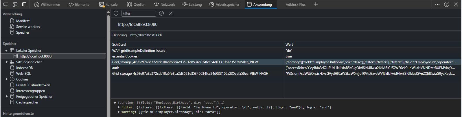
Possible values:
Possible values:
Note: If server-side paging is enabled and pagingEnabled is set to false, the server-side paging mode is disabled and client-side filters can be used.
Possible values:
If all three attributes are set to  Note: The |
| The When using the Possible values:
|
| The When using the Possible values: 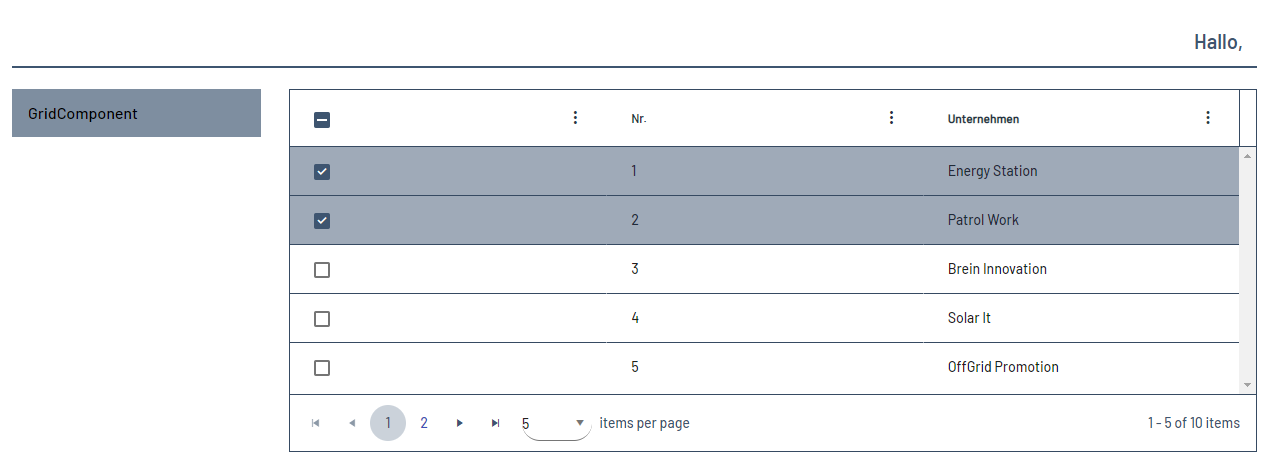 |
| The When using the
Specifies whether to save the specified filter setting and apply it the next time the Grid Component is opened.
Possible values:
Specifies whether to save the specified pagination setting and apply it the next time the Grid Component is opened.
Possible values:
Specifies whether to save the specified setting for the selection of elements in the Web App and apply it the next time the Grid Component is opened.
Possible values:
Specifies whether to save the specified sort setting and apply it the next time the Grid Component is opened.
Possible values:
Specifies whether to save the specified visibility setting and apply it the next time the Grid Component is opened.
Possible values:
|
| With the 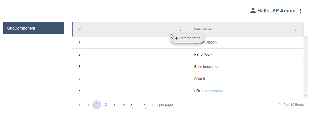 |
| The 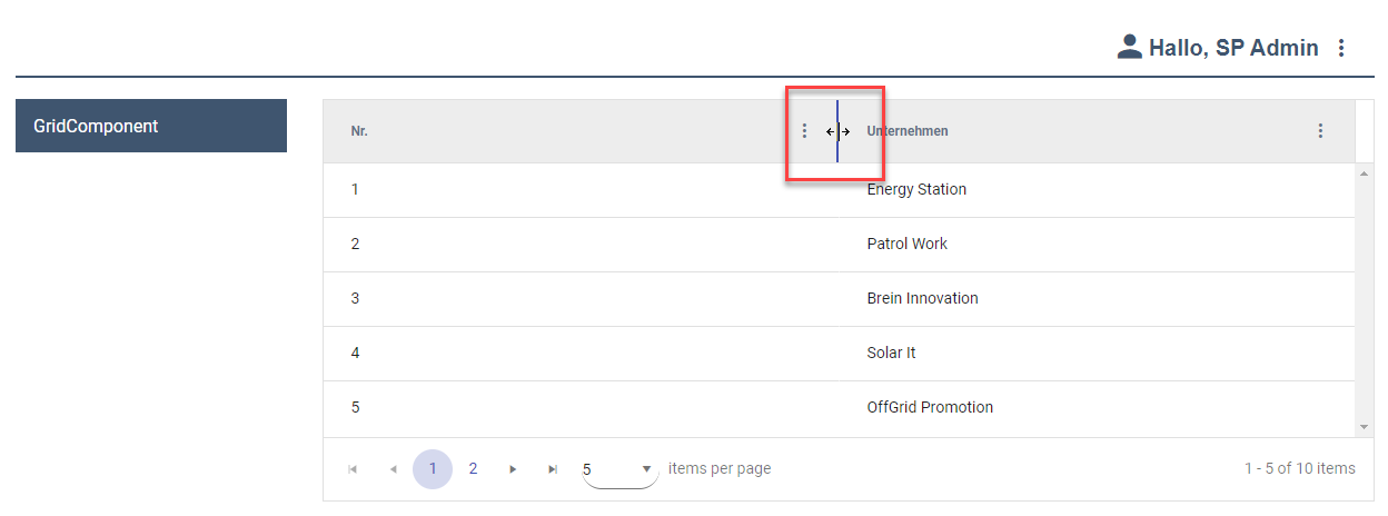 |
| The |
Defining Rows in the Grid Component
Within the grid component, the rows must be defined using the RowSettings element. You can use the RowStyle element contained in RowSettings to define colors for individual rows.
Note:
If a cell is at the intersection of a row and a column for which colors have been defined, the column definitions take precedence.
The RowStyle element can be declared within the RowSettings element. It can have the following attributes
Attribute | Description |
|---|---|
| Defines a background color.
Note: The data binding for this attribute can be defined with the property of type Complex, which is valid for the entire grid component.
Possible values:
|
| Defines the font family within the component. The property is inherited by all controls and actions of the component.
Possible values: Font code from the font palette, e.g. |
| Defines the font size within the component. The property is inherited by all controls and actions of the component.
Possible values:
|
| Defines the width of each character. The property is inherited by all controls and actions of the component.
Possible values:
|
| Defines the slant of the font. The property is inherited by all controls and actions of the component.
Possible values:
|
| Defines the font weight. The property is inherited by all controls and actions of the component.
Possible values:
|
| Defines the font color.
Note: The data binding for this attribute can be defined with the property of type Complex, which is valid for the entire grid component. This setting overrides the default color of the color scheme. Possible values:
|
| Defines the background color of the selected row on hover.
Note: Please note that the data binding for this attribute cannot be defined within the property of type Complex that is valid for the entire grid component, but that a separate property must be defined. Example
XML
This setting overrides the default color of the color scheme. Possible values:
|
| Defines the font color of the selected row on hover.
Note: Please note that the data binding for this attribute cannot be defined within the property of type Complex that is valid for the entire grid component, but that a separate property must be defined. Example
XML
This setting overrides the default color of the color scheme. Possible values:
|
| Defines the background color of the selected row by click.
Note: Please note that the data binding for this attribute cannot be defined within the property of type Complex that is valid for the entire grid component, but that a separate property must be defined. Example
XML
This setting overrides the default color of the color scheme. Possible values:
|
| Defines the font color of the selected row by click.
Note: Please note that the data binding for this attribute cannot be defined within the property of type Complex that is valid for the entire grid component, but that a separate property must be defined. Example
XML
This setting overrides the default color of the color scheme. Possible values:
|
Defining Columns in the Grid Component
Within the grid component the columns have to be defined. The column definition is done with the <GridColumn> element. All columns must be defined within <GridColumn> elements.
Possible attributes:
Attribute | Description |
|---|---|
| Title of the column.
Possible values: Any string Note: For very long column titles that you define using the
|
| Defines whether the contents of the column are editable. Data binding possible (with property of type Possible values: |
| Specifies whether the contents of the column can be filtered. Note: Das Attribut
Possible values: |
| Defines the date format including minutes, seconds or milliseconds. Possible values:
|
| Defines the horizontal alignment of the content within the column. Possible values:
|
| Defines the order of the columns.
Possible values: integers from 0 or string for data binding Note: The column with the lowest number in the |
| Defines whether sorting can be performed according to the contents of the column. More information about Sorting.
Possible values: |
| Defines the content of the column by data binding. Possible values: String (data binding) If no attribute |
| Specifies whether the column will be shown.
Possible values: |
Grid Column
The elements listed below can be declared within the GridColumn element:
Possible elements
Element | Description |
|---|---|
| Defines the appearance of the column. |
| Filters
Note: If DataBinding is used, an element |
The attributes listed below can be declared for the MultiselectFilter element:
Possible attributes
Element | Description |
|---|---|
| Defines the content of the column via data binding. In the Possible values: Any string (data binding) |
| Defines the content of the column via data binding. Possible values: Any string (data binding) |
Example for <MultiselectFilter> without data binding
<?xml version="1.0" encoding="UTF-8"?>
<GridComponent xmlns="http://softproject.de/webapp/1.0"
	process="Grid.wrf">
	<Properties>
		<Property name="Entry" type="Complex">
			<Property name="Field" displayName="Field" type="String"></Property>
		</Property>
		<Property name="Filter" type="List">
			<Property name="Option" type="String"></Property>
		</Property>
	</Properties>
	<GridSettings>
		<Filtering />
	</GridSettings>
	<GridColumns>
		<GridColumn editable="false" value="#Entry.Field"
			sortable="true">
			<MultiselectFilter>
				<Option value="1" />
				<Option value="2" />
				<Option value="3" />
			</MultiselectFilter>
		</GridColumn>
	</GridColumns>
</GridComponent>
Example of <MultiselectFilter> with data binding
<?xml version="1.0" encoding="UTF-8"?>
<GridComponent xmlns="http://softproject.de/webapp/1.0"
	process="Grid.wrf">
	<Properties>
		<Property name="Entry" type="Complex">
			<Property name="Field" displayName="Field" type="String"></Property>
		</Property>
		<Property name="Filter" type="List">
			<Property name="Option" type="String"></Property>
		</Property>
	</Properties>
	<GridSettings>
		<Filtering />
	</GridSettings>
	<GridColumns>
		<GridColumn editable="false" value="#Entry.Field"
			sortable="true">
			<MultiselectFilter list="#Filter" value="#Option" />
		</GridColumn>
	</GridColumns>
</GridComponent>
The <ColumnStyle> element can have the following attributes:
Attribute | Description |
|---|---|
| Defines a background color.
This setting overwrites the default color of the color scheme. Possible values:
|
| Defines the font family within the component. The property is inherited by all controls and actions of the component.
Possible values: Font code from the font palette, e.g. |
| Defines the font size within the component. The property is inherited by all controls and actions of the component.
Possible values:
|
| Defines the width of the individual characters. The property is inherited by all controls and actions of the component.
Possible values:
|
| Defines the inclination of the font. The property is inherited by all controls and actions of the component.
Possible values:
|
| Defines the font weight. The property is inherited by all controls and actions of the component.
Possible values:
|
| Defines the font color.
This setting overwrites the default color of the color scheme. Possible values:
|
| Defines what should happen if overflowing texts cannot be displayed. Possible values:
|
| Defines the column width. Possible values:
The unit in which the column width is specified is defined with the |
| Defines the unit in which the column width ( Possible values:
|
Periodical reloading
The ReloadTimer element can be used to periodically reload the grid component.
Periodical reloading of data can cause a high load and should only be used in rare use cases.
Possible attributes:
Attribute | Description |
|---|---|
| Time until reload in seconds
Possible values: Any integer |
| Optional; Unique key for the data represented in the rows.
Possible values: Data Binding to a defined Property of the grid component |
<SelectAction> within a Grid Component
The Select action is created via the <SelectAction/> element within <Actions> and is triggered when a user selects an entry from a grid component.
<DoubleClickAction> within a Grid Component
The DoubleClick action is created via the <DoubleClickAction/> element within <Actions> and is triggered when a user double-clicks an entry from a grid component.
Note:
If the Editing attribute in the GridSettings element and the editable attribute in the GridColumn element are set to true, the DoubleClick action has no effect.
<SaveAction> within a Grid Component
The Save action is created with the element <SaveAction/> within <Actions> and saves entered data. The status depends on the validation status.
Note:
If the Save action defined, the Technical Process receives the data objects of the edited rows with a new index attribute containing the index of the row. The numbering starts from 0.