ComboBox
<ComboBox> controls are used to create pick lists with automatic completion.
To trigger the action "Select" when selecting a ComboBox entry, a SelectAction can be inserted within the ComboBox control.
In addition to the general attributes for controls, the following additional attributes can be defined for the <ComboBox> element:
Attribute | Description |
|---|---|
| Title of the ComboBox. Appears small above the input/output field.
Possible values: Any string |
| Must be specified if Possible values: String that corresponds to a defined property. The specified string must correspond to a valid subproperty used in |
| Name of the property that contains the color information of the icon. This attribute is only used for Material Icons. The color can be a hexadecimal color value (e.g.
Possible values: String that corresponds to a defined property. For relative bindings, the hashtag |
| Name of the property that contains the URL of the icon resource. The icon can be either a resource from the
Possible values: String that corresponds to a defined property. For relative bindings, the hashtag |
| Enable automatic width for the options list Possible values:
|
| For swapped-out options list: Source of the list. Can only be used in conjunction with
Possible values: String (data binding) |
| Maximum width of the options list in percent or pixels, where percent refers to the screen width Possible values: Any integer |
| Defines the unit for the Possible values:
|
| Value that is displayed and stored.
Possible values: Any string |
| Value that is technically processed. If this attribute is set, the property defined for this value must also be called this. If this attribute is not set, Possible values: Any string The specified string must correspond to a valid subproperty used in |
| Defines a color for the background of the control.
Possible values:
Do not use a hash before the color value. Do not use an abbreviated notation of the color value!
|
| Specifies whether the user can interact with the control.
Possible values: The |
| Specifies the font family.
Possible values:
|
| Sets the font size.
Possible values:
|
| Specifies the width of each character. This attribute overrides the default character width for this layout. Possible values:
This attribute does not work for the |
| Sets the tilt of the font. This attribute overrides the default font tilt for this layout. Possible values:
This attribute does not work for the |
| Sets the font weight. This attribute overrides the default font weight for this layout. Possible values:
This attribute does not work for the |
| Defines a color for the foreground (text, etc.) of the control.
Do not use a hash before the color value. Do not use an abbreviated notation of the color value!
|
| The direction in which the elements flow. The order of the elements corresponds to their declaration. Possible values:
|
| Specifies what should happen when the control is full. Possible values:
|
| Defines if the control is visible.
Possible values: |
ComboBox contains at least one <Option> element that creates a selection option. The options in the pick list can either come from a Technical Process or be entered manually.
Note:
You can insert an empty <Option> element if you do not want the first entry in the pick list to be pre-selected automatically. For connected ComboBox elements, you must add an empty <Option> element in each element.
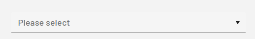
If you add an empty <Option> element and have added a display name for the ComboBox using the displayName attribute, the display name (for example, Please select) is displayed as the first entry:
For the <Option> element, you can define the following attributes:
Attribute | Description |
|---|---|
| Required Display name of the selection option.
Possible values: Any string Note: If you want to quickly switch to a specific option in a ComboBox with many selection options instead of scrolling through the entire list, click in the ComboBox and enter all or part of the display name of the option. |
| Value of the selection option
Possible values: Any string |
| Color of the icon This attribute is only used for Material Icons. Possible values: |
| Path to the icon used The icon can be either a resource from the Possible values:
With
|
The data for an outsourced option list must be XML data. The options must be included in a list:
<example>
	<listElement>list element 1</listElement>
</example>
<example>
	<listElement>list element 2</listElement>
</example>
Properties are defined according to the XML data. Note that an additional property saveValue is created, which is used as the initial value and container for saving the user input.
<Property name="example" type="List">
	<Property name="listElement" type="String" />
</Property>
<Property name="saveValue" type="String" />
Examples
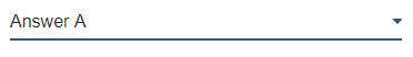
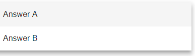
Example of <ComboBox>
The following example shows how to use the <ComboBox> tag.
<DetailComponent name="ExampleComboBox" path="ExampleComboBox" displayName="Example ComboBox" process="ComboBox.wrf">
	<FlowLayout>
		<ComboBox value="#saveValue">
			<Option displayName="Answer A"/>
			<Option displayName="Answer B"/>
		</ComboBox>
	</FlowLayout>
</DetailComponent>
The above code results in the following ComboBox:
Example of <ComboBox> with outsourced option list
The following example uses a swapped-out option list. The displayed name and associated technical value differ.
The data for an outsourced option list must be XML data. The options, including the technical values, must be included in a list:
<?xml version="1.0" encoding="UTF-8"?>
<Ok>
	<ComboBoxValue></ComboBoxValue>
	<OptionList>
		<OptionValue>Red</OptionValue>
		<TechnicalValue>#FF0000</TechnicalValue>
	</OptionList>
	<OptionList>
		<OptionValue>Green</OptionValue>
		<TechnicalValue>#008000</TechnicalValue>
	</OptionList>
	<OptionList>
		<OptionValue>Blue</OptionValue>
		<TechnicalValue>#0000FF</TechnicalValue>
	</OptionList>
</Ok>
Properties are defined according to the XML data.
<Properties>
  <Property name="ComboBoxValue" type="String"></Property>
  <Property name="OptionList" type="List">
			<Property name="OptionValue" type="String"></Property>
			<Property name="TechnicalValue" type="String"></Property>
  </Property>
</Properties>
The ComboBox control in the component contains a SelectAction. The SelectAction sends the data to the defined Technical Process when an option is selected from the ComboBox.
The data from the outsourced option list (optionsList attribute) is used in the ComboBox. The OptionValue elements are displayed, but the technical data from the TechnicalValue element is selected in the background.
<?xml version="1.0" encoding="UTF-8"?>
<DetailComponent
	xmlns="http://softproject.de/webapp/1.0"
	process="LoadData.wrf">
<Properties>
  <Property name="ComboBoxValue" type="String"></Property>
  <Property name="OptionList" type="List">
			<Property name="OptionValue" type="String"></Property>
			<Property name="TechnicalValue" type="String"></Property>
  </Property>
</Properties>
	<FlowLayout>
		<Header value="Welcome to my new Web App!" />
		<ComboBox
			value="#ComboBoxValue"
			optionsList="#OptionList"
			valueProperty="#TechnicalValue"
			displayProperty="#OptionValue">
			<SelectAction process="SaveData.wrf" />
		</ComboBox>
	</FlowLayout>
</DetailComponent>
Note:
The XML data to be used for the options must be provided by a Technical Process (in the example LoadData.wrf and SaveData.wrf).
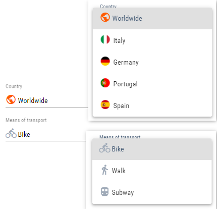
Example of <ComboBox> with icons
The following example shows the use of the <ComboBox> element with icons and an outsourced option list.
The following options are provided as a selection option via a Technical Process (in this case Options.wrf):
Options list
<?xml version="1.0" encoding="UTF-8"?>
<OkList>
	<Country>
		<Id>6</Id>
		<Name>Worldwide</Name>
		<icon>icon:public</icon>
		<color>ff5a00</color>
	</Country>
	<Country>
		<Id>2</Id>
		<Name>Italy</Name>
		<icon>italy.png</icon>
	</Country>
	<Country>
		<Id>5</Id>
		<Name>Germany</Name>
		<icon>germany.png</icon>
	</Country>
	<Country>
		<Id>3</Id>
		<Name>Portugal</Name>
		<icon>portugal.png</icon>
	</Country>
	<Country>
		<Id>4</Id>
		<Name>Spain</Name>
		<icon>spain.png</icon>
	</Country>
	<selected>6</selected>
</OkList>
The two example ComboBoxes are defined as follows:
A snippet from the definition file
...
<DetailComponent default="true" displayName="Dashboard" path="Dashboard"
                 process="folder_1/Options.wrf">
	<Properties>
		<Property name="selected" type="Integer"/>
		<Property name="direction" type="Integer"/>
		<Property name="Country" type="List">
			<Property name="Id" type="Integer"/>
			<Property name="Name" type="String"/>
			<Property name="icon" type="Image"/>
			<Property name="color" type="Color"/>
		</Property>
		<Property name="image" type="Image"/>
	</Properties>
	<FlowLayout>
		<ComboBox displayName="$Country" displayProperty="#Name"
                  iconColorProperty="#color"
                  iconProperty="#icon"
                  optionsList="#Country"
                  value="#selected"
                  valueProperty="#Id"/>
		<ComboBox displayName="Means of transport" value="#direction">
			<Option displayName="Bike" iconColor="A200" iconUrl="icon:directions_bike" value="1"/>
			<Option displayName="Walk" iconColor="A200" iconUrl="icon:directions_walk" value="4"/>
			<Option displayName="Subway" iconColor="A200" iconUrl="icon:directions_subway" value="3"/>
		</ComboBox>
	</FlowLayout>
</DetailComponent>
...
The result looks like this: