Card
With the <Card> control, cards can be integrated into X4 Web Apps, for example to integrate teasers or dashboards into applications. A card can contain a title and subtitle, various actions and a layout with any controls.
Creating a <Card> Control
A <Card> control is created with the <Card> element. The element can only be used in the layout of one (7.4.0-en) Detail Component.
In addition to the default attributes listed under Controls, the following attributes can be defined for the <Card> element:
Attribute | Description |
|---|---|
| Defines whether a border is displayed around the control. Possible values: |
| Defines whether a left border is displayed. Possible values: |
| Defines whether a right border is displayed. Possible values: |
| Defines whether a top border is displayed. Possible values: |
| Defines whether a bottom border is displayed. Possible values: |
| Icon for the control
Possible values:
Press Ctrl+Space to get an overview of the available icons. The selection may differ from the actual Material Icons available.
This attribute cannot be used at the same time as |
| Defines the color of the icon. Possible values:
Do not use a hash (#) before the color value or a shortened notation of the color value.
|
| Subtitle of the card.
|
| Title of the card.
|
Actions
Actions can be defined within the <Card> element.
If a Select action (<SelectAction/>) and/or a DoubleClick action (<DoubleClickAction/>) has been defined in the <Card> element, then no further actions can be defined. The user can select and/or double-click the entire <Card> element. If none of the two actions is specified, the <Card> element may contain any number of other actions.
<Card>
    <FlowLayout>
	...
	</FlowLayout>
    <Actions>
        <CustomAction displayName="Card action"/>
    </Actions>
</Card>
Example
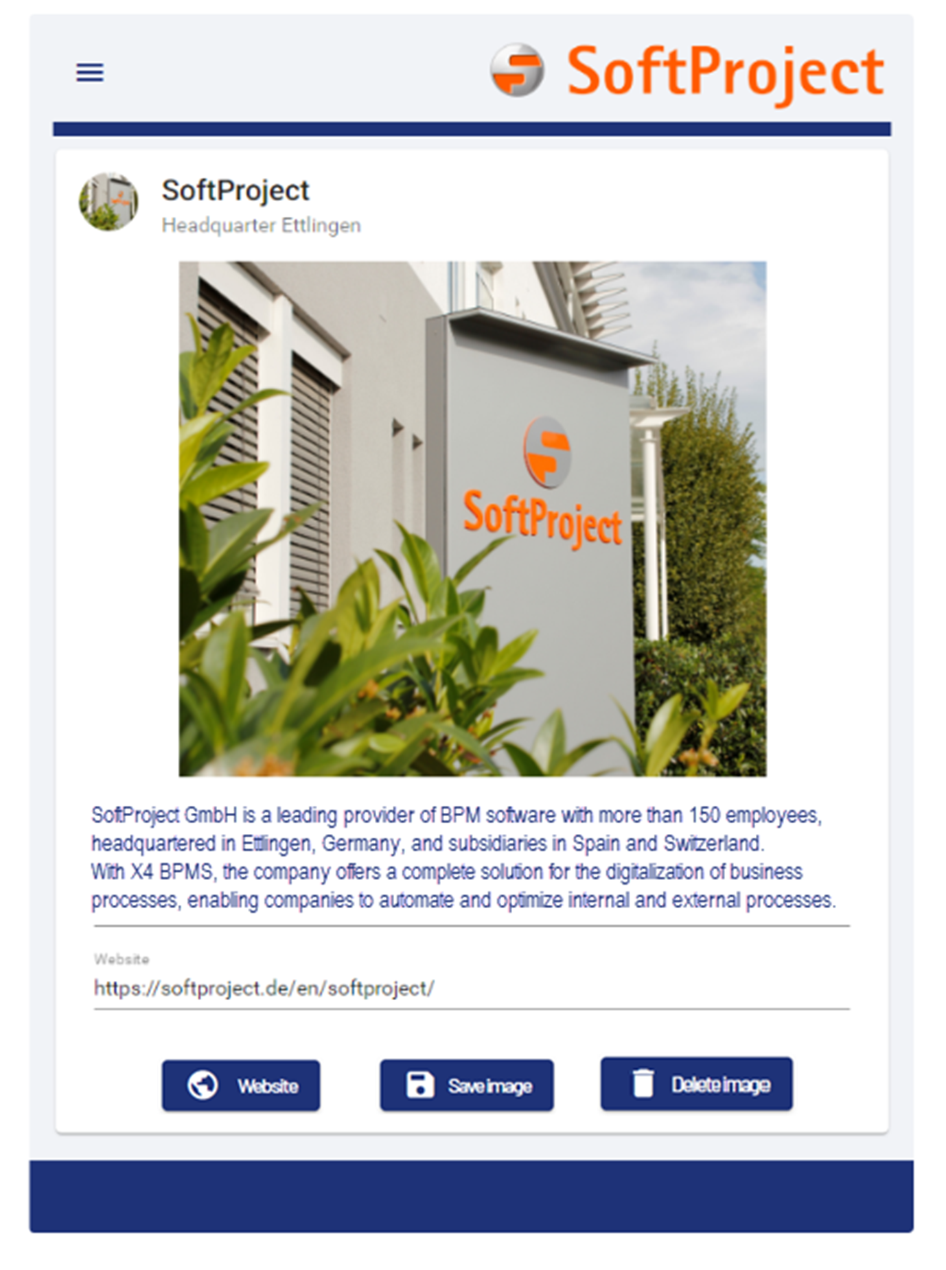
In this example, the attributes as well as the contents of the <Card> control are defined.
<Card border="true" icon="SPHeadquarters.jpg" title="SoftProject" subtitle="Headquarters Ettlingen">
	<FlowLayout>
		<Image resourceUrl="SPHeadquarters.jpg" width="400"/>
		<TextBox border="false" type="text" value="We have been offering products and services related to the digitization and automation of business processes since 2000. The strong demand from various industries is leading to an above-average corporate growth. Today we employ over 90 people in our head office in the technology region of Karlsruhe and our branches located in Spain and Slovakia." multiline="true"/>
		<TextBox type="url" value="https://softproject.de/en/softproject/" displayName="Website"/>
	</FlowLayout>
	<Actions>
		<CustomAction icon="Website.png" iconPosition="left" displayName="Website" externalLink="https://softproject.de/de/"/>
		<SaveAction displayName="Save Picture"/>
		<DeleteAction displayName="Delete Picture"/>
	</Actions>
</Card>
The above example leads to the following result: