Accordion controls are used to structure areas on a page and to represent extensive lists in a space-saving way. This is helpful, for example, when you work with numerous input fields relating to different categories. In addition, Accordion controls offer a high degree of flexibility, since you can add more accordion panels at any time and your web app always remains well-structured.
Accordion controls can be used in all available layout types :
BoxLayout
FlowLayout
GridLayout
ResponsiveLayout
TabLayout
The following attributes can be defined for an Accordion control:
Attribute
Description
background
Defines a color for the background of the control.
This setting overwrites the default color of the color scheme!
This attribute doesn't work with theMapsandHtmlDocumentcontrols!
Possible values:
hexadecimal color value, e.g., ff5a00
Do not use a hash in front of the color value! Do not use a shortened notation of the color value!
color code from the color palette of the Web App (seeTheming), e.g.,A200
disabled
Defines if the user can interact with the control.
Data binding (boolean) possible
Possible values:
true/false or data binding expression
enabled
Defines if the user can interact with the control.
Data binding (boolean) possible
Possible values:
true/false or data binding expression
expanded
Defines if the accordion panel is expanded or collapsed when opening the web app.
Data binding (boolean) possible
Possible values:
true (default)
false
data binding expression
fontFamily
Defines the font family.
This attribute overrides the default font of the Web App for this control.
If the attribute is defined on an element, the font family is inherited by the element's child elements, unless the child elements have thefontFamilyattribute explicitly set.
This attribute doesn't work with theImage,MapsandHtmlDocumentcontrols.
Possible values:
MainFont: Stored main font
font code from the font palette, e.g.,Font04
fontSize
Defines the font size.
This attribute overrides the default font size of the Web App for this control.
This attribute doesn't work with theImage,MapsandHtmlDocumentcontrols.
Possible values:
any integer or decimal number with a dot as decimal separator, e.g.,20;20.8;.9
font size in pixels, e.g.,20px
font size in points, e.g.,18pt
font size compared to the font size of the parent element, e.g.,.8emor120
This attribute overrides the default width of the characters of the Web App for this control.
Possible values:
Condensed (default)
Expanded
ExtraCondensed
ExtraExpanded
Medium
Normal
SemiCondensed
SemiExpanded
UltraCondensed
UltraExpanded
This attribute doesn't work with theImage,Maps,ChartsandHtmlDocumentcontrols.
fontStyle
Defines the font style.
This attribute overrides the default style of the characters of the Web App for this control.
Possible values:
italic: italic characters
normal: normal characters (default)
oblique: italic characters (calculated)
This attribute doesn't work with theImage,MapsandHtmlDocumentcontrols.
fontWeight
Defines the font weight.
This attribute overrides the default font weight of the Web App for this control.
Possible values:
Black
Bold
DemiBold
ExtraBlack
ExtraBold
ExtraLight
Heavy
Light
Medium
Normal (default)
Regular
SemiBold
Thin
UltraBlack
UltraBold
UltraLight
This attribute doesn't work with theImage,MapsandHtmlDocumentcontrols.
foreground
Defines a color for the foreground (texts, etc.) of the control.
This setting overwrites the default color of the color scheme!
This attribute does not work with theMap andHtmlDocumentcontrols!
Possible values:
hexadecimal color value, e.g., ff5a00
Do not use a hash in front of the color value! Do not use a shortened notation of the color value!
color code from the color palette of the Web App (seeTheming), e.g.,A200
horizontalAlign
Direction in which the elements flow. The order of the elements corresponds to their declaration.
Possible values:
left (default)
center
right
subtitle
Subtitle of the accordion element
Possible values:
expression for data binding (String, Date,DateTime)
subtitleForeground
Defines a color for the foreground of the subtitle.
This setting overwrites the default color of the color scheme!
This attribute does not work with theMap andHtmlDocumentcontrols!
Possible values:
hexadecimal color value, e.g., ff5a00
Do not use a hash in front of the color value! Do not use a shortened notation of the color value!
color code from the color palette of the Web App (seeTheming), e.g.,A200
textOverflow
Defines what happens if the page is full.
Possible values:
ellipsis: show with … that the text is not finished (default)
hidden: break off text, paying attention to whole words
wordBreak: break off within the word
allow: break off text between words
title
Title of the accordion element
Possible values:
expression for data binding (String,Date,DateTime,Integer,Decimal,URL)
visible
Defines whether the control is visible.
Data binding (boolean) possible
Possible values:
true/falseor data binding expression
<SelectAction/> within an Accordion Control
The Select action is created using the <SelectAction/> element within <Accordion> and is triggered once a user selects the corresponding item in the accordion.
<DoubleclickAction> within an Accordion Control
The DoubleClickaction is created using the <DoubleClickAction/> element within <Accordion> and is triggered once a user double-clicks the corresponding item in an accordion.
Note:
The <SelectAction/> and <DoubleClickAction> elements must be inserted before the desired layout type (BoxLayout, FlowLayout, GridLayout, ResponsiveLayout, TabLayout).
Example
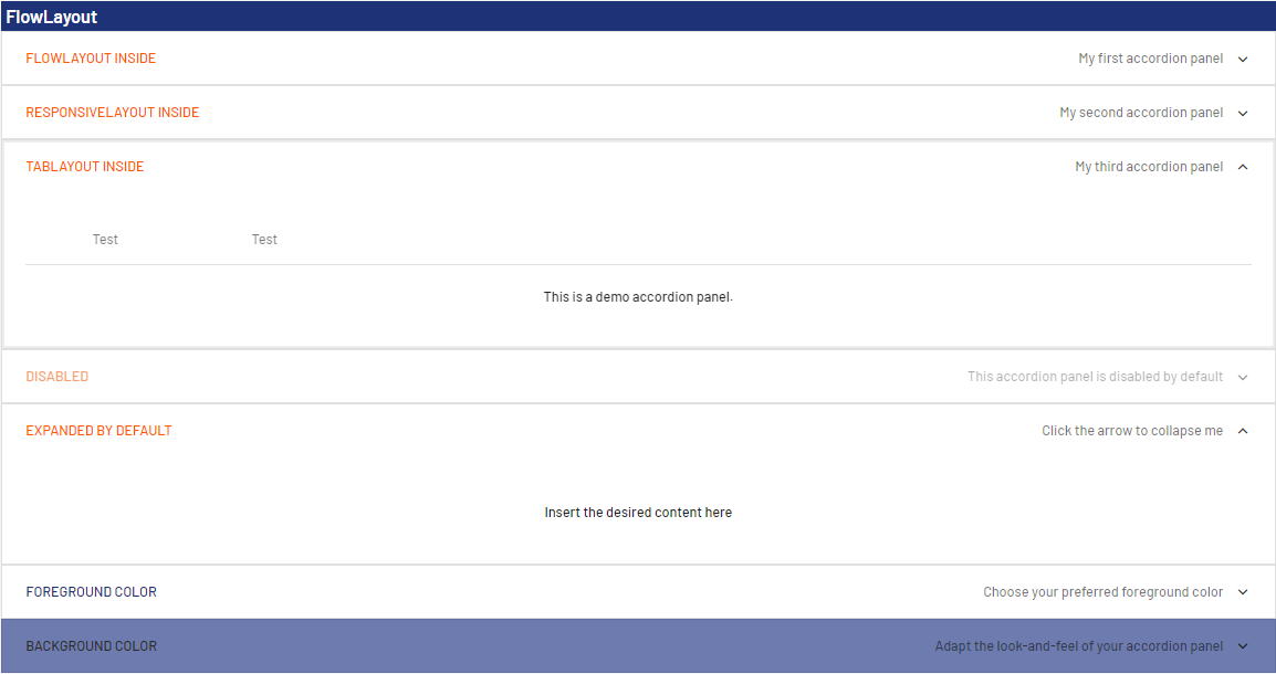
CODE
<?xml version="1.0" encoding="UTF-8"?>
<DetailComponent
    xmlns="http://softproject.de/webapp/1.0">
        <FlowLayout>
        <Header value="FlowLayout" />
        <Accordion title="FlowLayout inside" subtitle="My first accordion panel"
            expanded="false">
            <FlowLayout>
                <Label value="Welcome to my first accordion panel!" />
            </FlowLayout>
        </Accordion>
        <Accordion title="ResponsiveLayout inside"
            subtitle="My second accordion panel">
            <ResponsiveLayout>
                <Cell>
                    <Label value="Welcome to my second accordion panel" />
                </Cell>
            </ResponsiveLayout>
        </Accordion>
        <Accordion title="TabLayout inside" subtitle="My third accordion panel">
            <TabLayout>
                <Tab displayName="Test">
                    <FlowLayout>
                        <Label value="This is a demo accordion panel."></Label>
                    </FlowLayout>
                </Tab>
                <Tab displayName="Test">
                    <FlowLayout>
                        <Checkbox checked="true" displayName="I am a test checkbox" />
                    </FlowLayout>
                </Tab>
            </TabLayout>
        </Accordion>
        <Accordion title="Disabled" subtitle="This accordion panel is disabled by default"
            disabled="true">
            <GridLayout>
                <Label value="Label" />
            </GridLayout>
        </Accordion>
        <Accordion title="Expanded by default" subtitle="Click the arrow to collapse me"
            expanded="true">
            <FlowLayout>
                <Label value="Insert the desired content here" />
            </FlowLayout>
        </Accordion>
        <Accordion title="Foreground color" subtitle="Choose your preferred foreground color"
            expanded="false" foreground="500">
            <FlowLayout>
                <Label value="Label"></Label>
                <Checkbox checked="true" displayName="I am a test checkbox" />
            </FlowLayout>
        </Accordion>
        <Accordion title="Background color"
            subtitle="Adapt the look-and-feel of your accordion panel" background="A200" foreground="900">
            <ResponsiveLayout>
                <Cell>
                    <Label value="Select your favorite background color" />
                </Cell>
            </ResponsiveLayout>
        </Accordion>
    </FlowLayout>
</DetailComponent>
The above code generates the following output in the web app:
JavaScript errors detected
Please note, these errors can depend on your browser setup.
If this problem persists, please contact our support.