X4 Web Apps 7.2.0
Customizable border colors in List Component
The border color for the border in the List Component can now be configured with the new borderColor attribute in the List Component. Possible values are hexadecimal color values, e.g. ff5a00, or color codes from the color palette of the Web App, e.g. A200.
HTMLDocument control should allow configuring the sandbox mode
The security level of the sandboxed iframe is defined by multiple flags on the HTMLDocument control as attributes.
allowForms | Allows embedded content to submit forms. |
allowPopups | Allows embedded content to open a web page in a new window or tab. |
allowPointerLock | Allows embedded content to interpret mouse movements directly as an input method. |
allowSameOrigin | Allows embedded content to share memory if the origin of the embedded content is the same as the origin of the host web application. |
allowScript | Allows embedded content to execute JavaScript. |
allowTopNavigation | Allows embedded content to open a web page in the same window or tab. |
allowModals | Allows embedded content to display modal dialogs. |
Logout action in Web Apps
A new action type was added (LogoutAction) and it is possible to call a process before logout (optional). When the Action is executed and a process is specified, the process will be executed first. Afterwards the user will be logged out and the page will be reloaded.
Note:
The action does the same as the actual logout button in the standard Web App header.
Multiselect mode in Grid Component behaves like single-selection mode
Row selection without clicking on the checkbox is now possible in multiselect mode as well as it was possible before in single-selection mode.
The selection is prevented if external links or editable cells are clicked.
Define borders on four sides of Web App elements
The Web App elements Image, BoxLayout, TextBox (multiline) and Card can have borders on any side independently. One element can have a border only on the bottom or top or left or right of an element instead of always having a border around the complete element.
New attributes have been defined which can either be true or false:
borderTop
borderBottom
borderLeft
borderRight
Note: The border attribute overrides the values of side-specific attributes (top, bottom, ...).
<Card border="false"
borderTop="true"
borderLeft="true"
borderRight="true"
borderBottom="false"
>
<BoxLayout></BoxLayout>
</Card>
Resizing cards on forms
Cards added to a form take just the space needed to include elements inside them. The standard cards do appear smaller now.
This was achieved by adding styles in the stylesheet of the Card element and the BoxLayout element avoiding empty spaces.
Send several entries to a Grid Component as preselected
It is now possible to send a series of entries to a Grid Component during the loading process and to display the selected entries in the Grid Component (checkbox checked) so that they can be deselected.
The selected attribute is set to true for the respective elements and the following setting is set in the Grid Component:
<GridSettings>
    <Multiselect/>
</GridSettings>
Renamed pie chart attributes
For easier understanding, the following attributes for the <Pie> element were renamed:
OLD | NEW |
|---|---|
center1 | centerHorizontal |
center2 | centerVertical |
radius1 | radius |
radius2 | radiusOuterDonut |
Add enhanced features to charts
Additional attributes for the <Chart> element are now available in X4:
saveAsImage | Enables the download of the charts as image files in SVG format. Possible values:
|
subtitle | Subtitle oft he chart. Possible values: Any string or data binding |
avoidLabelOverlap | Specifies whether to prevent labels from overlapping. Possible values:
|
In addition, zoom sliders are available and the radius as well as the horizontal and vertical position of the chart can be configured.
Copying table data in Grid Component
Data can be copied from a table in the Grid Component with CTRL+C and inserted elsewhere (CTRL+V). Even if the table data is not editable (editable=false) it should be able to mark cells and copy their content.
Show change password link depending on user auth mechanism
When logging in with a user of a social identity provider, it is not possible to change the user password with a Web App. The change password button is not available.
Create a datetime picker with customizable format
A new control, DateTimePicker, for adding a datetime picker to the Grid Component is available. The date/time can be displayed in different formats in the Grid Component:
Only date (if data has <date> type)
Datetime with hh:mm
Datetime with hh:mm:ss
Datetime with hh:mm:ss.sss
Note:
For the <date> type only dates can be displayed, the <datetime> type displays the date and the time as hh:mm.
The existing text boxes with date/datetime are automatically migrated to the new datetime picker.
Date and datetime picker input fields support typing from keyboard as well as picking from the picker popup.
The date format is changing with change of browser language (e.g., 11/22/2021 in the US English locale should be 22.11.2021 in German).
Translate all messages from Kendo UI
The texts of the Grid Component and of the ComboBoxAutocomplete and DateTimePicker controls are available in more than 10 languages, including English, French, German, and Spanish.
Bindable parameter values in actions
Actions can be extended with the <Parameters> element if you want, for example, pass the ID of an item selected via a button in the ListView.
Within the <Parameters> element, you can set further definitions using the <Parameter> element with the following mandatory attributes:
Attribute | Description |
|---|---|
key | Name of the parameter Data binding (boolean) possible Possible values:
|
value | Parameter value Data binding (boolean) possible Possible values:
|
ExternalWeb Component allows configuring the sandbox mode
The security level of the sandboxed iframe is defined by multiple flags on the HTMLDocument control as attributes (see allowSameOrigin). All flags are set to false as a default.
allowForms | Allows embedded content to submit forms. |
allowPopups | Allows embedded content to open a web page in a new window or tab. |
allowPointerLock | Allows embedded content to interpret mouse movements directly as an input method. |
allowSameOrigin | Allows embedded content to share memory if the origin of the embedded content is the same as the origin of the host web application. |
allowScripts | Allows embedded content to execute JavaScript. |
allowTopNavigation | Allows embedded content to open a web page in the same window or tab. |
allowModals | Allows embedded content to display modal dialogs. |
LinkControl available in TextBlock component
A link can be added to the TextBlock element using the <Link> element. To generate the link, an action must be defined.
The following actions are supported:
UploadActionDownloadActionSelectActionCustomAction
Example:
CODE
|
Replace default header with custom header
It is possible to replace the default header in a Web App with a custom header using the new <HeaderSection> element.
The HeaderSection is named according to the Web App project und has the file name extension .headersection. There can only be one .headersection file per Web App project.
The <HeaderSection> element creates the header. All layouts and controls of X4 Web Apps can be used in the header section. The custom header overwrites the standard header.
The following attribute can be defined for the <HeaderSection> element:
Attribute | Description |
|---|---|
process | Path to the .wrf file returning the data for the header. The process needs to be stored in the Services/Processes folder. Possible values:
|
Set HTTP Security Header
For each Web App, you can specify an HTTP Security Header in the Configuration file.
The HTTPSecurityHeader element was added to the root element <Configuration> of the .wac file. It contains configuration definitions for the HTTP Security Header.
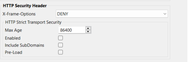
The HTTPSecurityHeader element creates an HTTP Security Header in the Web App.
For more information, see HTTP-Security-Header.