TextBox
<TextBox> controls are used to work with text, numbers, or dates. Depending on the type of TextBox its appearance and behavior changes.
To trigger the "Select" Action when a TextBox item is deselected, a SelectAction action can be inserted within the TextBox control.
The following attributes can be defined for the <TextBox> element:
| Attribute | Description |
|---|---|
autocomplete | This HTML attribute specifies whether autocompletion is enabled or disabled for the TextBox. By default, the autocomplete feature is enabled. Possible values: |
border | Defines whether a frame is displayed around the control. Works only if Possible values: |
border-left | Defines whether a left border is displayed. Works only if Possible values: |
border-right | Defines whether a right border is displayed. Works only if Possible values: |
border-top | Defines whether a top border is displayed. Works only if Possible values: |
border-bottom | Defines whether a bottom border is displayed. Works only if Possible values: |
displayName | Label of the TextBox.
Possible values: Any string |
iconColor | Defines the color of the icon.
Possible values:
|
iconPosition | Position of the icon within the TextBox. Possible values:
|
iconUrl | Path to an graphic file or specification of a Material Icon to be used as an icon.
Possible values:
With |
multiline | Defines whether multi-line inputs/outputs are possible in the TextBox. Works only for the Possible values: |
rows | Defines the visible height of the text field. Works only with multiline text fields. More lines can be entered, these are then visible via scrolling. Possible values: Integer (default: |
type | Type of TextBox, changes behavior and appearance. Possible values:
All values containing a date or time must be stored and provided in UTC. |
value | Content of the TextBox.
Possible values: Any string |
background | Defines a color for the background of the control.
Possible values:
|
enabled | Defines if the user can interact with the control.
Possible values: |
disabled | Defines if the user can interact with the control.
Possible values: |
fontFamily | Defines the font family.
Possible values:
|
fontSize | Defines the font size.
Possible values:
|
fontStretch | Sets the width of the single characters.
This attribute overrides the default width of the characters of the Web App for this control.
Possible values:
This attribute doesn't work with the |
fontStyle | Defines the font style.
This attribute overrides the default style of the characters of the Web App for this control.
Possible values:
This attribute doesn't work with the |
fontWeight | Defines the font weight.
This attribute overrides the default font weight of the Web App for this control.
Possible values:
This attribute doesn't work with the |
foreground | Defines a color for the foreground (texts, etc.) of the control.
Possible values:
|
horizontalAlign | Direction in which the elements flow. The order of the elements corresponds to their declaration. Possible values:
|
textOverflow | Defines what happens if the page is full. Possible values:
|
visible | Defines if the control is visible.
Possible values: |
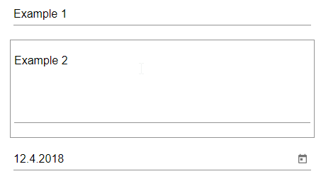
Example <TextBox>
The following example shows the usage of the <TextBox> tag.
<FlowLayout>
	<TextBox value="Example 1"/>
	<TextBox value="Example 2" multiline="true"/>
	<TextBox value="2018-04-12" type="date"/>
</FlowLayout>
The above code creates the following TextBoxes: