Responsive Layout
The Responsive Layout is ideal for web applications that are designed to be displayed on different devices. The Responsive Layout is divided into 12 virtual columns. The available space for a column depends on the resolution of the device.
The <ResponsiveLayout> element creates a Responsive layout. At least one <Cell> element must be defined inside the ResponsiveLayout <ResponsiveLayout>. For each <Cell> element, you can define the number of columns that the element will take on the corresponding device. Additional layout types can be nested in the <Cell> element. In Responsive layout, the content within the <Cell> element is adjusted to the available screen space and wrapped if necessary.
For more information, see
Examples
XML
<DetailComponent
default="true"
displayName="Dashboard"
path="Dashboard">
<ResponsiveLayout defaultCellSizeTablet="6">
<Cell cellSizeTablet="3">
<FlowLayout>
<TextBox
displayName="Unternehmen"
value="SoftProject GmbH" />
</FlowLayout>
</Cell>
<Cell cellSizeDesktop="3">
<GridLayout columns="2">
<TextBox
displayName="Straße"
value="Am Erlengraben 3" />
<TextBox
displayName="Land"
value="Deutschland" />
<TextBox
displayName="Postleitzahl"
value="76275" />
<TextBox
displayName="Ort"
value="Ettlingen" />
</GridLayout>
</Cell>
<Cell
cellSizeDesktop="6"
cellSizeTablet="12">
<Map vendor="OpenStreetMap">
<SingleMarker
name="Marker"
searchString="Am Erlengraben 3, 76275 Ettlingen" />
</Map>
</Cell>
</ResponsiveLayout>
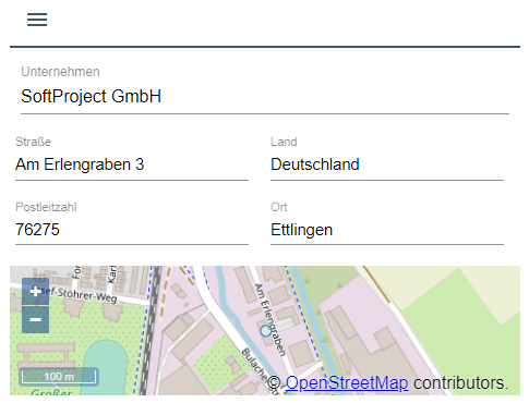
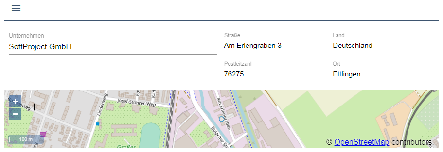
</DetailComponent>Desktop view

Tablet view
Mobile view