Overlay Structural Element
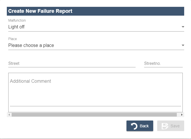
The content of the Overlay structural element is displayed as pop-up in the web application and lies above other elements. The Overlay structural element contains one more component that can display both static and dynamic content.

The Overlay structural element is defined within MasterDetailComponent after the structural elements Master and Detail. The Overlay structural element is only displayed if it is called using an action.
Within the MasterDetailComponent, any number of Overlay elements can be created, which can be defined with the following attributes.
| Attribute | Description |
|---|---|
width | Width of the overlay The specification of the Possible value:
|
height | Height of the overlay The specification of the Possible value:
|
units | Defines the unit that applies to size specifications. Possible values:
|
- If the attributes
widthandheightare filled with invalid values when specifying a percentage, a validation error will be output. - If the attributes
widthandheightare not set or specified with0, overlays are displayed in the default size.
The attribute enableOverlayBlurredBackground within the Web App definition (.wad) can be used to specify whether the part of the Web App that is still visible in the background should be blurred or not in the case of overlays.
Example definition
<MasterDetailComponent  xmlns="http://softproject.de/webapp/1.0">
	<Actions/>
	<Master/>
	<Detail/>
	<Overlay width="100" height="100" units="percents">
	<!-- Reference to a component in which the Overlay element is defined-->
        <ComponentReference source="Customers/AddToEvent.list" name="AddToEvent"></ComponentReference>
    </Overlay>
    <Overlay width="200" height="300" units="pixels">
        <ComponentReference source="Customers/AddToEvent.list" name="DifferentEvent"></ComponentReference>
    </Overlay>
</MasterDetailComponent