Main Theme
In the Main Theme, you can define the colors of the Web App. A main color can be defined by specifying a color in Main Color. Based on the Main Color, the remaining colors are calculated automatically. However, the colors can also be defined individually.
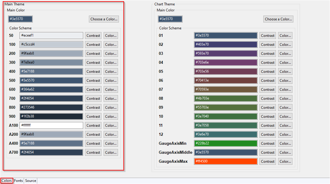
In the following table, you can see the default usage of the Color and Contrast defined for the color scheme:
With Contrast, you can switch between black and white.
| Color Scheme | Color | Contrast |
|---|---|---|
50 | Zebra table
| Zebra table
|
100 | Zebra table
| Zebra table
|
200 | Zebra table
| Zebra table
|
300 | Cookie consent window
| |
400 |
|
|
500 | website
Menu
Date picker
Login
| website
Menu
|
600 | Grid Component
| |
700 | Cookie consent window
| |
800 | Cookie consent window
| |
900 | Grid Component
| |
A100 | Web App
| |
A200 | Menu:
Zebra table
| Zebra table
|
A400 | Zebra table
| Zebra table
|
A700 | Cookie consent window
DateTime picker
|