ListView
ListView controls are used to display data objects (simple or complex) from lists. How a single object is displayed is defined as an item template. For this purpose, the display is defined within a layout (flow or Grid Layout). This display is adopted for each individual object. Since the data objects to be displayed are provided by a Technical Process, a corresponding Technical Process must be defined in the component that contains the ListView.
| Attribute | Description |
|---|---|
elementWidth | Defines the width of an element (corresponds to a list entry in the xml file). Possible values: Integer |
elementWidthUnits | Defines the unit that applies to the sizes of the element. Possible values:
|
MaxLength | Defines the maximum number of entries to be displayed. If there are more entries in the list, the user can display them using a drop-down arrow. Possible values: Integer |
objectList | Required. Source of the data. The number of entries defines the number of displayed elements.
Possible values: Any string |
background | Defines a color for the background of the control.
Possible values:
|
enabled | Defines if the user can interact with the control.
Possible values:
The
enabled attribute replaces the obsolete disabled attribute. enabled="true" thus corresponds to the obsolete
disabled="false" attribute
.
|
fontFamily | Defines the font family.
Possible values:
|
fontSize | Defines the font size.
Possible values:
|
fontStretch | Sets the width of the single characters.
This attribute overrides the default width of the characters of the Web App for this control.
Possible values:
This attribute doesn't work with the |
fontStyle | Defines the font style.
This attribute overrides the default style of the characters of the Web App for this control.
Possible values:
This attribute doesn't work with the |
fontWeight | Defines the font weight.
This attribute overrides the default font weight of the Web App for this control.
Possible values:
This attribute doesn't work with the |
foreground | Defines a color for the foreground (texts etc.) of the control.
Possible values:
|
horizontalAlign | Direction in which the elements flow. The order of the elements corresponds to their declaration. Possible values:
|
visible | Defines if the control is visible.
Possible values: |
<SelectAction/> within a ListView Control
The Select action is created using the <SelectAction/> element within <ListView> and is triggered once a user selects an entry in the list.
The selected element is marked in the output with the attribute selected="true".
<DoubleclickAction> within a ListView Control
The DoubleClick action is created using the <DoubleClickAction/> element within <ListView> and is triggered once a user double-clicks an entry in the list.
Examples
List without actions
Input
<DetailComponent name="ExampleListView" path="ExampleListView" displayName="Example ListView" process="example.wrf">
<Properties>
<Property name="ListObject" type="List">
<Property name="Caption" type="String" />
<Property name="Name" type="String" />
<Property name="City" type="String" />
</Property>
</Properties>
<FlowLayout>
<ListView objectList="#ListObject">
<FlowLayout>
<Label value="#Caption"/>
<Label value="#Name"/>
<Label value="#City"/>
</FlowLayout>
</ListView>
</FlowLayout>
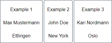
</DetailComponent>Output
The data provided by the Technical Process have the following format:
<?xml version="1.0" encoding="UTF-8" ?>
<Ok>
	<ListObject>
		<Caption>Example 1</Caption>
		<Name>Max Mustermann</Name>
		<City>Ettlingen</City>
	</ListObject>
	<ListObject>
		<Caption>Example 2</Caption>
		<Name>John Doe</Name>
		<City>New York</City>
	</ListObject>
	<ListObject>
		<Caption>Example 3</Caption>
		<Name>Kari Nordmann</Name>
		<City>Oslo</City>
	</ListObject>
	...
</Ok>
Above code creates the following ListView:
List with actions
Input
<DetailComponent
	path="Dashboard"
	displayName="Dashboard"
	process="DataInput.wrf"
	default="true">
	<Properties>
		<Property
			name="ListObject"
			type="List">
			<Property
				name="name"
				type="String" />
		</Property>
	</Properties>
	<FlowLayout>
		<ListView objectList="#ListObject">
			<SelectAction process="Response.wrf" />
			<FlowLayout>
				<TextBox value="#name" />
			</FlowLayout>
		</ListView>
	</FlowLayout>
</DetailComponent>
Output
The data provided by the Technical Process have the following format:
The selected element is marked in the output with the attribute selected="true".
In order to delete all entries of the ListView completely, the attribute empty="true" must be set in the output.
<?xml version="1.0" encoding="UTF-8"?>
<Action>
   <ListObject selected="true">
      <name>Ettlingen</name>
   </ListObject>
   <ListObject>
      <name>New York</name>
   </ListObject>
   <ListObject>
      <name>Oslo</name>
   </ListObject>
</Action>