Checkbox
<Checkbox> controls are created using the <Checkbox> element and are used to work with boolean values, e.g. to get user input in "Yes/No" format.
In addition to the default attributes listed under Controls, the following attributes can be defined for the <Card> element:
| Attribute | Description |
|---|---|
checked | Mandatory Indicates whether the checkbox is checked or unchecked by default.
Possible values: |
displayName | Label. Displayed next to the checkbox.
Possible values: Any string |
sliderOnDesktop | Defines whether the checkbox is displayed as a slider in the desktop version. Possible values: |
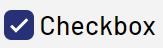
Checkboxes are displayed differently in the desktop and mobile version.
- Display in the desktop version:

- Display in the mobile version:

With the attribute sliderOnDesktop, the display for the mobile version can also be displayed in the desktop version.
"Select" Action within a Checkbox
The Select action is created via the element <SelectAction/> within <Checkbox> and is triggered as soon as the checkbox has been checked or unchecked.
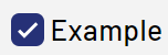
Example for <Checkbox>
<DetailComponent name="Example" path="Example" displayName="Example">
	<FlowLayout>
		<Checkbox checked="true" displayName="Example"/>
	</FlowLayout>
</DetailComponent>
The above code creates the following checkbox:
Example for <Checkbox> with a Technical Process
<DetailComponent path="Dashboard"
       displayName="Dashboard" default="true"
       process="/Processes/process_1.wrf">
       <Properties>
             <Property name="boolean" type="Boolean"></Property>
       </Properties>
       <FlowLayout>
             <Checkbox checked="#boolean" displayName="Check box" />
       </FlowLayout>
</DetailComponent>
The above code creates the following checkbox: