Gauge Chart
A gauge chart can be used to show states with different valuations. It is well suited to compare target/actual values, e.g. for key figures, customer satisfaction or quality measurements.
A gauge chart can contain the following elements:
<Gauge>: Defines how the diagram is displayed.<Tooltip>: Defines how the tooltip for the single values within the chart is displayed.
General Attributes
The following attributes are provided for all elements of a gauge chart:
| Attributes | Description |
|---|---|
| Defines the font family.
Possible values:
|
| Defines the font size.
Possible values:
|
| Sets the width of the single characters.
This attribute overrides the default width of the characters of the Web App for this control.
Possible values:
This attribute doesn't work with the
Image, Maps and HtmlDocument controls.
|
| Defines the font style.
This attribute overrides the default style of the characters of the Web App for this control.
Possible values:
This attribute doesn't work with the
Image, Maps and HtmlDocument controls.
|
| Defines the font weight.
This attribute overrides the default font weight of the Web App for this control.
Possible values:
This attribute doesn't work with the
Image, Maps and HtmlDocument controls.
|
| Defines the font color.
This setting overwrites the default color of the color scheme!
Possible values:
Do not use a hash in front of the color value! Do not use a shortened notation of the color value!
|
Gauge
<Gauge>: Defines how the diagram is displayed.
In addition to the general attributes, <Gauge> can have the following attributes:
| Attribute | Description |
|---|---|
axisMax | Defines the end range of the gauge chart in percent. The color of the area is defined within the Theming Editor via the color property Possible values: Integer between Example The default values ( |
axisMiddle | Defines the middle range of the gauge chart in percent. The color of the area is defined within the Theming Editor via the color property Possible values: Integer between |
axisMin | Defines the initial range of the gauge chart in percent. The color of the area is defined within the Theming Editor via the color property Possible values: Integer between |
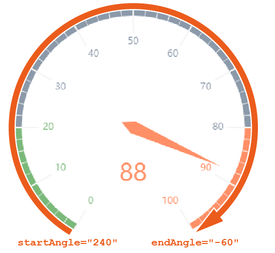
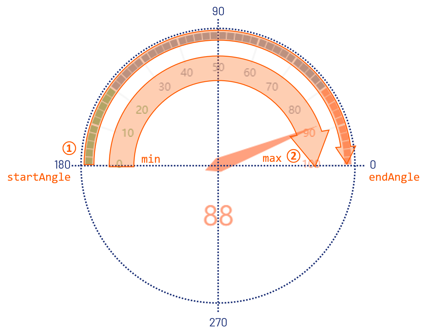
endAngle | Defines the endpoint of the gauge chart. Possible values: Integer between
|
legend | Defines if a legend is displayed. Possible values: |
max | Defines the maximum value of the gauge chart. Possible values: Integer (default: |
min | Defines the minimum value of the gauge chart. Possible values: Integer (default: The connection from |
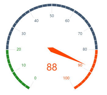
startAngle | Defines the start point of the gauge chart. Possible values: Integer between For this setting, the following integers correspond to the following positions on a clock face:
|
value | Defines which value of the data object is visualized. Possible values: Any string or Data Binding |
Tooltip
<Tooltip>: Child element of <Gauge>. Defines how the tooltip for the single values within the chart is displayed.
For <Tooltip> the general attributes (see above) can be defined.
Examples
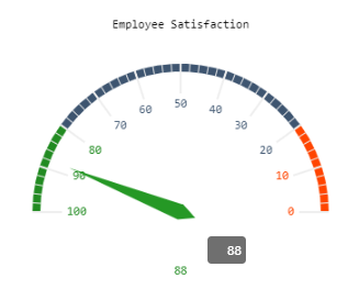
Example 1:
<Properties>
<Property name="DataSource" type="Complex">
<Property name="Satisfaction" type="Integer"/>
</Property>
</Properties>
<FlowLayout>
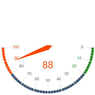
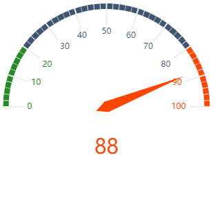
<Chart fontFamily="Font03" title="Employee Satisfaction">
<Gauge max="0" min="100" value="#DataSource.Satisfaction">
<Tooltip fontFamily="Font02" fontSize="12"/>
</Gauge>
</Chart>
</FlowLayout>The above example creates the following diagram:
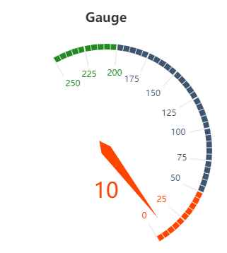
Example 2:
<Property name="Datasource" type="Complex">
<Property name="gauge" type="Integer"/>
...
...
...
</Property>
<Chart title="Gauge">
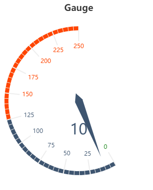
<Gauge value="#Datasource.gauge" min="0" max="250" startAngle="-60" endAngle="-270" axisMin="0" axisMiddle="50" />
</Chart>
<Chart title="Gauge">
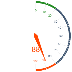
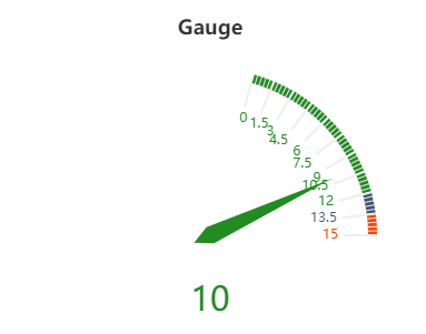
<Gauge value="#Datasource.gauge" min="0" max="15" startAngle="75" axisMin="80" axisMiddle="90" />
</Chart>
<Chart title="Gauge">
<Gauge value="#Datasource.gauge" min="-1" max="250" startAngle="120" />
</Chart>The above example creates the following diagrams:
Functionality and further examples for gauge charts
The following must be observed for gauge charts:
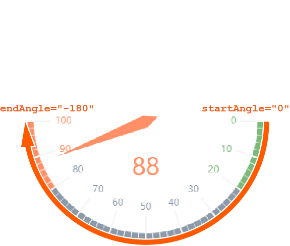
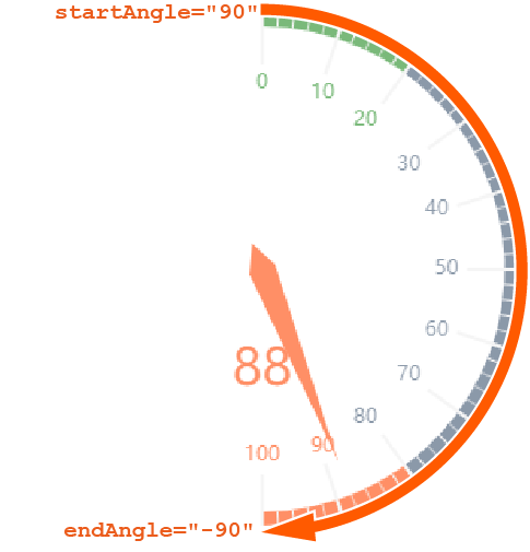
endAnglemust be smaller thanstartAngle.- The connection from the start angle to the end angle is always clockwise.
The connection from
mintomax(scale) is always clockwise.
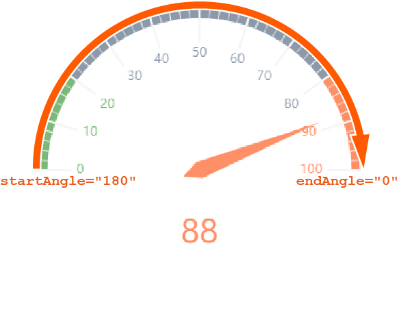
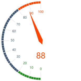
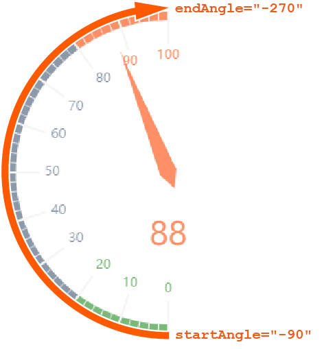
The following are further examples of gauge charts with explanations to illustrate how the start and end angles work.
| Definition | Result | Explanation |
|---|---|---|
<Gauge startAngle="0" endAngle="-180" min="0" max="100" ...> |
|
|
<Gauge startAngle="90" endAngle="-90" min="0" max="100" ...> |
|
|
<Gauge startAngle="180" endAngle="0" min="0" max="100" ...> |
|
|
|
|
|
|
|
|