ComboBox
<ComboBox> controls are used to create selection lists.
To trigger the Action "Select" when a ComboBox item is selected, a SelectAction can be inserted within the ComboBox control.
In addition to the standard attributes for controls, the following attributes are available for the element <ComboBox> element:
Attribute | Description |
|---|---|
| Title of the ComboBox. Displayed small above the input/output field.
Possible values: Any string |
| Has to be set if Possible values: String that corresponds to a defined property. The specified string must correspond to a valid subproperty used in |
| Name of the property that contains the color information of the icon. This attribute is only used for material icons. The color specification can be a hexadecimal color value, e.g.
Possible values: String that corresponds to a defined property. For relative bindings a hashtag |
| Name of the property containing the URL of the icon resource. The icon can be either a resource from the
Possible values: String that corresponds to a defined property. For relative bindings a hashtag |
| Enable automatic width for the option list Possible values:
|
| If the option list is outsourced : Source of the list. Can only be used together with
Possible values: String (data binding) |
| Maximum width of the option list in percent or pixels, where percent refers to the screen width Possible values: Integer |
| Defines the unit for the attribute Possible values:
|
| Value that is displayed and saved.
Possible values: Any string |
| Value that is processed technically. If this attribute is set, the property that is defined for this value must have the same name. If this attribute is not set, Possible values: Any string The specified string must correspond to a valid subproperty used in |
| Defines a color for the background of the control.
Possible values:
|
| Defines if the user can interact with the control.
Possible values: The |
| Defines the font family.
Possible values:
|
| Defines the font size.
Possible values:
|
| Sets the width of the single characters. This attribute overrides the default width of the characters of the Web App for this control. Possible values:
This attribute doesn't work with the |
| Defines the font style. This attribute overrides the default style of the characters of the Web App for this control. Possible values:
This attribute doesn't work with the |
| Defines the font weight. This attribute overrides the default font weight of the Web App for this control. Possible values:
This attribute doesn't work with the |
| Defines a color for the foreground (texts etc.) of the control.
|
| Direction in which the elements flow. The order of the elements corresponds to their declaration. Possible values:
|
| Defines what happens if the page is full. Possible values:
|
| Defines if the control is visible.
Possible values: |
ComboBox contains at least one <Option> element that creates an option. The options of the pick list can either come from a Technical Process or be entered manually.
The <Option> element may have the following attributes:
Attribute | Description |
|---|---|
| Mandatory. Display name of the pick list option.
Note: To quickly jump to a specific option in a combo box with many choices, rather than scrolling through the entire list, click in the combo box and type all or part of the option's display name. |
| Value of the pick list option
Possible values: any string |
| Color of the icon This attribute is only used for Material Icons. Possible values:
|
| Path to the used icon The icon can be either a resource from the Possible values:
|
The data for the outsourced options list must be available as XML data. The options must be contained in a list:
<example>
	<listElement>list element 1</listElement>
</example>
<example>
	<listElement>list element 2</listElement>
</example>
The property definition is carried out according to the XML data. Please not that an additional property saveValue is created, which is used as initial value and container for saving the user input.
<Property name="example" type="List">
	<Property name="listElement" type="String" />
</Property>
<Property name="saveValue" type="String" />
Examples
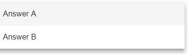
Example <ComboBox>
The following example shows the usage of the <ComboBox> tag.
<DetailComponent name="ExampleComboBox" path="ExampleComboBox" displayName="Example ComboBox" process="ComboBox.wrf">
	<FlowLayout>
		<ComboBox value="#saveValue">
			<Option displayName="Answer A"/>
			<Option displayName="Answer B"/>
		</ComboBox>
	</FlowLayout>
</DetailComponent>
Above code creates the following ComboBox:

Example <ComboBox> with outsourced pick list
The following example shows the usage of the <ComboBox> element with an outsourced pick list. The displayed name and the associated technical value differ.
The data for an outsourced options list have to be available as XML data. The options including the technical values must be contained in a list:
<?xml version="1.0" encoding="UTF-8"?>
<Ok>
	<ComboBoxValue></ComboBoxValue>
	<OptionList>
		<OptionValue>Red</OptionValue>
		<TechnicalValue>#FF0000</TechnicalValue>
	</OptionList>
	<OptionList>
		<OptionValue>Green</OptionValue>
		<TechnicalValue>#008000</TechnicalValue>
	</OptionList>
	<OptionList>
		<OptionValue>Blue</OptionValue>
		<TechnicalValue>#0000FF</TechnicalValue>
	</OptionList>
</Ok>
The properties definition is done according to the XML data.
<Properties>
	<Property name="ComboBoxValue" type="String"></Property>
	<Property name="OptionList" type="List">
		<Property name="OptionValue" type="String"></Property>
		<Property name="TechnicalValue" type="String"></Property>
	</Property>
</Properties>
The ComboBox control in the component contains a SelectAction. The SelectAction sends the data to the defined Technical Process when an option is selected from the ComboBox. In the ComboBox the data from the swapped option list is used. The OptionValue elements are displayed, but the technical data from the TechnicalValue element are selected in the background.
<?xml version="1.0" encoding="UTF-8"?>
<DetailComponent
	xmlns="http://softproject.de/webapp/1.0"
	process="LoadData.wrf">
<Properties>
	<Property name="ComboBoxValue" type="String"></Property>
	<Property name="OptionList" type="List">
		<Property name="OptionValue" type="String"></Property>
		<Property name="TechnicalValue" type="String"></Property>
	</Property>
</Properties>
	<FlowLayout>
		<Header value="Welcome to my new Web App!" />
		<ComboBox
			value="#ComboBoxValue"
			optionsList="#OptionList"
			valueProperty="#TechnicalValue"
			displayProperty="#OptionValue">
			<SelectAction process="SaveData.wrf" />
		</ComboBox>
	</FlowLayout>
</DetailComponent>
The XML data to be used for the options must be provided by a Technical Process (in the example LoadData.wrf and SaveData.wrf).
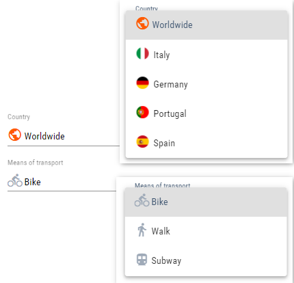
Example <ComboBox> with icon
The following example shows the usage of the <ComboBox> element with icons and an outsourced pick list.
The following options are provided as selection options via a Technical Process (here Options.wrf):
Options list
<?xml version="1.0" encoding="UTF-8"?>
<OkList>
	<Country>
		<Id>6</Id>
		<Name>Worldwide</Name>
		<icon>icon:public</icon>
		<color>ff5a00</color>
	</Country>
	<Country>
		<Id>2</Id>
		<Name>Italy</Name>
		<icon>italy.png</icon>
	</Country>
	<Country>
		<Id>5</Id>
		<Name>Germany</Name>
		<icon>germany.png</icon>
	</Country>
	<Country>
		<Id>3</Id>
		<Name>Portugal</Name>
		<icon>portugal.png</icon>
	</Country>
	<Country>
		<Id>4</Id>
		<Name>Spain</Name>
		<icon>spain.png</icon>
	</Country>
	<selected>6</selected>
</OkList>
The two example ComboBoxes are defined as follows:
Snippet from the definition file
...
<DetailComponent default="true" displayName="Dashboard" path="Dashboard"
                 process="folder_1/Options.wrf">
	<Properties>
		<Property name="selected" type="Integer"/>
		<Property name="direction" type="Integer"/>
		<Property name="Country" type="List">
			<Property name="Id" type="Integer"/>
			<Property name="Name" type="String"/>
			<Property name="icon" type="Image"/>
			<Property name="color" type="Color"/>
		</Property>
		<Property name="image" type="Image"/>
	</Properties>
	<FlowLayout>
		<ComboBox displayName="$Country" displayProperty="#Name"
                  iconColorProperty="#color"
                  iconProperty="#icon"
                  optionsList="#Country"
                  value="#selected"
                  valueProperty="#Id"/>
		<ComboBox displayName="Means of transport" value="#direction">
			<Option displayName="Bike" iconColor="A200" iconUrl="icon:directions_bike" value="1"/>
			<Option displayName="Walk" iconColor="A200" iconUrl="icon:directions_walk" value="4"/>
			<Option displayName="Subway" iconColor="A200" iconUrl="icon:directions_subway" value="3"/>
		</ComboBox>
	</FlowLayout>
</DetailComponent>
...
The result is as follows: